
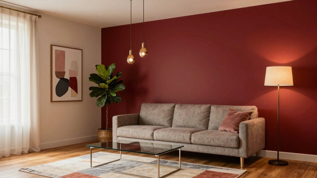
I’ll tell you why red walls need the right partner hue and how to pick one based on your lighting. Cool blues, sage greens, and muted terracotta calm the boldness, while crisp white or soft gray trims keep the space airy. Warm beige and greige flooring add cozy balance, and metallic brass or brushed‑steel accents bring a modern sparkle. For small rooms, keep ceilings and floors neutral, and for open‑plan areas, use large muted‑tone art and reflective surfaces. Keep reading to discover the seasonal swaps and a quick checklist that will nail the perfect red‑wall palette.
Explaining Why Red Walls Need the Right Pairing Color
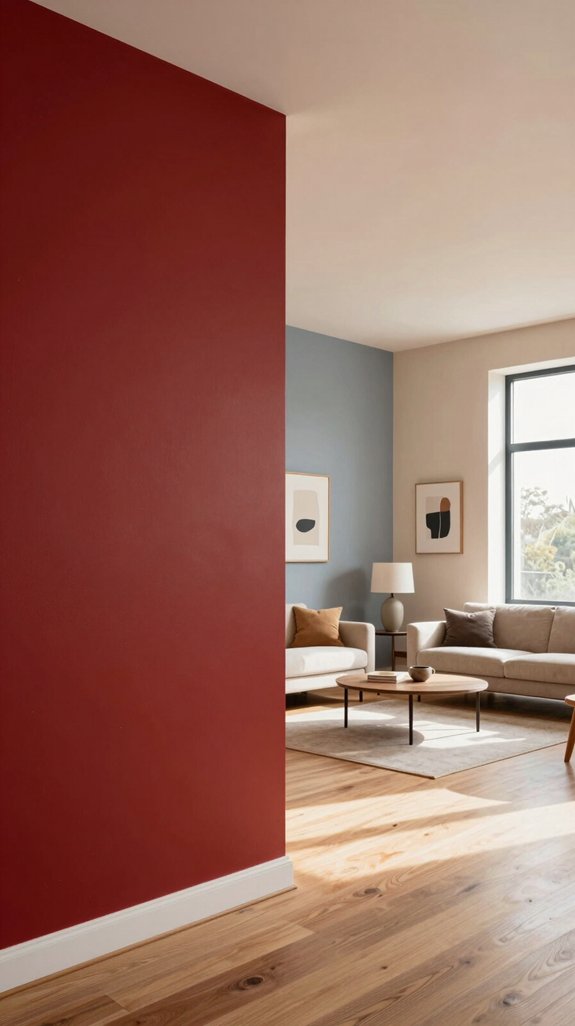
Red walls demand careful color pairing because their intensity can dominate a space, so I’ll show you how the right hue balances the drama and keeps the room feeling inviting. I’ve learned that red’s visual weight can overwhelm without a counterbalance, making a space feel cramped or chaotic. By introducing a complementary shade, I create visual breathing room, allowing the red to stay bold while the rest of the palette so. This interplay softens edges, guides the eye, and preserves energy without sacrificing style. I choose hues that echo contemporary trends, ensuring the décor feels fresh, cohesive, and innovative, not dated. For spaces seeking modern sophistication, silver metallic finishes offer a refined shimmer that beautifully complements red walls while adding luxury to your design scheme.

PREMIUM ARTWORK: High-quality canvas print featuring a vibrant urban streetscape with colorful buildings and swirling cobblestone path under a dramatic sun-filled sky


Choosing Complementary Hues Based on Room Lighting
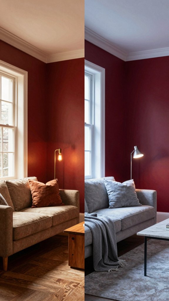
I’ve already shown how a complementary hue can temper a red wall’s intensity, now let’s look at how the room’s lighting dictates which shades will truly shine. In bright, sun‑flooded spaces I lean toward cool, muted blues or soft sage; the natural light amplifies their subtle contrast, keeping the red from overwhelming. In low‑key, amber‑lit rooms I choose warm greys or muted terracotta, letting the glow soften the red while preserving depth. LED fixtures with adjustable temperature let you experiment—swap a warm wash for a cooler one and watch the complementary color shift. For those preferring understated sophistication, light grey paints offer another excellent option in naturally bright rooms where you want to dial back color intensity entirely. Tailor hues to light, and you’ll achieve a balanced, modern vibe.
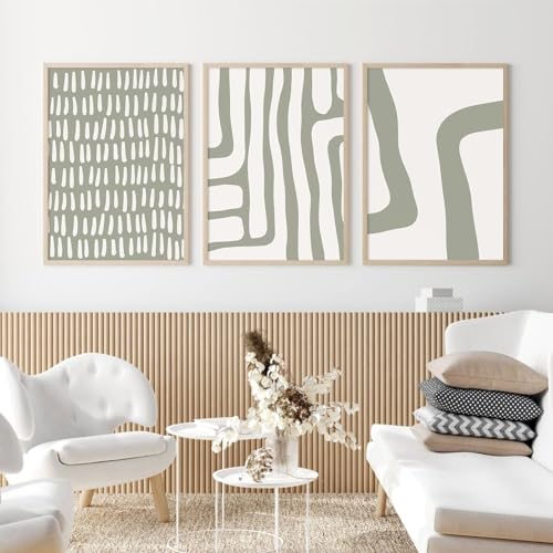
Unframed Prints: Watercolor wall art prints - (Set of 3) - Unframed - 12x16 inches.

Inspirational Botanical Design:Bring positivity and natural beauty into your home with this inspirational wall art featuring a peaceful hummingbird, eucalyptus leaves, and an uplifting quote. The calming design creates a warm atmosphere for bathrooms, bedrooms, living rooms, offices, and farmhouse spaces.

Preppy Themed Decoration: this preppy wooden decor is designed in green color and printed with inspirational quotes, full of preppy elements, using it to decorate your room, can better add a dreamy and cute atmosphere
Mixing Neutrals: Crisp White With Red Walls
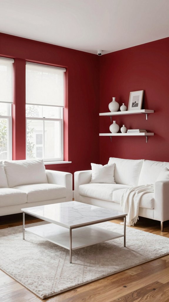
When I pair crisp white with red walls, the stark contrast instantly brightens the space while letting the bold hue stay grounded. I lean into clean lines, using white trim, ceiling, and built‑in shelving to carve visual breathing room. The white reflects natural light, amplifying the red’s energy without overwhelming. I choose matte or satin finishes for a modern, tactile feel, and I accent with brushed‑metal hardware to add subtle sheen. To enhance the vintage aesthetic, I incorporate antique-style decor items that complement both the red and white palette, creating layers of visual interest. This combination feels fresh, adaptable, and instantly Instagram‑ready, letting me experiment with bold art or patterned textiles while the white foundation keeps the overall vibe balanced and sophisticated.

Pattern: Printed Boho Vintage; Size: 2' x 6' (24" x 72"); Thickness: 0.31"; Color: Muted Navy/Blue Gray/Ivory/Terracotta, cream beige, navy, orange, brick red. Note: color may vary in brightness or tone under different lighting
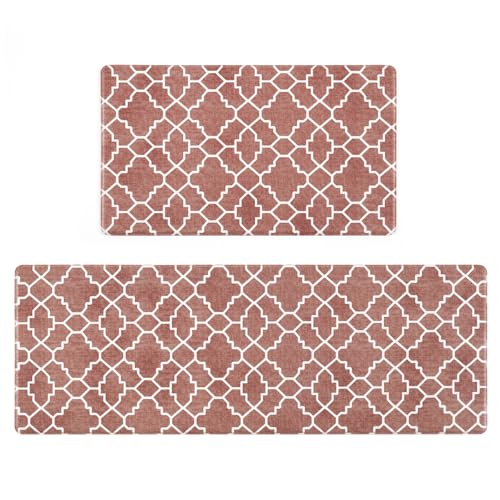
Vintage Trellis Design - Style your kitchen with our vintage look trellis kitchen rug set. This kitchen decor and accessories with a Moroccan inspired trellis pattern features a geometric diamond design that'll look perfect in any kitchen interior.

❤️【Soft Low Pile Rug】 This area rug is made of high-quality polyester. Ultra pleasant soft feel and quality appearance. The rug is low pile but it is very soft, almost plush feeling. The texture is very bare-feet friendly and is luxury soft underfoot.
Softening Bold Red With Gray Accents
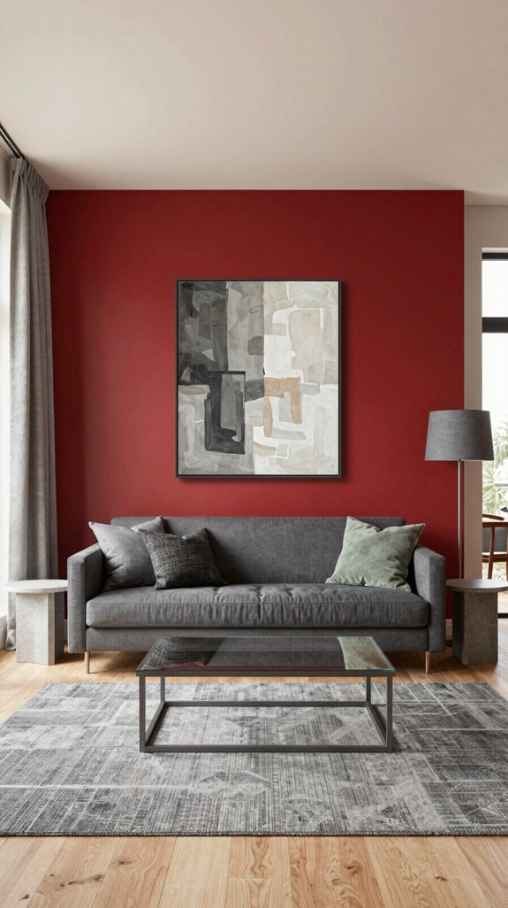
Even though red dominates the room, a soft gray accent can instantly dial back its intensity while preserving the drama. I layer charcoal‑gray on a feature wall, letting the hue absorb excess heat and create depth. Pairing matte gray furniture with glossy red trim balances texture, while gray‑tinted lighting softens glare. I choose cool‑taupe curtains to echo the gray, extending the calm into windows. A gray rug anchors the space, preventing red from overwhelming. I experiment with metallic gray accessories—lamp bases, picture frames—to add futuristic sparkle. Consider using cable management solutions to keep metallic accessories and electronic cords organized along baseboards and walls. This nuanced gray strategy tempers bold red, delivering a sophisticated, trend‑forward sanctuary.

Ready to use, pre-mixed door and trim paint offers a fresh new look on interior or exterior metal, wood and fiberglass
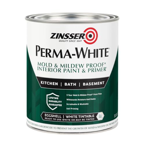
Self-Priming formula - requires no sanding

CABINET TRANSFORMATION: Refresh outdated cabinets, vanities, furniture and trim with rich Pure White color and a smooth semi-gloss finish
Adding Warm Beige for Cozy, Balanced Red‑Wall Spaces
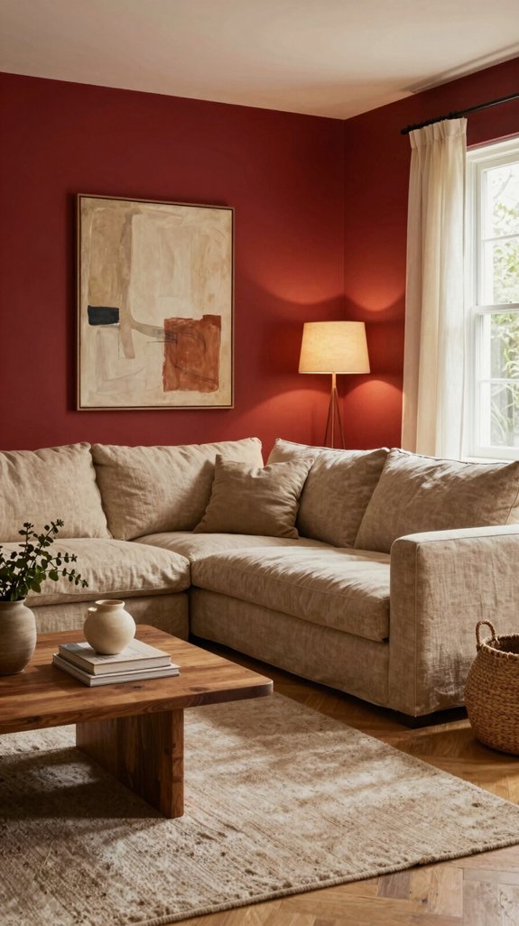
Because warm beige naturally softens the intensity of red, I introduce it through plush sofas, buttery cushions, and light‑toned wood trims. I pair these pieces with subtle metallic accents to keep the space feeling fresh yet grounded. A matte beige rug under a bold red coffee table creates visual tension without overwhelming the eye. I select wall‑adjacent shelving in warm tones, allowing books and décor to echo the hue while preserving red’s drama. Floating ledges designed for art provide an excellent way to display curated pieces that complement both the warm beige and red tones without cluttering surfaces. By layering textures—linen throws, woven baskets, and brushed brass—I achieve a balanced, cozy ambiance that feels both contemporary and timeless, inviting lingering comfort.


Using Muted Terracotta as a Harmonious Warm Counterpoint
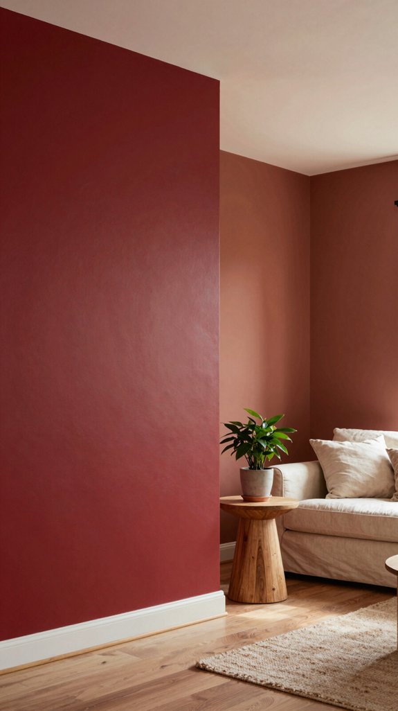
If I sprinkle muted terracotta accents throughout a red‑walled room, the warmth of the earth tone softens the bold hue while preserving its drama. I choose terracotta vases, woven rugs, and matte‑finish wall art to introduce subtle rust without overpowering. The hue’s low saturation pairs naturally with crimson, creating a seamless gradient that feels both modern and timeless. I layer terracotta textiles over sleek leather chairs, letting the texture anchor the space. This approach keeps the palette cohesive, reduces visual fatigue, and invites a grounded, innovative vibe that resonates with design‑forward interiors.

SPARKLE FOR WALLS: Our paint glitter additive is an easy & effective way to add a unique, shimmering finish to any interior surface; particles capture & reflect light for an enchanting effect.
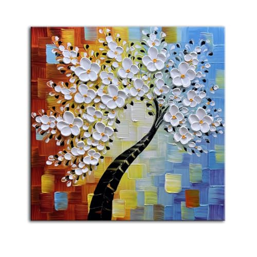
Wall Art Size : 24×24 inches (60×60 cm). Original handmade oil painting. 100% handpainted Tree of Life Artworks paintings by professional artists, not printed or poster.Each painting features rich texture, strong three-dimensional effect and is unique.

Framed Wall Art Decor: If you are looking for decorative wall paintings to enhance your home, explore our wide range of styles including flower; summer ocean; landscape; boho; farmhouse; botanical; abstract; retro; modern geometric and more theme
Introducing Teal for Unexpected Yet Elegant Contrast
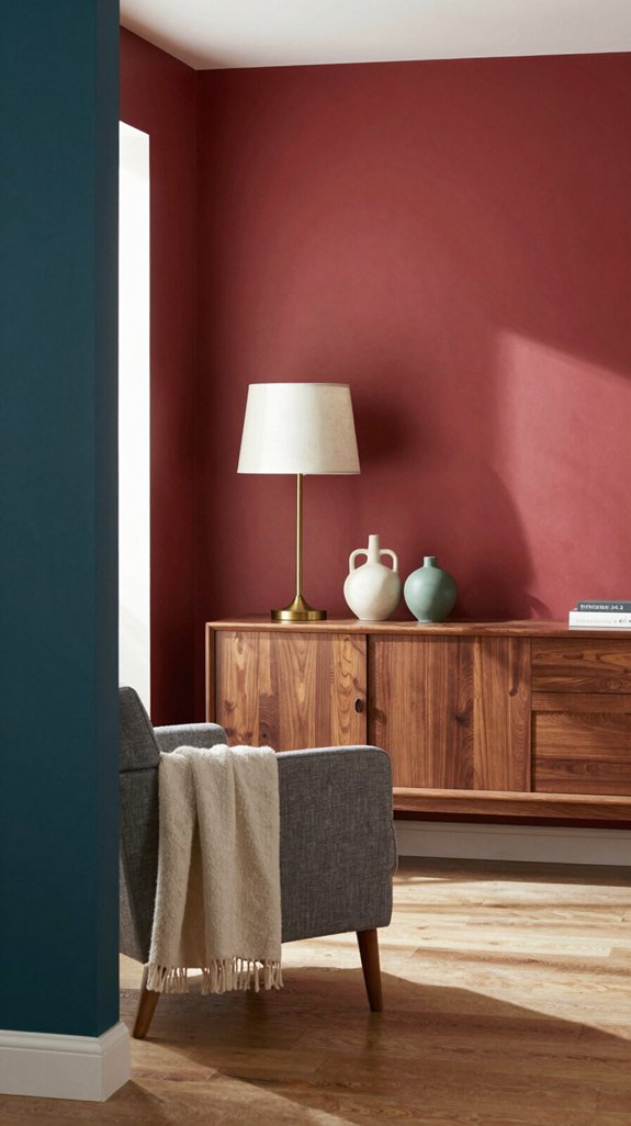
Ever wondered how a splash of teal can transform a red‑walled space without clashing? I’ve found that teal’s cool‑green undertones offset red’s heat, creating a sophisticated tension that feels fresh. I pair teal accent walls with minimalist white trim, letting the color breathe while preserving visual balance. I choose matte finishes to mute glare, and I introduce teal through textiles, cushions, or a statement sofa for easy swaps. I also layer subtle metallic accessories to amplify the modern vibe. For those seeking even more color impact, saturated interior paints like cobalt blue offer another bold option that pairs beautifully with warm tones. This unexpected contrast draws the eye, energizes the room, and keeps the design daring yet refined.

3D hollow-out butterfly wall decals: the package contains 3 sizes of 3D butterfly wall stickers in 3 different styles, totally 72 pieces stickers; These stickers are suitable for serving as wall decoration or DIY home decor

Sage Green Arched Wall Decor: This set of 2 arched wooden floral pieces features soft sage green panels, raised white floral cutouts, and natural wood-style frames for a calm boho farmhouse look.

Daisy Wall Decor Set of 3: what you will receive are 3 pieces of boho nursery decor in different sizes, designed in a unified daisy patterns in the theme of boho style; Enough quantities and various sizes can basically meet your interior decoration needs and satisfy your personal preferences
Applying Navy Blue for Sophisticated, Deep Complement
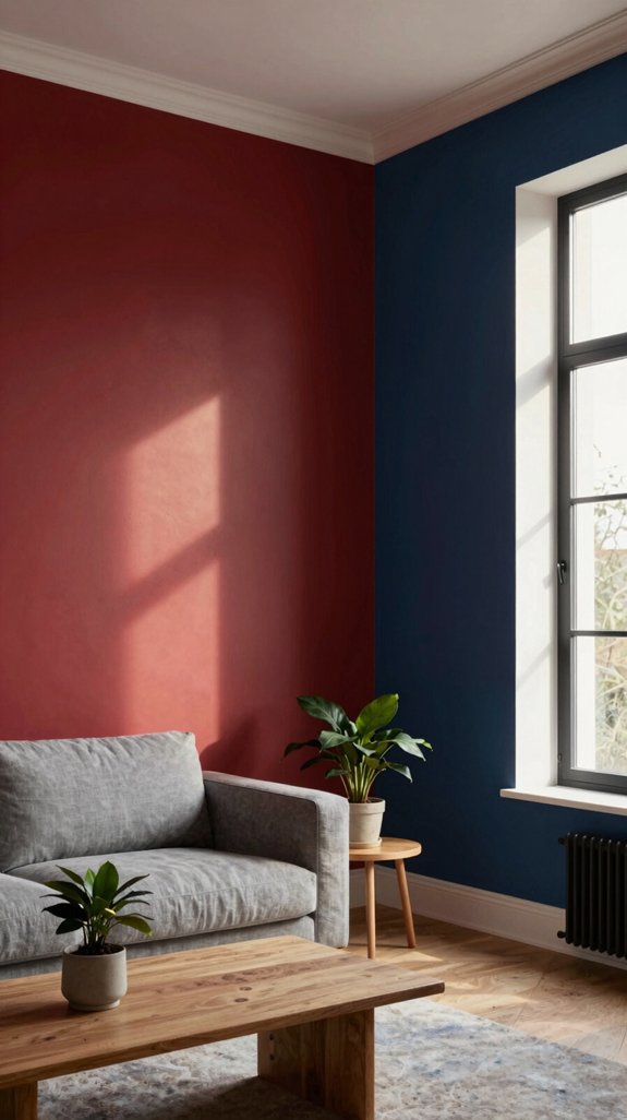
When I introduce navy blue into a red‑walled room, the deep, cool hue instantly grounds the fiery backdrop, creating a sophisticated, almost regal contrast. I pair navy accents with sleek metal fixtures and matte black hardware, letting the color anchor modern furnishings while preserving warmth. Textured navy velvet cushions or a statement rug add tactile depth without overwhelming the space. I choose low‑gloss paint for walls to maintain subtlety, and I integrate subtle lighting—warm LEDs or amber sconces—to highlight the interplay of tones. Blue interior wall paints offer versatile options for creating depth and sophistication in contemporary spaces. This combination feels timeless yet forward‑thinking, perfect for innovators seeking bold, refined interiors.

❤️【Soft Low Pile Rug】 This area rug is made of high-quality polyester. Ultra pleasant soft feel and quality appearance. The rug is low pile but it is very soft, almost plush feeling. The texture is very bare-feet friendly and is luxury soft underfoot.

❤️【Soft Low Pile Rug】 This area rug is made of high-quality polyester. Ultra pleasant soft feel and quality appearance. The rug is low pile but it is very soft, almost plush feeling. The texture is very bare-feet friendly and is luxury soft underfoot.

Stain Resistant: This washable rug runner can be machine or hand-washable. Hand-washing can reduce the appearance of creases. Wash this ultra-thin rug in a cold water washing machine and dry it without heating, The vintage rug runner is easy to clean. You can use a broom, robot vacuum cleaner to clean hair and pet hair.Professional cleaning recommended for large stains.
Balancing Red With Sage Green for Natural Calm
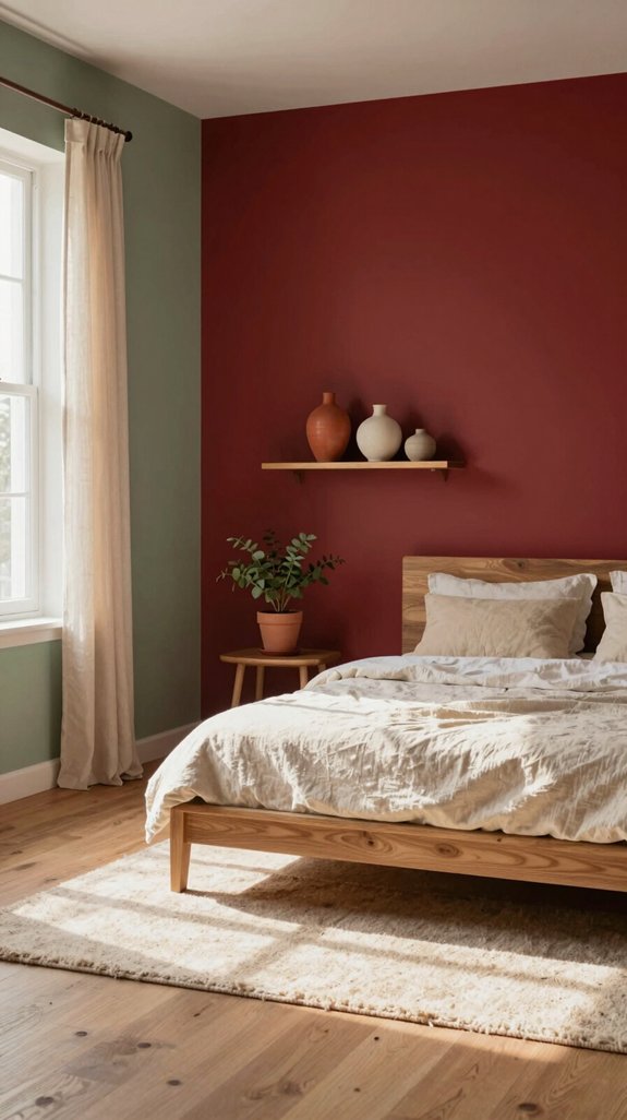
After exploring the regal depth of navy, I turn to sage green to soften the intensity of red walls and invite a natural calm. I blend muted sage accents with bold red, letting the green act as a visual breath. This pairing grounds the space, creating a soothing backdrop for modern furnishings. I recommend matte finishes on trim and soft textiles in sage to balance the vivid walls without overwhelming. Light wood tones echo the earthiness, while subtle patterns keep the look fresh. For those seeking a lighter alternative, pistachio green wall paint offers a playful yet sophisticated option that maintains the calming effect while introducing a more vibrant undertone. By integrating sage green, I achieve a harmonious, trend‑forward environment that feels both innovative and serene.

Use for a variety of indoor and outdoor project surfaces including wood, metal, plaster, masonry or unglazed ceramic

Use for a variety of indoor and outdoor project surfaces including wood, metal, plaster, masonry or unglazed ceramic
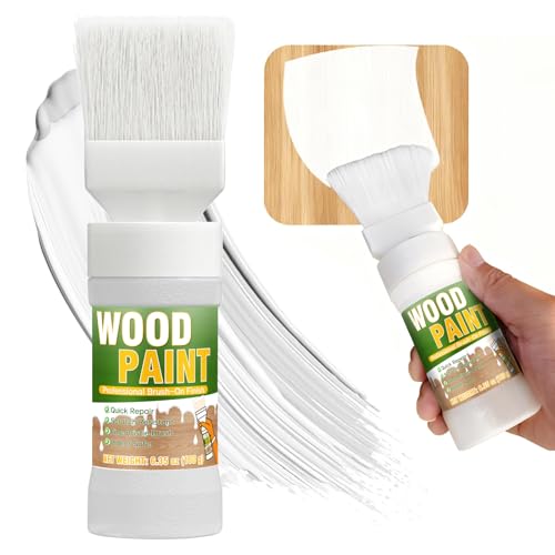
【Multi-Purpose Water-Based Paint】: Vigorder white touch up paint requires no sanding, primer, or multiple coats—achieve a perfect finish in just one step. Easily refresh furniture, door frames, and other painted surfaces
Elevating Red Walls With Gold Accents and Metallics
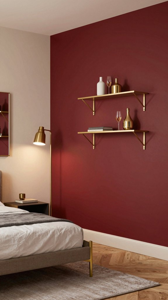
If I lace a red wall with brushed‑gold fixtures and subtle metallic accents, the space instantly feels luxe without losing its bold heart. I pair matte copper lamp bases with sleek chrome shelving, letting light bounce off the red for a sophisticated glow. A gold‑leafed mirror expands the room, while brushed‑steel picture frames anchor art without overwhelming color. I choose brushed‑gold drawer pulls and a metallic rug runner to weave texture throughout. These accents stay understated yet striking, keeping the red dominant while adding modern opulence. Smart LED strip lighting installed along shelving edges can enhance the metallic finishes by casting warm glows that amplify the luxurious aesthetic. The result is a daring, runway‑inspired interior that feels both innovative and inviting.


Compact Desktop Accent: This mini vase measures 4.33 x 1.88 x 1.88 in and fits neatly on a desk, shelf, or table, making it a practical desktop decor piece for adding a small vase look without crowding your space

Brushed gold finish: Shiny gold color with textured finish; brightens bathroom space; base has threads of silver and gold for a 3D effect; complements Glam style or adds texture to neutral decor
Selecting Paint Finishes for Red‑Wall Pairings
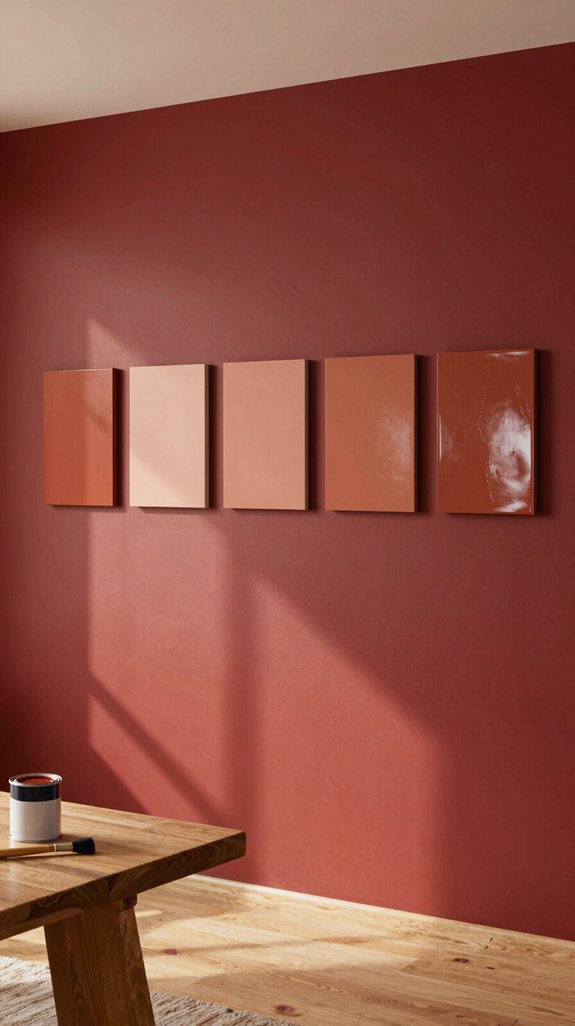
Even though red walls demand attention, the finish you choose can either amplify that drama or soften it. I recommend a low‑sheen matte for a modern, velvety backdrop that mutes glare while preserving depth. If you crave subtle reflection, a satin finish adds a whisper of sheen without competing with bold hues. For high‑traffic zones, a durable semi‑gloss resists scuffs and highlights architectural lines. I pair these choices with accent trims in flat or eggshell to maintain visual hierarchy. By calibrating sheen levels, you control mood, enhance texture, and keep the space feeling fresh and innovative. Consider how brightness and lighting from your fixtures interact with these finishes, as reflective surfaces will amplify the luminosity of your room’s light sources.
Mixing Patterned Fabrics With Red Walls for Cohesive Style
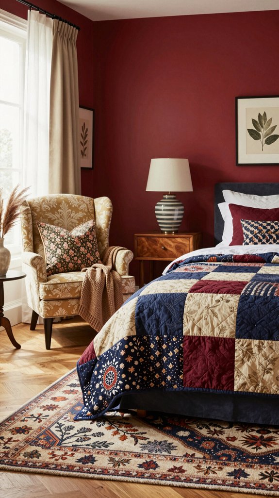
While the red walls set a bold stage, I’ll weave patterned fabrics into the scene by balancing scale, color, and texture so the room feels cohesive rather than chaotic. I start with a neutral base—linen or cotton in ivory or soft gray—then layer a geometric rug that mirrors the wall’s intensity without competing. A velvet throw in deep navy adds depth, while a silk pillow with subtle gold thread introduces luxe contrast. Keep patterns proportionate: large‑scale prints on sofas, small motifs on cushions. This curated mix respects the red backdrop, creates visual harmony, and stays on‑trend with layered, tactile sophistication. Just as agility equipment sets require thoughtful arrangement to create an effective training space, your fabric selections benefit from intentional spacing and coordination to maximize visual impact.
Choosing Flooring Shades That Anchor Red Walls
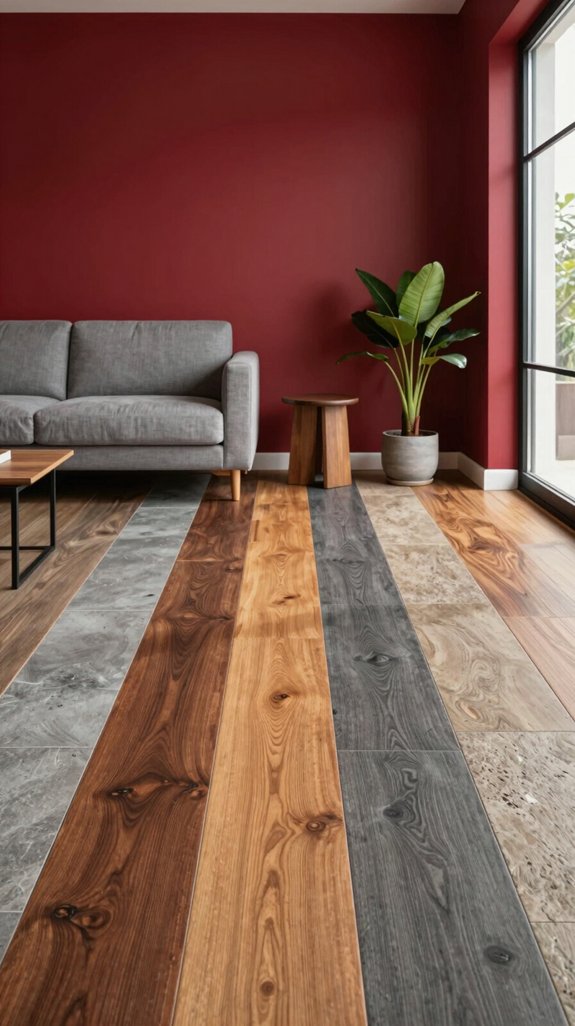
I’ve already set the tone with patterned fabrics, now I’m anchoring the space with flooring that grounds the red walls. I choose muted taupe or warm greige hardwood to mute the intensity while preserving depth. Light oak with subtle grain adds texture without competing, and matte porcelain tiles in soft dove gray reflect ambient light, keeping the room airy. For a bold twist, charcoal‑stained bamboo offers contrast that feels modern yet cohesive. I layer low‑pile rugs in neutral tones to define zones, ensuring the floor acts as a visual anchor that lets the red walls shine without overwhelming. Pairing red walls with grey shade options creates a sophisticated balance that prevents the space from feeling too intense.
Choosing Ceiling Paint That Keeps Red From Overwhelming
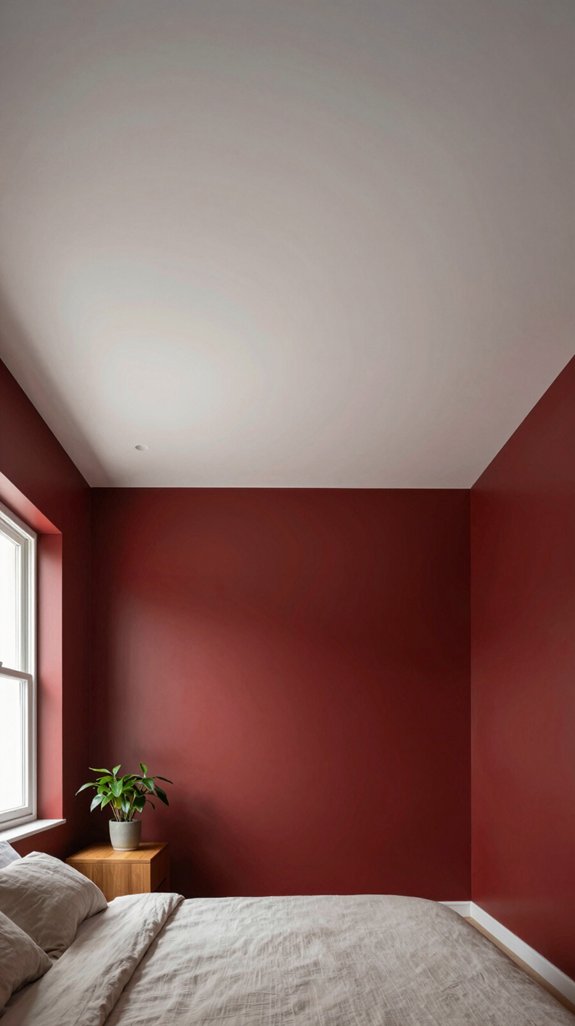
If I want the red walls to feel vibrant rather than oppressive, I’ll start by treating the ceiling as a light‑reflecting buffer. I choose a high‑gloss or satin white that bounces daylight, softening the red’s intensity. For a modern twist, I experiment with muted greys or warm creams that echo the wall’s undertones without competing. I also consider a subtle pastel—sage or blush—to add depth while preserving openness. Installing LED strip lighting along the crown moulding amplifies the reflective effect, ensuring the room feels airy. Pairing these ceiling treatments with natural light filtering window coverings like bamboo shades further enhances the room’s ability to balance bold color. By balancing reflectivity, hue temperature, and innovative lighting, the ceiling becomes a calming counterpoint to bold red walls.
Matching Furniture Finishes to Red‑Wall Color Schemes
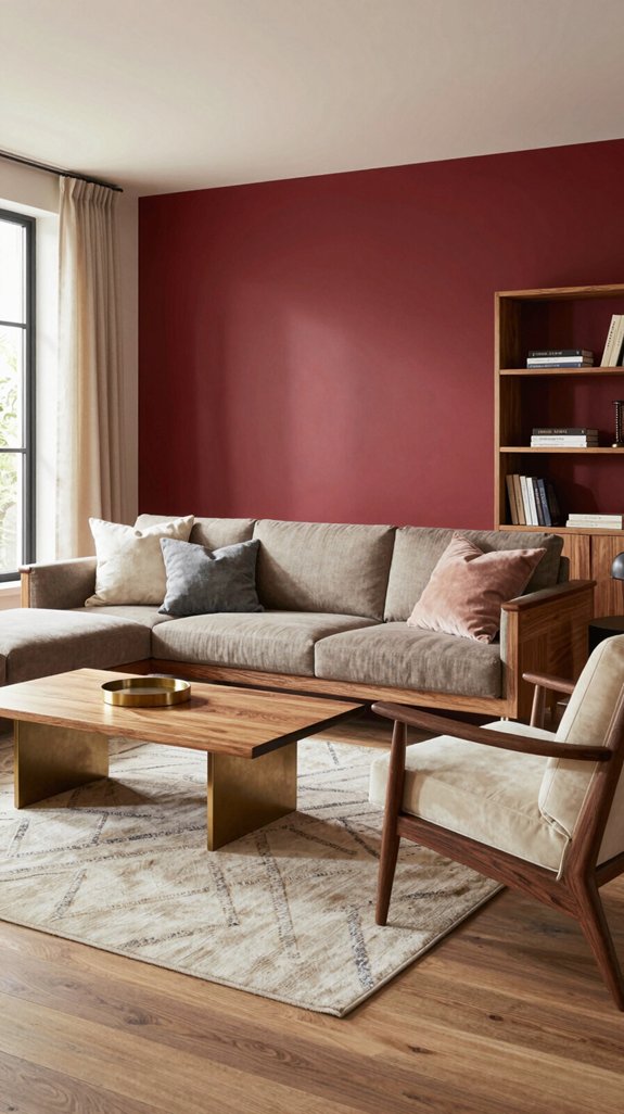
When I pair furniture finishes with red walls, I start by choosing tones that either echo the boldness or provide a subtle contrast, ensuring the space feels balanced rather than chaotic. I gravitate toward matte black metal frames for a sleek, modern edge, while brushed brass legs add warm luminosity without competing. Dark walnut or charcoal upholstery absorbs excess energy, and glossy white lacquer creates crisp visual relief. I also experiment with subtle sheen finishes—soft satin or low‑gloss—that reflect light gently, preserving red’s intensity. Metal wall art with matte and brushed finishes can further enhance this balanced aesthetic by adding dimensional depth to the space. By mixing texture, metal, and wood, I craft a cohesive, forward‑thinking interior that feels both daring and harmonious.
Using Artwork and Décor to Tie Complementary Colors Together

I love using artwork and décor as the bridge that unites red walls with complementary hues, because a well‑chosen piece can instantly balance boldness and softness. I select prints that echo teal, mustard, or teal‑green accents, letting color motifs echo the wall’s intensity without overwhelming the space. Sculptural objects in brushed brass or matte black create visual anchors, while patterned cushions and throws introduce texture and subtle color shifts. I layer framed photography with thin metallic borders to reinforce the palette’s rhythm. Creative frames designed specifically for displaying art and photography can elevate the overall aesthetic while protecting your pieces. By curating a cohesive gallery wall, I turn the room into a dynamic canvas where each decorative element reinforces the complementary scheme and feels fresh, modern, and intentionally designed.
Designing Small Spaces With Red Walls
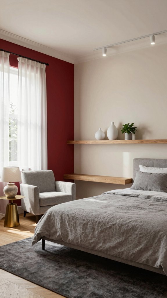
Having just curated a gallery wall that tames bold red, I now turn to how those same principles help make a compact room feel airy and inviting. I layer light neutrals—soft dove, warm ivory—on ceilings and trim to lift the eye, while the red wall becomes a focal anchor. Strategic mirrors reflect natural light, expanding perception without clutter. I choose sleek, low‑profile furniture in muted tones, letting the wall’s vibrancy punctuate the space. Accent textures—linen throws, woven baskets—add depth without overwhelming. Modular shelving systems with flexible layouts maximize vertical storage while maintaining the clean aesthetic I’m after. By balancing boldness with restraint, I create a cozy, modern haven that feels larger than its square footage.
Designing Large Open‑Plan Areas With Red Walls
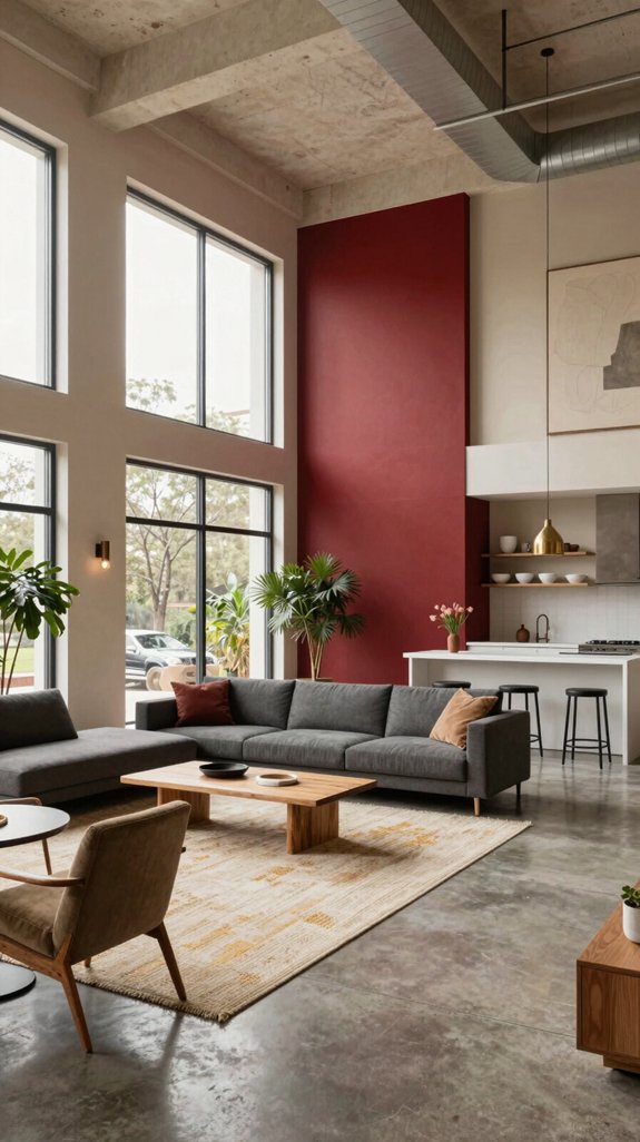
If you want a red wall to feel expansive rather than oppressive, start by anchoring the space with a light, neutral ceiling and floor that let the eye travel upward and outward. I layer large‑scale art in muted tones to break up the intensity while preserving drama. I incorporate glass partitions and reflective surfaces, which bounce light and soften the hue. I choose sleek, low‑profile furniture in soft greys or warm beiges to balance the boldness. I add subtle, warm lighting that accentuates texture without overwhelming the red. For spaces seeking an alternative mood, midnight blue paints offer a sophisticated option that creates similarly luxurious depth without the visual intensity of red. This approach keeps the open‑plan airy, contemporary, and visually harmonious.
Seasonal Color Swaps for Red Walls
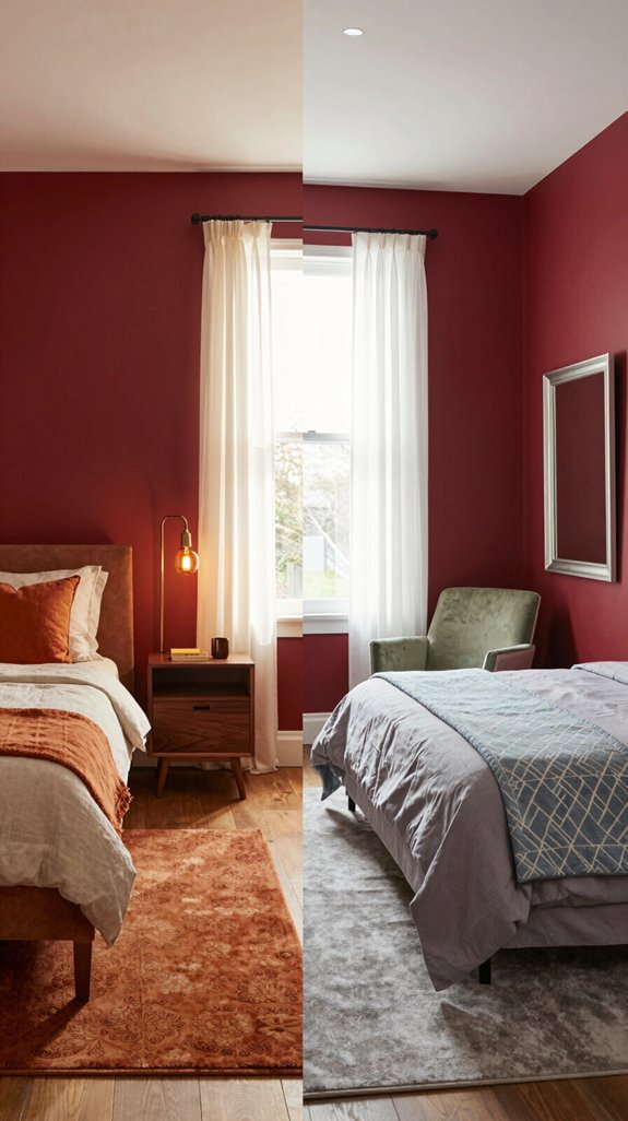
Even as the seasons shift, I can keep a red wall feeling fresh by swapping in complementary hues that echo the time of year—soft pastels for spring, bright citrus for summer, muted earth tones for autumn, and cool blues or greys for winter. In spring I layer mint, blush, or lavender textiles over the red, letting natural light amplify their delicacy. Summer calls for bold lemon, tangerine, or turquoise accessories that energize the space. For those seeking to enhance brightness further, golden yellow paints offer excellent warm tones that complement red walls beautifully. Autumn arrives with terracotta, sage, and deep ochre accents, grounding the red in warmth. Winter’s palette leans on slate, ice‑blue, and charcoal accents, creating crisp contrast while preserving the wall’s dramatic flair.
Quick Checklist for Perfectly Paired Red‑Wall Designs
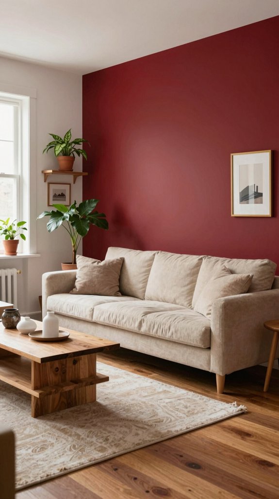
I’ll walk you through a quick checklist that guarantees your red‑wall design feels intentional and on‑trend, from color balance to texture harmony. First, choose a complementary hue—soft neutrals, deep navy, or muted teal—to anchor the space without competing. Next, test contrast ratios with natural light; make certain the red remains vibrant yet not overwhelming. Then, layer textures—linen cushions, brushed metal fixtures, or woven rugs—to soften the visual impact. Incorporate reflective accents like glass or polished chrome for depth. Finally, evaluate the overall palette on a mood board, adjusting saturation until the composition feels cohesive, fresh, and unmistakably modern. Consider wine‑red paint tones from premium collections to ensure your walls display the depth and richness needed for a sophisticated, gallery‑quality finish.
Frequently Asked Questions
Can I Use Wallpaper Instead of Paint for Red‑Wall Pairings?
I’d say yes—wallpaper can replace paint for red‑wall pairings, giving you texture and pattern flexibility while staying on‑trend. Choose matte or subtle metallic finishes to balance the bold hue without overwhelming the space.
How Do I Choose Trim Colors That Complement Red Walls?
I’ll match trim to red walls by picking neutrals—soft whites, warm greys, or crisp blacks—creating a visual anchor. I’ll also experiment with deep navy or muted gold for a modern, avant‑garde contrast.
Are There Specific Lighting Fixtures That Enhance Red‑Wall Color Schemes?
I recommend sleek, warm‑tone LED pendants or brushed‑gold sconces; they amplify red’s richness while adding modern glow. Pair them with dimmable controls for adaptable ambience, and the space feels instantly sophisticated.
What Rug Styles Work Best With Red Walls?
I’d say geometric‑patterned rugs or plush, muted‑tone shags work best with red walls—think a sleek, black‑and‑white chevron or a soft ivory pile that grounds the bold hue while staying on‑trend.
How Can I Incorporate Plants Without Clashing With Red Walls?
I’ll blend deep‑green foliage or soft‑white succulents, letting their natural tones offset the red. Choose sleek pots in matte black or brushed brass, and arrange them at varying heights for visual balance.



