
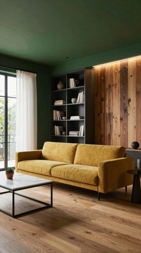
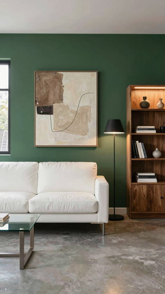
You’ll find dark‑green walls look bold yet grounded when you pair them with crisp whites, warm terracotta, or muted teal accents. Use a dominant accent like metallic teal or soft mustard on pillows or a statement chair, and keep the rest of the palette in quiet neutrals—creamy whites, slate‑blue, or soft taupe—to let the green breathe. Add sleek finishes—brushed brass, matte black, or high‑gloss tiles—to enhance depth, and let natural light or cool LEDs shift the mood. Keep reading to discover how fabrics, flooring, and lighting further refine the look.
Swift Summary
- Pair muted neutrals (ivory, warm greys) with dark‑green walls to brighten the space while preserving depth.
- Use teal or slate‑blue accents for a sophisticated, monochrome vibe that bridges green walls and cooler furnishings.
- Add warm terracotta or mustard accessories for an energetic pop that feels grounded and earthy.
- Incorporate metallic finishes (brushed brass, chrome, matte gold) to introduce sleek contrast without overwhelming the palette.
- Balance lighting: cool LEDs for crisp teal pairings, warm tungsten for terracotta richness, and natural light to shift mood dynamically.

Twin Spiral Composition: Sage green, forest green, ivory, taupe, beige, and gold-toned brushstrokes form a balanced abstract framed canvas wall art design.

Style: Boho wall decor combines soft woven cotton yarn with rounded wooden tops and flowing strands, adding rich texture and a relaxed natural look to modern, farmhouse, rustic and bohemian interiors.

MODERN ORGANIC ABSTRACT: Misty sage-green forms, expressive black curves, warm neutral brushwork, and restrained gold-tone accents create a fluid contemporary composition.
Why Dark Green Needs the Right Pairings
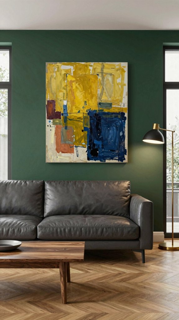
Because dark green carries a natural depth, it demands thoughtful companions to release its full impact. You’ll notice that when you pair it with muted neutrals, the hue steadies, letting sleek textures and metallic accents shine. Pairing with warm terracotta injects subtle energy, while crisp ivory creates a clean, airy contrast that feels futuristic. You can also experiment with deep navy for a sophisticated, monochrome vibe that feels grounded yet daring. For a timeless foundation, consider anchoring your palette with classic creamy neutrals that provide sophisticated balance without competing for attention. The key is to balance intensity with restraint, letting each shade amplify the other’s character. This strategic pairing transforms a space from ordinary to avant‑garde, resonating with innovative design sensibilities.

★【Size】: 20 x 20 inches,fit most 50x50cm pillows, NOTE: ONLY 2 orange and brown pillow covers contained, no insert or filler.

Velvet Fabric: Teal blue color with throw pillow covers is made of 280gsm thick premium velvet fabric - super soft and comfortable to use, durable long-lasting and fade-resistant shrink-resistant.The square pillow covers paired with teal blue chic solid color - suitable for spring, summer, autumn, and winter season, is luxury and minimalist - used for couch sofa decoration.

Luxurious Velvet Material: Our modern luxury throw pillow covers are made with premium quality velvet material. The material is soft and gentle to the touch, providing a cozy and comfortable experience.
How to Pick the Perfect Accent Color

When you’re choosing an accent color for dark‑green walls, start by identifying the mood you want to amplify—whether it’s calm, energy, or depth. Pinpoint a hue that mirrors that feeling, then test it against natural light and artificial fixtures. Opt for metallic teal, muted copper, or soft mustard to inject subtle contrast without overwhelming the space. Use a limited palette: one dominant accent, a secondary tone for accessories, and a neutral base for balance. Apply the accent sparingly—think throw pillows, artwork frames, or a single statement chair—to keep the design grounded yet forward‑thinking. Consider integrating security camera sets into your décor by strategically placing them near accent pieces to blend technology seamlessly with your interior design.
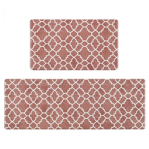
Vintage Trellis Design - Style your kitchen with our vintage look trellis kitchen rug set. This kitchen decor and accessories with a Moroccan inspired trellis pattern features a geometric diamond design that'll look perfect in any kitchen interior.

Tiger Tribal Rug: Stand out with this eye-catching tiger-print rug, ideal for boho, vintage, or global-themed spaces. This lively rug tells a story through its shell and floral motifs that symbolize protection and growth. The color palette pairs warm tones like terracotta and chocolate brown with dusty blues and bright teal to evoke the power of earth and sky.

【Non-Slip Backing】Experience peace of mind with every step on our vintage area rug, featuring an innovative TPE non-slip rubber backing. Designed to keep your carpet securely anchored, it effortlessly holds its ground against movement and slippage. Provides safety and stability for high-traffic areas such as entrances or front doors, reducing the likelihood of people and pets slipping, making it easy to walk and play
Crisp White for Fresh Contrast With Dark Green
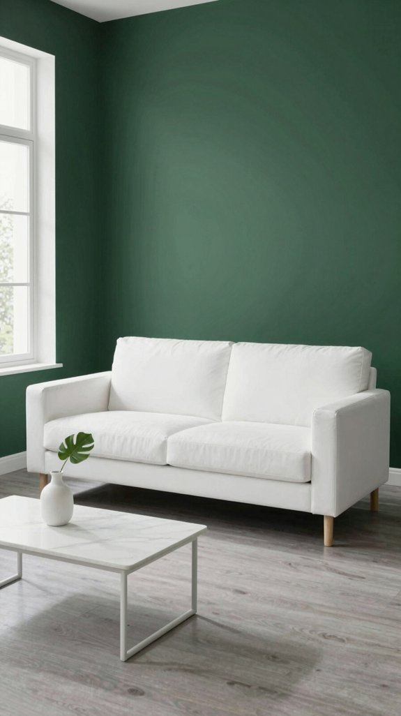
If you pair crisp white with dark‑green walls, the contrast instantly brightens the room while preserving the depth of the hue. White trims, ceiling moldings, and furniture legs carve clean lines that amplify the green’s richness without drowning it. Choose high‑gloss finishes for a sleek, modern edge, or matte porcelain tiles for subtle texture. White accessories—think sculptural vases, geometric rugs, and metallic accents—inject freshness and guide the eye across the space. Like dark slate gray tones used in industrial design, dark green creates sophisticated depth when balanced with crisp white elements. By balancing stark white against the verdant backdrop, you create a dynamic dialogue that feels both contemporary and grounded, perfect for innovative interiors that demand visual impact.
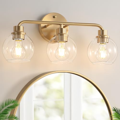
🏵️Stunning Pure Gold Color & Modern Design: Our 3-light gold vanity lights have a very pure gold color that will never let you down! Crafted from metal and globe glass shades, this gold wall mount light finished in a gold stylish appearance! Total brushed brass vanity light size 19.69 inch L x 6.96 inch W x 9.11 inch H.

【Upgrade Brushed Gold Vanity Light】Gold light fixture bathroom features a smooth brushed brass finish, thickened high transparency glass lampshade to maximize its light, rugged metal pole and rust and corrosion resistant coating to ensure long-term safety and durability, providing a bold and stylish solution for your bathroom or powder room lighting needs!

【Mid Century Modern Design】this wall sconces Brushed Brass perfect for your indoor sconce light,decorative wall sconce,bathroom vanity wall sconces,restaurant,hallway and more.brings more brilliance to your home decor.
Soft Neutrals That Soften Forest‑Deep Hues
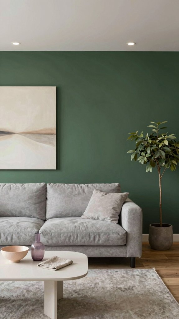
What soft, muted tones can coax a forest‑deep green into a serene backdrop? You’ll discover that warm greys, muted taupes, and whispery beiges act as quiet anchors, letting the green breathe while retaining depth. Pair a charcoal‑mist accent wall with a sage‑green sofa, and the contrast feels intentional, not stark. Introduce soft‑white linen curtains to diffuse light, creating a layered, airy atmosphere. A sand‑colored rug under a dark‑green coffee table grounds the space without overwhelming it. These neutrals amplify the green’s richness, delivering a sophisticated, forward‑thinking palette that feels both bold and balanced. Complete your sophisticated interior by incorporating matching coaster sets to protect your surfaces while adding coordinated style to your dark green room.

Size: This metal wall art home decoration measures approximately 35 x 25 x 0.1 cm/13.77 x 9.84 x 0.04 inch.

High-quality material:Made of 304 stainless steel to prevent corrosion ,heavy duty and rustproof,inlcude 1x towel ring,

Hanging Planters with Fake Plants Set: you will receive 2 pieces metal wall planter decors and 2 pieces plastic fake plants, which can match well with each other and are ideal for making your home or office more colorful and vibrant
Warm Terracotta as an Earthy Counterpoint
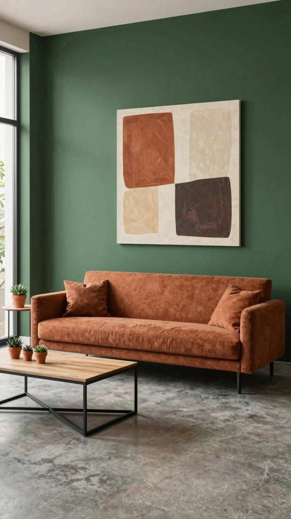
Although deep forest green dominates the room, a warm terracotta accent instantly grounds the space, adding earthy depth without sacrificing sophistication. You’ll notice how terracotta’s muted orange‑red hue creates a tactile contrast that feels both modern and timeless. Pair it with matte ceramic vases, woven baskets, or a reclaimed‑wood coffee table to amplify the organic vibe. The color thrives in natural light, subtly shifting tone throughout the day, which keeps the environment dynamic yet cohesive. For those seeking specific paint options, brick red interior paints offer an excellent range of terracotta-inspired shades that maintain these earthy qualities while providing professional color consistency. By integrating terracotta, you anchor the bold green, delivering a balanced palette that feels grounded, inviting, and unmistakably avant‑garde.

Large Abstract Wall Art: This 29x58 inch green and gold print features sweeping curves and layered colors, creating elegant large wall decor with a contemporary artistic style.

【Product Size:】2 Pcs Macrame tapestry wall hanging 13.7"W x 51"L (35x130cm).Due to its large width, it is recommended to choose a spacious wall to hang it on and showcase its beauty and artistic value.

Macrame Wall Hanging is a stunning and unique piece of decor, perfect for adding a touch of bohemian style to any room. Handcrafted using traditional techniques, this wall hanging creates a beautiful and textured design, making it the perfect addition to any home.
Metallic Accents for a Modern Edge
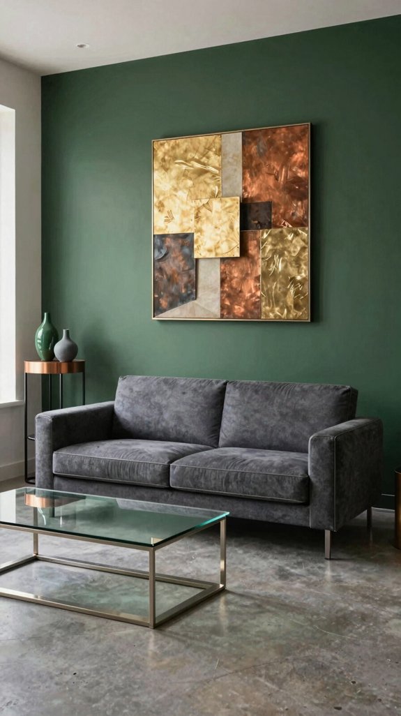
Add brushed brass or polished chrome fixtures, and the deep green walls instantly gain a sleek, contemporary edge. You’ll notice the reflective surfaces amplify the room’s depth, while soft metallic tones counterbalance the dark hue without overwhelming it. Choose slim, geometric lighting, matte‑finish handles, and sculptural art pieces that echo the wall’s richness. Pair these accents with crisp white textiles or charcoal leather to keep the palette grounded yet forward‑thinking. Consider layering your scheme with accent lighting kits that emphasize architectural details and create ambient zones throughout the space. The result feels purposeful: a sophisticated, urban sanctuary where tradition meets innovation, inviting you to inhabit a space that’s both bold and effortlessly refined.

【PACKAGE】:It comes in a set of 2 (no pillows insert or filler).The tropical leaves pillow covers can be a great decoration to decorate the home ambitiously,which is a great home decoration,it looks so elegant.

★High Quality Material: Our spring pillow covers 18x18 set of 2 is made of 100% durable linen material, the pattern will not fade. This outdoor pillows features a teal flower design and makes a great home decor

EMBROIDERED “blessed” – NOT PRINTED: The word is raised in high-density muted gold thread in a flowing hand-lettered script — dimensional, textured and crisp, a daily reminder of gratitude and faith that reads clearly across the room.
Light Wood Tones to Balance Dark Green
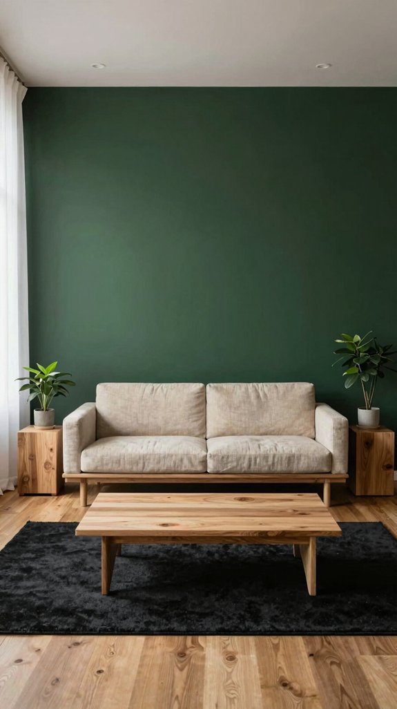
When you introduce light wood tones alongside dark green walls, the contrast instantly lifts the space, creating a harmonious blend of depth and airiness. Choose maple, birch, or reclaimed pine with subtle grain to inject natural brightness without overwhelming the hue. Pair a floating shelf or a sleek console in these tones to anchor furniture while preserving visual flow. Light wood frames accentuate artwork, and tapered legs on chairs keep the floor visually light. Opt for matte finishes to maintain a contemporary feel, and consider angled slats for dynamic texture. For additional storage that complements your light wood accents, ladder racks offer a stylish way to display and organize textiles while maintaining the room’s visual balance. This balance amplifies modern elegance, letting the green anchor the room while the wood breathes openness.

UPGRADED WAFFLE DESGIN: 24x72 terracotta waffle bath mat. This boho bath mat is woven with upgraded yarns. The heavier and thicker threads are applied to ensure the pattern will be more solid and compact. It is not only decorative but also durable and NEVER OUT OF SHAPE. Our extra long bathoom rug is ideal for bathroom, double sinks, kitchen, entryway, hallway or bedroom. Note: Length and width of these bath rugs include tassel part

Machine Washable And Easy Care: This washable 2x3 rug adds softness inside your entryway, in front of the kitchen sink, or beside the bed. Blot spills promptly with a towel or paper towel, and machine wash according to the care label when needed. For routine vacuuming, use a dusting brush attachment on low suction and move gently in one direction to help prevent this small, lightweight rug from lifting or bunching

Designed to withstand everyday wear, this 5' 3 x 8' area rug is the perfect size for living rooms, bedrooms, or anywhere you want to add a warm, inviting touch to your home.
Black for Dramatic Depth in Green Rooms
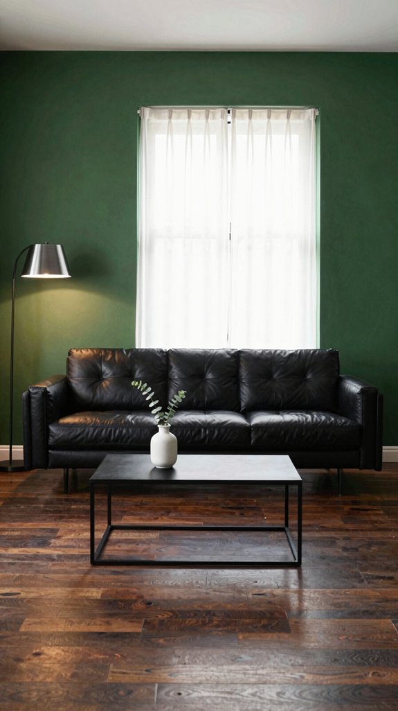
If you pair black accents with dark‑green walls, the room instantly gains a cinematic depth that feels both daring and grounded. You’ll notice how a sleek black console anchors the space, while matte black picture frames draw the eye without overwhelming the verdant backdrop. Consider a black‑finished light fixture that casts subtle shadows, adding texture and intrigue. Black hardware on cabinets or shelving creates a seamless visual line, reinforcing the room’s sculptural quality. Matte black wall paints deliver the dramatic interior aesthetic that transforms green rooms into sophisticated, gallery-like spaces. Pair these elements with minimalist décor, and the juxtaposition of light and dark becomes a bold statement, reflecting contemporary design trends while preserving an intimate, grounded atmosphere.

Warm Brushed Gold Elegance: The gold bathroom light fixtures combines rustic charm with timeless appeal, creating a captivating lighting fixture for your home. The wood accents and matte antique Brass finish (brushed gold effect) that brings timeless sophistication and a touch of rustic charm to your farmhouse or modern bathroom

Inspired Design-Our Watyo vanity light holds an exclusive design patent. Unlike standard designs, with unique sizes and crackle globe glass shapes,our custom-made glass add a distinctive and sleek contemporary style to your home decor. Total gold vanity light size 20 inch L x 7 inch W x 9.11 inch H.The MAX size of glass shade is 5.12 inch, the bottom size of glass shade is 3.15 inch.
Blue Shades That Blend Seamlessly With Dark Green
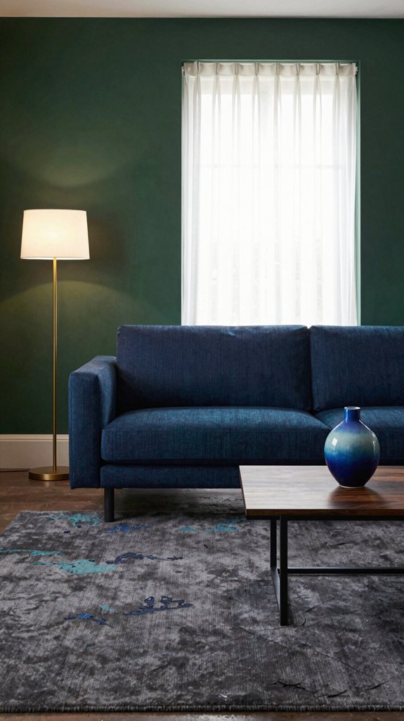
The deep, muted green that already anchors your space invites a cool counterpoint, and a well‑chosen shade of blue can amplify that grounded vibe while adding visual lift. Choose a slate‑blue with subtle gray undertones for a seamless merge that feels sophisticated rather than stark. Pair it with teal accents that echo the green’s depth, creating a fluid dialogue between walls and furnishings. Opt for a navy‑rich hue on textiles to anchor the room, then introduce a whisper of cerulean in décor pieces for a fresh, airy contrast. This palette balances intensity with serenity, delivering a modern, cohesive aesthetic that feels both bold and grounded. Teal-blue interior paints are particularly effective at bridging the gap between your dark green walls and cooler accent colors, enhancing the overall harmony of the space.

Modern Wall Decor: Enhance your space with this contemporary wood wall decor piece that effortlessly complements any decor style.

Black Metal Wall Decor Set of 3: featuring 3 different elegant flower patterns, 11.8×11.8 in, 8.2×8.2 in, 6×6 in, meet your daily home and office wall decoration needs, instantly adding a stylish, vivid, and farmhouse touch to any blank space

Modern Boho Wall Decor: Elevate your home with this beautifully designed wood wall planter, embodying a modern boho chic that complements with your living room, bedroom,and more.
Yellow Pops That Energize a Dark‑Green Space
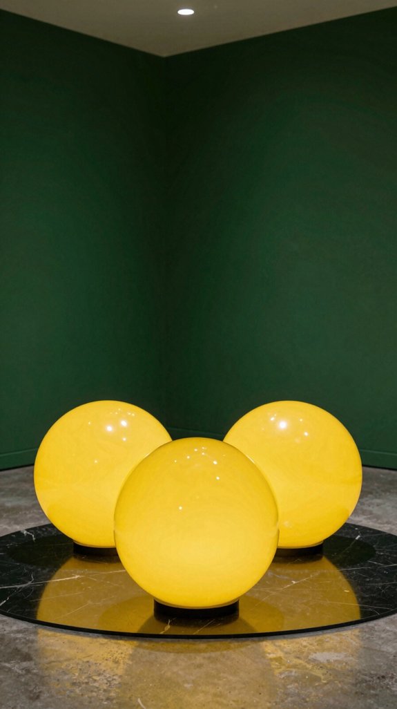
Looking to inject a burst of optimism into a room dominated by deep, earthy green? You can achieve that with strategic yellow pops—think mustard cushions, sun‑lit wall art, or a single chrome‑finished lamp shade. These accents cut through the moody backdrop, creating kinetic energy without overwhelming the space. Pair a matte gold rug with a sleek, angular coffee table to reinforce modernity. Use translucent yellow glass vases to reflect light, adding depth and a tactile sparkle. By limiting yellow to focal points, you preserve the grounding power of dark green while injecting fresh, forward‑thinking vibrancy that feels both bold and balanced. Consider implementing smart cable management solutions behind your furniture to maintain the clean, organized aesthetic that complements this sophisticated color scheme.
Choosing the Right Flooring Color for Dark Green Walls
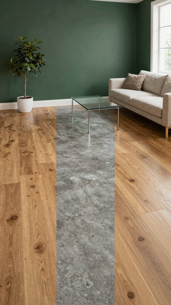
When you pair dark‑green walls with the right flooring hue, you instantly anchor the space while letting the walls breathe. Opt for muted earth tones—warm greige, soft taupe, or charcoal slate—to ground the bold green and create a seamless visual flow. If you crave contrast, a sleek, high‑glossed white or pale ivory floor adds airy freshness without overwhelming the palette. Consider textured finishes: brushed concrete or matte oak introduce subtle depth and tactile intrigue. For a sophisticated modern take, cool industrial style palettes incorporating zinc grey flooring can complement dark green walls while maintaining that contemporary edge. Match the floor’s undertone to accent pieces, ensuring a cohesive, forward‑thinking environment that feels both daring and harmonious.
Selecting Fabrics and Textiles That Echo Your Accent
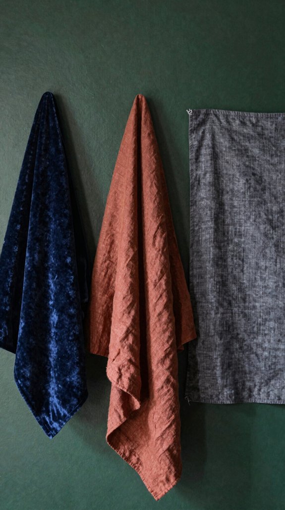
How can you weave textiles that amplify your accent while keeping the room grounded? Choose fabrics that echo the dark‑green hue yet introduce texture contrast. Opt for matte velvet cushions in muted mustard, brushed linen drapes in soft taupe, and woven wool throws with subtle geometric patterns. Pair a sleek leather ottoman in deep charcoal with a silk rug that reflects a faint amber sheen. Layering different weaves creates depth without overwhelming the palette. Consider incorporating indoor privacy panels in complementary fabrics to define spaces while maintaining your cohesive color story. Prioritize sustainable fibers and modular pieces, allowing you to swap colors as trends shift. This curated mix sustains visual harmony while showcasing forward‑thinking design.
How Light Affects Dark‑Green Color Pairings
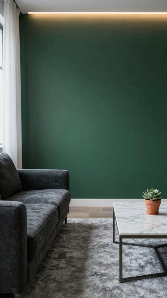
Even a soft cascade of natural light can transform a dark‑green palette from somber to vibrant, revealing hidden undertones that shift the room’s mood. You’ll notice that directional sunlight accentuates the emerald depth, while diffused daylight softens it, creating a mutable backdrop for metallic accents or matte whites. Artificial LEDs with cooler temperature bring a crisp contrast, making teal or mustard pairings pop, whereas warm‑tungsten bulbs amplify the earthy richness, inviting rust or terracotta highlights. By calibrating light intensity and angle, you control how each hue interacts, turning static color schemes into dynamic, trend‑forward experiences that feel both grounded and bold. For those seeking lighter alternatives, pistachio green wall paint offers similarly sophisticated palettes that maintain visual interest while creating more airy, luminous interiors.
Common Mistakes When Pairing Dark Green
Light can turn a dark‑green scheme from muted to striking, but it also reveals the most common pairing pitfalls. You often drown the hue with too many neutrals, letting the green lose its depth. Pairing dark green with overly bright yellows creates visual tension that feels chaotic, not confident. Ignoring texture contrast—using glossy finishes on both sides—flattens the space. You may also match green with clashing undertones, like neon pink, which overwhelms rather than balances. Finally, neglecting proportion, such as a massive green wall against a tiny accent, skews scale and diminishes impact. Choose complementary tones, varied finishes, and measured ratios for a grounded, bold aesthetic.
Quick Reference Cheat Sheet for Dark‑Green Color Combos
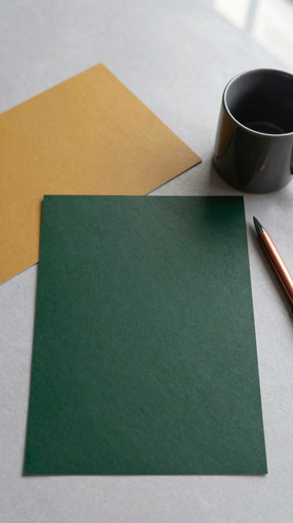
A few key pairings instantly guide you to a confident, grounded look: deep forest green with warm amber, muted terracotta, or brushed gold creates depth without overwhelm; adding crisp ivory or soft dove gray offers contrast while preserving richness; and a subtle pop of matte navy or charcoal balances boldness with subtlety. Use this cheat sheet as your visual toolkit. Pair emerald with blush pink for a fresh, modern vibe; match pine with copper accents for industrial chic; blend sage with teal for a serene, layered feel; combine hunter green with mustard for retro energy. Apply these combos in textiles, accessories, or accent walls to keep your space innovative yet timeless. For those seeking alternative sophistication, charcoal grey walls also create bold dramatic spaces that work beautifully as grounding anchors in modern interiors.
Frequently Asked Questions
Can Dark Green Walls Make a Room Feel Smaller?
Yes, they can shrink a space—studies show 70% of people perceive dark walls as 15% smaller. Pair them with light accents, reflective surfaces, and vertical lines to expand depth while staying bold.
Is It Safe to Paint Over Wallpaper With Dark Green?
Yes, you can safely paint over wallpaper with dark green, just guarantee the paper’s firmly adhered, prime the surface, and choose a high‑quality, low‑odor paint. This preserves texture while delivering bold, grounded elegance.
Do Plants Thrive Better Against Dark Green Walls?
You’ll find plants actually flourish against dark‑green walls—those hues mimic forest canopies, boosting photosynthesis vibes. Yet, don’t expect miracles; proper light, watering, and soil still rule the growth game.
How Does LED Lighting Affect Dark Green Paint?
LED lighting amplifies dark green’s depth, casting a cool, sophisticated glow that feels modern and grounded. You’ll notice richer undertones, sharper contrast with accents, and a vibrant, forward‑thinking ambience that energizes any space.
Can Dark Green Be Used in Kitchens Without Looking Dated?
Like a fresh sprig of rosemary, dark green can energize kitchens without feeling dated—pair it with matte brass, light wood, and crisp white accents for a modern, grounded vibe that stays timeless.



