
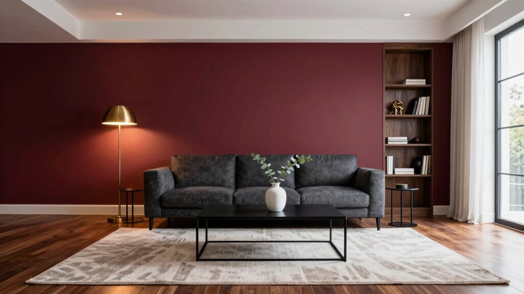
Wine-red walls bring instant drama to a room, especially when paired with crisp white ceilings that lift the space and deep charcoal furniture that adds grounding depth.
Introduce matte black metal accents or brushed copper lighting fixtures for a contemporary touch, while navy or forest-green throw cushions offer contrast and soften the boldness.
Incorporate glossy ivory marble surfaces, like a backsplash or a coffee table, or add a sleek glass console to reflect light and maintain an airy feel.
Continue reading to uncover more ways to balance richness with brightness in your interior scheme.
Why Wine‑Red Creates Drama in Any Room
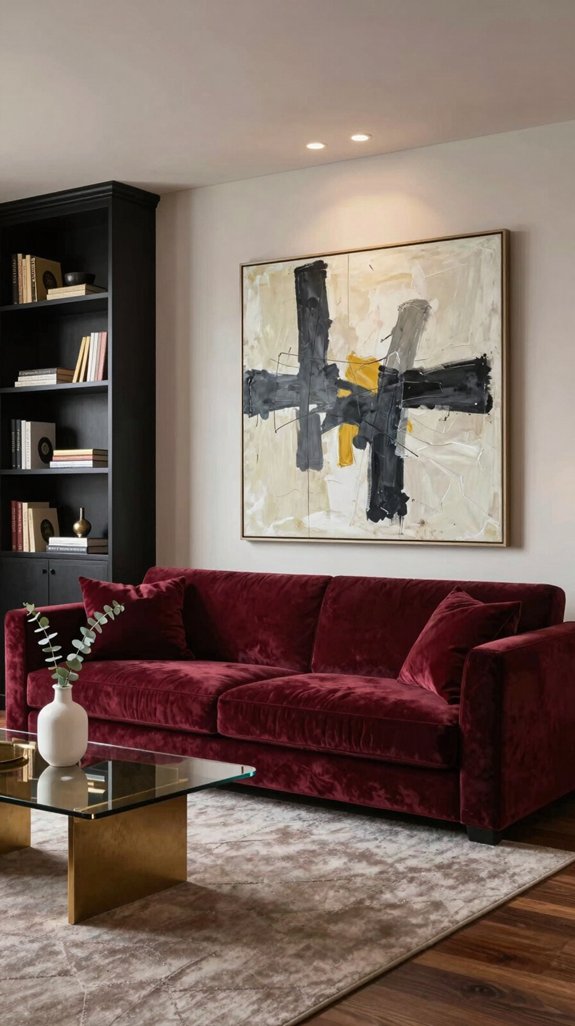
One bold splash of wine‑red instantly transforms a neutral space into a dramatic focal point, capturing attention with quiet intensity. The hue adds depth and warmth, reminiscent of a well-aged vintage, elevating the room’s atmosphere with sophisticated allure. Against light walls or natural wood finishes, wine‑red creates striking contrast, making furniture, architectural details, and artwork stand out with elegance and flair. It serves as a grounding element in a color scheme, allowing soft neutrals, warm greys, or shimmering metallics to complement it without overpowering the senses. When incorporated through accent walls, lush velvet drapes, or statement furniture, wine‑red brings a sense of boldness and refinement that feels both modern and enduring. This rich tone doesn’t just change a room—it deepens the mood, invites intimacy, and turns everyday spaces into something unforgettable. Pairing wine‑red with mustard yellow accents can amplify retro‑mid‑century vibes, adding a lively, complementary pop of color.
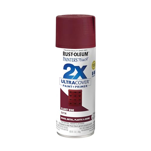
Ideal for use on interior/exterior surfaces including wood, plastic, plaster, metal, masonry and unglazed ceramic

Rich burgundy peonies and soft ivory blossoms are arranged in a rounded ceramic vase with deep green foliage. The warm brown background, layered petals, and classic still-life composition create an elegant, moody botanical atmosphere with refined vintage character.

COLORS CRAFTED BY ANNIE SLOAN: Tyrian Plum is a dramatic, rich, jewel-toned plum with both maroon and red elements. It’s Annie’s homage to the ancient pigment, Tyrian purple (a shade reserved for Roman emperors). This deeply saturated maroon will flatter most spaces and generate an indulgent atmosphere. A regal yet mellow shade, the warmth, ripeness and depth of pigment in Tyrian Plum make it an ideal choice for dining spaces or bedrooms.
How to Pick a Small‑Space Wine‑Red Shade
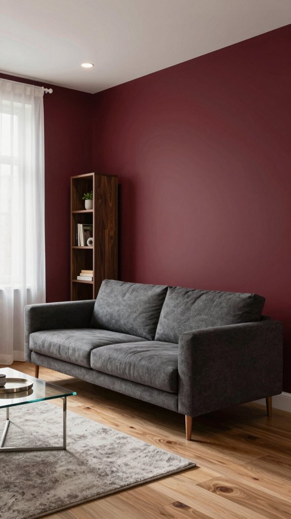
When selecting a wine-red shade for a compact living room, opt for a cooler, muted tone—like a gray-infused burgundy—to introduce rich depth without closing in the space. Test the color with large paint swatches viewed at different times of day, observing how it responds to both natural light and indoor lighting to ensure it maintains a refined, balanced presence. Pair the hue with high-contrast neutrals such as warm ivory or deep charcoal to enhance dimension and prevent visual heaviness. Integrate reflective materials—think matte metallic finishes, glass tabletops, or glossy cabinetry—to amplify light and create a sense of airiness. Apply the wine-red selectively in decorative accents like throw pillows, artwork mats, or a single statement furniture piece, while keeping wall colors light and airy. This layered approach delivers sophistication and bold character while preserving the room’s open, inviting feel. Consider adding a universal smart remote to streamline lighting and shade adjustments.
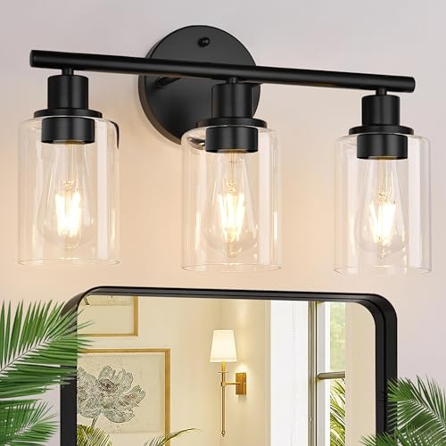
Upgraded Matte Black Finish: The vanity lighting fixtures feature a sleek matte black finish lamp body accompanied by clear glass shades. The upgraded finish not only adds an elegant touch but also includes a scratch and tarnish-resistant coating, ensuring that the black bathroom light maintains its pristine appearance over time. This exquisite bathroom vanity light is suitable for various decoration styles, making it the perfect choice to enhance your home lighting.

Matte Black Finish: Designed with a smooth, matte black finish and clear glass shades, this black vanity light reflects soft light to achieve a refined and warm ambiance. Its scratch-resistant finish ensures the bathroom light fixtures retains its sophisticated look over time
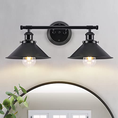
Industrial and Rustic Farmhouse Style Design: 2-light black farmhouse bathroom light fixtures with oil rubbed black baking paint finish lampshade, create a farmhouse look, which is easy to clean and enhances the soft warm glow of this matte black bathroom light fixture. Black farmhouse vanity lights for bathroom provides a modern industrial and rustic style look. An elegant upgrade from standard overhead lights. Ideal for bathroom update/renovation or house flipping
Accent Wall vs. Full‑Room Red: When to Use Each?
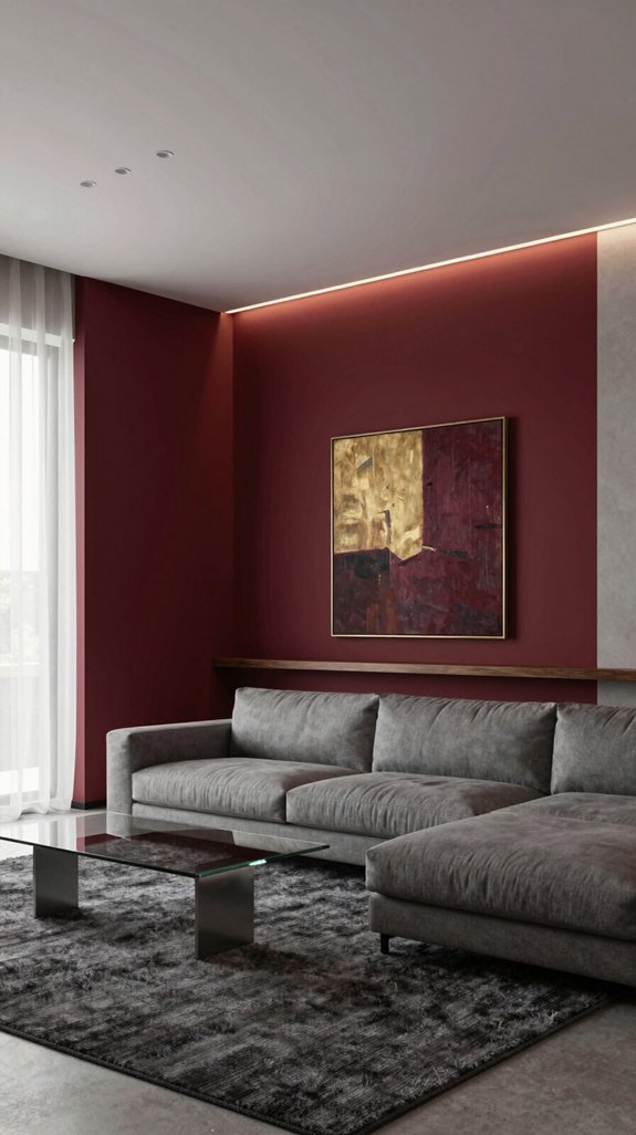
An accent wall in bold wine red adds striking contrast without dominating the space, making it ideal for open-concept living areas where you want to define a focal point while maintaining balance. I recommend pairing it with soft neutrals, matte finishes, and layered lighting to let the color stand out while preserving an airy feel. For a more enveloping effect, painting the entire room red creates a rich, unified ambiance suited to cozy studies, dining nooks, or boutique-inspired interiors where intimacy and warmth are desired. To prevent the space from feeling closed in, opt for satin or high-gloss finishes, incorporate LED cove lighting, and use mirrors or metallic accents to reflect light and enhance the sense of depth.

Authentic Vintage Industrial Ambiance: Crafted with distressed metal and an exposed Edison bulb, this hanging lamp embodies raw, authentic industrial charm. Perfect for creating a nostalgic loft, rustic farmhouse, or urban warehouse vibe in your space

This eye-catching indoor spherical pendant with washed copper finish compliments a wide range of interior decor styles

14.96 Inch Drum Shade: Features a spacious 14.96" wide x 7.48" high metal drum shade with a finely brushed copper bronze finish, providing soft, warm light and premium visual impact for any room
Pairing Wine‑Red With Charcoal for Moody Sophistication
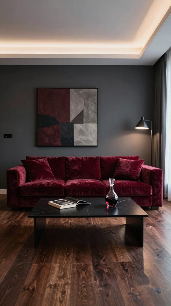
When wine-red meets charcoal, the atmosphere transforms into a sleek, nocturnal sanctuary—deep, dramatic, and intimately inviting. A matte charcoal wall sets the stage, providing a brooding backdrop that lets wine-red emerge with intensity. Introduce the crimson hue through a statement sofa or a plush velvet armchair, its richness catching the light like a subtle pulse in a dimly lit space. Elevate the contrast with metallic finishes: copper lighting, brushed-steel shelves, or matte black fixtures that echo the palette’s modern edge. Layer in charcoal-gray textured rugs to ground the room, while wine-red accent pillows or a woven throw add warmth and balance. This interplay of shadow and depth cultivates moody sophistication—an enduring yet innovative aesthetic that embodies quiet luxury, ideal for interiors that dare to be felt as much as seen. Pair these tones with soft gray‑white paint for a balanced, elegant neutral backdrop.
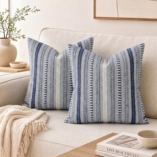
Premium Fabric: Crafted from a high-quality blend of 40% cotton and 60% polyester, this fabric offers a perfect balance of natural softness and enhanced durability. It is wrinkle-resistant, holds its shape well, and is easy to maintain for daily use.

Contains: Brand New 2 PCs Square Covers/Shells 18" X 18"(45 X 45cm), No Insert or Filler, Solid Colored

❤️【Package & Dimensions】Cushion cover only,Single-sided plush,no Cushion Insert. set of 2.
Brightening Wine‑Red With Crisp White
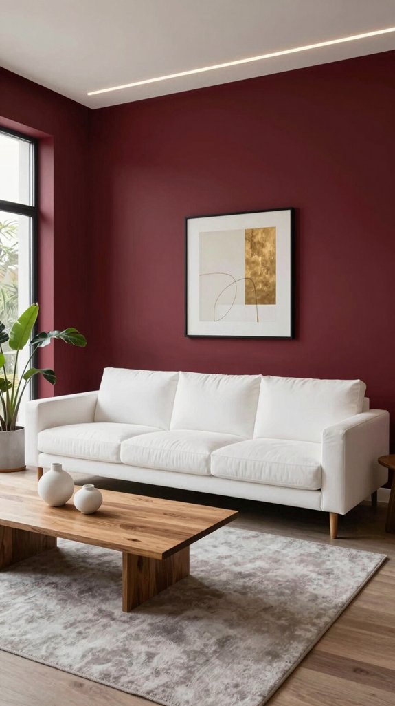
A crisp white backdrop instantly lifts wine-red, transforming a deep, intimate hue into a fresh, airy statement. Sleek white walls paired with a wine-red sofa allow light to reflect off its glossy surface, energizing the space. A white marble countertop beneath a wine-red backsplash creates a dynamic visual rhythm that feels modern and bold. White accessories—vases, lamps, throws—add punctuation without softening the impact. The contrast enhances definition, making furniture feel lighter and rooms appear more open. Matte white ceilings amplify the drama, allowing a wine-red ceiling to emerge as a striking focal point. This interplay of bright white and sumptuous red reimagines elegance, delivering a bold, contemporary aesthetic rooted in balance and contrast.

[SCULPTURAL MODERNITY]: This coffee table features a unique design with graceful sculptural lines and beautiful natural faux marble accents. Its innovative double-pillar construction and T-shaped base combine artful craftsmanship with exceptional stability, creating a striking balance of form and function.

Robust and Durable---Elegant living room furniture, this industrial wood classic circle coffee table is made of high-grade 16MM thickened MDF Board and metal legs 25MM durable powder-coated iron pipe with rust-resistant effect for long-lasting use. This modern coffee table is suitable for the living room and can match any decor in your house.

Soft Ivory Accents for Wine‑Red Warmth
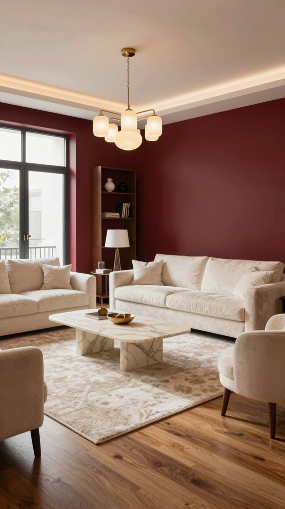
Introducing soft ivory accents into a wine‑red room enhances the warmth while subtly brightening the space. Ivory‑toned silk cushions paired with a plush velvet sofa allow the gentle glow to harmonize with the deep red, softening its intensity without diminishing its richness. A carved ivory sideboard, with clean, modern lines, serves as a grounding element and introduces a refined textural contrast. Sheer ivory curtains layer over windows, diffusing natural light and casting a delicate luminous veil that helps the wine‑red walls feel more airy and balanced. Placing an ivory marble vase on a reclaimed‑wood coffee table creates a serene focal point, blending elegance with earthy warmth. These thoughtful, luminous accents cultivate a harmonious environment where boldness and tranquility coexist in sophisticated style.

This product is Non-toxic
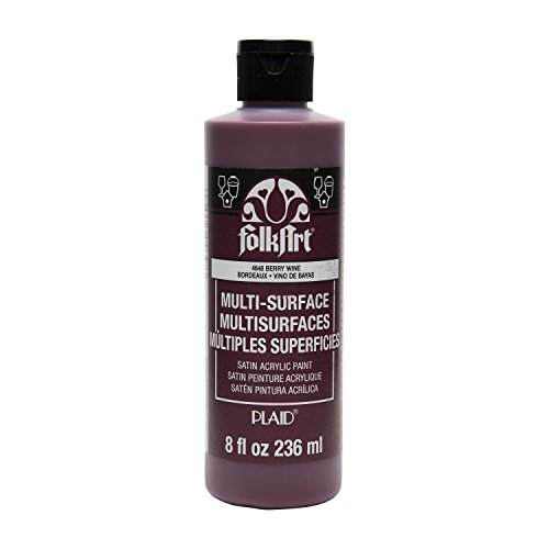
PERFECT SIZE & BRILLIANT COLORS - This line of vibrant, multi-surface acrylic paint is the perfect addition to any collection of art supplies! This craft paint comes in a 8 oz bottle

This round wall art features a classic vintage-inspired design that adds warmth and character to your space. The soft tones and elegant composition create a cozy and stylish atmosphere.
Metallic Gold Accents for a Luxe Red Palette
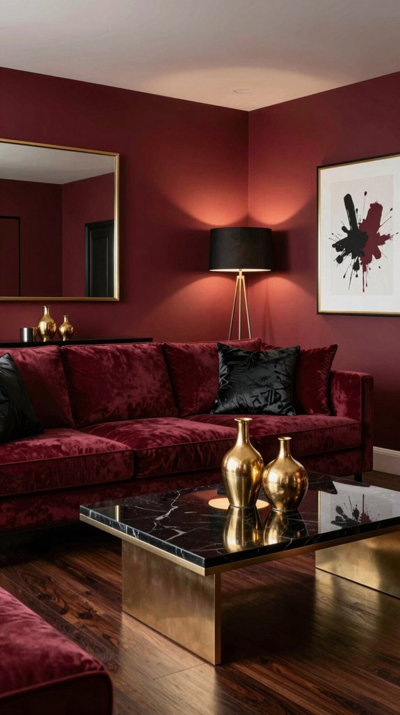
Even a hint of metallic gold can transform a wine-red room into a luxe sanctuary, instantly adding sparkle without diminishing the richness of the hue. A brushed-gold chandelier casts a warm, reflective glow across deep-toned walls, creating a visual rhythm that feels both contemporary and opulent. Gold-leafed picture frames paired with velvet-upholstered furniture introduce a refined tactile contrast—elegant yet enduring. Gold-tone hardware on cabinetry and drawers adds subtle gleam, accentuating details without overpowering the space. A matte gold mirror enhances natural light, opening up corners and lending an airy sophistication. Strategically placed, these metallic accents amplify the depth of wine red, resulting in a palette that’s bold, balanced, and rich with character. Mirrors can also serve as a space‑expanding tool by reflecting light and creating the illusion of a larger area.

【PREMIUM MATERIAL and MODERN DESIGN 】The vanity lights for mirror are built in sturdy metal black base and lamp body, with clear glass shades, create a modern warm to your home lighting. The shade makes the lamp base dust and water resistant, so it is also suitable for wet places such as bathroom lights over mirror, laundry rooms.

Upgraded Matte Black Finish: The vanity lighting fixtures feature a sleek matte black finish lamp body accompanied by clear glass shades. The upgraded finish not only adds an elegant touch but also includes a scratch and tarnish-resistant coating, ensuring that the black bathroom light maintains its pristine appearance over time. This exquisite bathroom vanity light is suitable for various decoration styles, making it the perfect choice to enhance your home lighting.
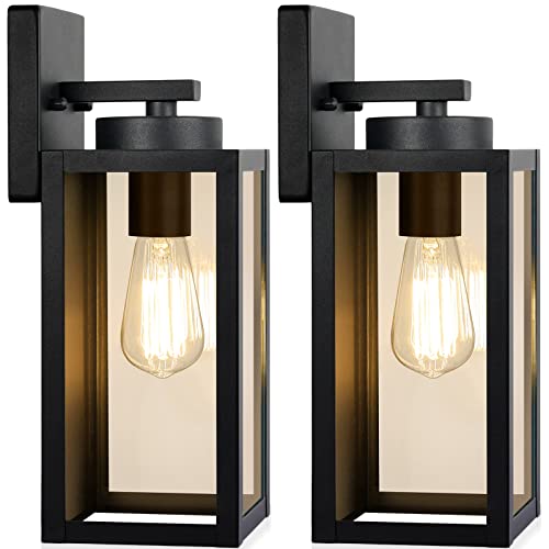
Weather-Resistant Outdoor Wall Lanterns: Constructed with a sturdy metal frame and thickened glass panel, this outdoor wall sconce is waterproof and built to withstand sun, rain, snow, and ice. The high-quality metal helps prevent rust and corrosion, making it suitable for long-term outdoor use.
Copper Details That Warm Wine‑Red Walls
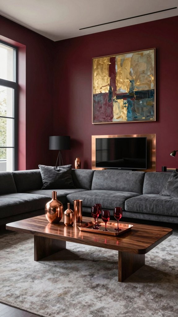
When copper fixtures are layered into a wine‑red room, the warm metallic sheen softens the depth of the walls while enhancing their richness. Brushed copper light fixtures amplify the space’s intimate tone, their amber glow blending seamlessly with the deep red backdrop. A copper‑finished coffee table acts as a tactile centerpiece, its evolving patina capturing shifts in natural and ambient light. Copper‑tone picture frames add rhythm and dimension, each edge gleaming subtly to guide the eye. Even a polished copper faucet in a powder room introduces a touch of quiet luxury, elevating the space into a refined retreat. Paired with matte black accents, the copper elements create a striking yet harmonious contrast—sophisticated, grounded, and inherently inviting—transforming interiors into thoughtfully curated environments. The bold wine‑red hue can be complemented by deep burgundy wall choices that intensify the dramatic effect.

One-light mini pendant light with hand blown clear textured glass shade and washed copper finish adds understated elegance to any room

One-light Mini Pendant with hand blown clear seeded glass shade and Washed Copper finish adds retro style

Industrial&Vintage Design: This copper pendant light is crafted from natural iron ore melted at an ultra-high temperature, this retro dome pendant light features a rusty color finish, is free from impurities, Surface baking paint undergoes a dust-free constant temperature process, ensuring a pure, crack-free, and durable color.
Matte Black Elements for Modern Contrast
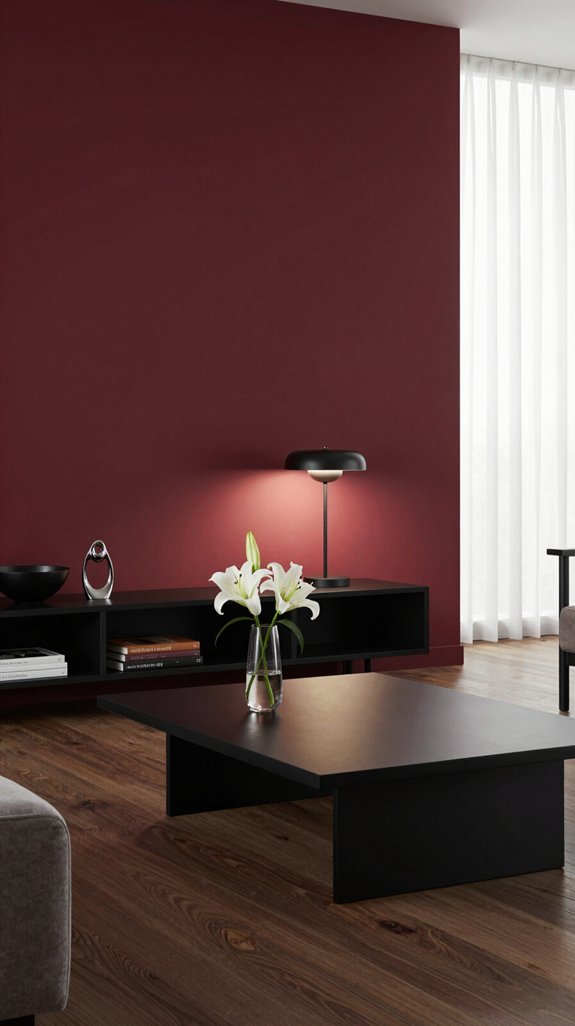
I love how the copper accents soften the wine-red walls, but introducing matte black elements adds a sharp, contemporary contrast. Sleek black metal frames paired with glass shelving allow the deep red to shine through, while the dark outlines create striking visual tension. A matte black console positioned beneath a wine-red accent wall grounds the space, its non-reflective finish absorbing light and highlighting the room’s layered textures. I incorporate matte black drawer pulls and lamp bases for subtle industrial appeal—minimal, modern touches that enhance without dominating. The interplay between warm richness and cool precision feels deliberate, a balanced dialogue that draws the eye across the room. By using matte black in intentional accents, the boldness of wine red evolves into a sophisticated, current, and visually dynamic interior.

Elegant Handmade 3D Flower Home Decorative Throw Pillow Cover: Unique, Cute and Stylish; Gorgeous Flower Throw Pillow Cover for Father's Day, Autumn, Fall, Sofa, Couch, Bed, Lounge, Salon, Farmhouse, Furniture, Guest Room, Bedroom, Hallway, Floor, Bedspread, Living Room, Nursery, Porch, Loveseat, Birthday, Holiday, Window Chair, Family, Home Office, Add Pop Color and Texture to Everyday Home Decor

Package Info: 2 pcs pillow covers (NO INSERT).Perfectly fit for the same size pillow insert. Please Note: Hidden zipper is well disguised and stitched in across one side.

Fabric and Packaging: Pack of 2 (Pillow Inserts are not included), cotton and linen blend fabric, this pillowcase is handcrafted from high-quality thick fabric, featuring a unique texture and natural touch, breathable, durable, and resistant to deformation, providing a comfortable support for the body
Navy Blue Highlights That Add Coastal Calm
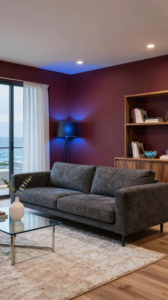
If you introduce navy blue into a wine-red color scheme, the room instantly evokes the calm of a coastal shoreline at twilight. I layer navy through decorative cushions, lamp shades, and a bold area rug, allowing the deep tone to reflect the ocean’s depths while the wine-colored walls maintain their rich, dramatic presence. The interplay between the two creates a soothing visual rhythm—like tides receding toward a quiet horizon—while still preserving a sense of boldness and depth. I play with matte textures and soft sheens, letting light travel across surfaces like waves brushing the sand. By weaving navy into unexpected details—such as painted door frames, the backs of open shelving, or a translucent glass vase—I infuse the space with a refined coastal tranquility that balances energy and relaxation, resulting in a room that feels both vibrant and peacefully grounded.

【Faux Marble & Gold】This marble coffee table features a wood-based top with a realistic marble finish—elegant, lightweight, and zero maintenance. The strong metal legs (Asterisk-like or inverted-triangle design) ensure lasting stability. The sealed surface resists water, stains, and fingerprints—just wipe clean with a damp cloth.
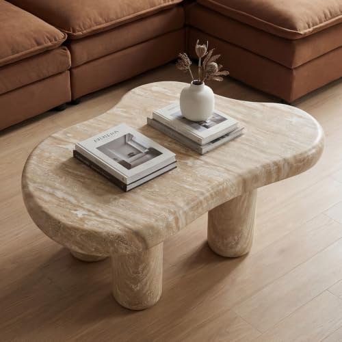
Sculptural Centerpiece: Elevate your living room with our Cloud Coffee Table, featuring a stunning cloud shape and 360° sculpted angles, measuring 39 inches long and 27 inches wide. This captivating piece acts as a perfect conversation starter and pairs beautifully with our ottoman coffee table.

MODERN MONOLITHIC DESIGN: Crafted with an elegant grey faux marble finish and a clean rectangular block silhouette, this mid century modern coffee table brings a sleek, art-gallery aesthetic to modern, minimalist, and contemporary living spaces.
Forest Green Touches for Earthy Balance
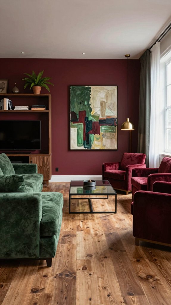
Even though the wine-red walls dominate the space, a touch of forest green instantly grounds the intensity, bringing an earthy balance that feels both lively and serene. I introduce a deep green accent wall behind the console, allowing the shade to mirror the lush canopy of a woodland while the red evokes the warmth of morning light filtering through trees. A reclaimed-wood coffee table finished with a soft green wash bridges the palette, complemented by emerald-glazed ceramics displayed on open shelving for a subtle infusion of nature. A low-slung sofa in a matte forest green fabric anchors the seating area, absorbing ambient light to create a soothing focal point amidst the bold surroundings. Integrated living elements—such as hanging ferns and clusters of succulents in textured planters—enhance the organic rhythm, transforming the room into a grounded, contemporary sanctuary. Emerald green tones can also be used in decorative accessories to reinforce the jewel‑tone aesthetic.
Which Fabrics Best Pair With Wine‑Red Walls?
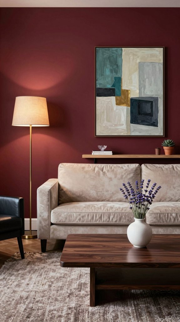
When pairing fabrics with wine-red walls, focus on textures that temper the hue’s drama while enhancing its depth. Velvet in deep charcoal or midnight blue absorbs light, adding luxurious contrast that feels bold yet balanced. Silk in ivory or soft gold introduces a refined sheen, reflecting light to brighten the space without diminishing the richness of the walls. For a contemporary touch, structured boucle in muted taupe offers tactile dimension and a hint of modern edge. Lightly brushed linen in cool gray provides understated texture, maintaining neutrality while ensuring the room feels open and harmonious. Together, these fabrics create a layered, intentional interior where warmth and sophistication coexist. Consider using a cable concealment box to keep power strips and cords out of sight while preserving the room’s aesthetic.
How to Light Wine‑Red Rooms Without Gloom?
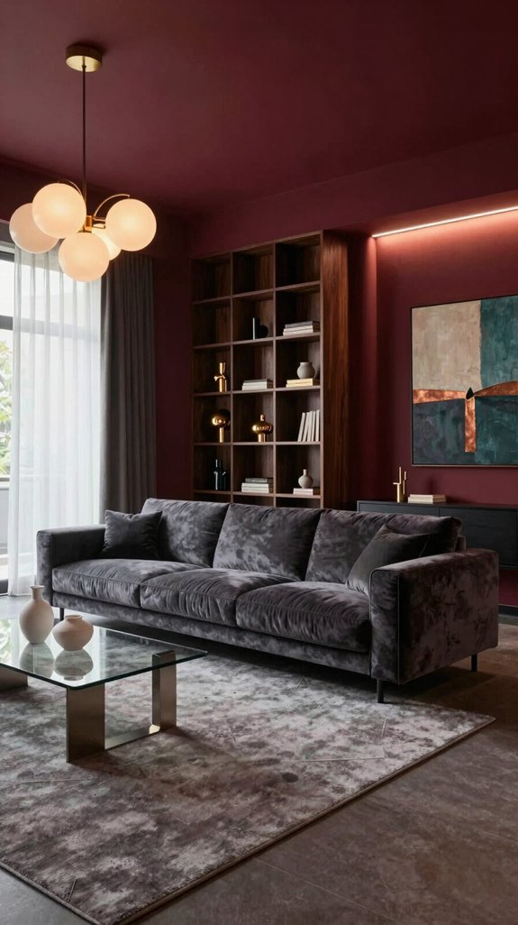
Wine-red walls have a rich, enveloping quality that can absorb light, so effective illumination requires thoughtful layering. Begin with a warm-toned overhead fixture, like a dimmable pendant with amber glass, to softly diffuse light while preserving the color’s intensity. Introduce a sleek floor lamp—preferably a tripod design with a brushed-metal shade—to deliver focused brightness without creating harsh contrasts. Integrate programmable LED strips behind crown molding or beneath shelves to add a cool, adjustable glow that emphasizes architectural details and adds visual depth. Balance the lighting temperatures by combining 2700 K warm sources with 3500 K neutral tones, ensuring the room feels dynamic rather than flat. Maximize light dispersion by placing fixtures near reflective surfaces such as mirrors, glass-top tables, or high-gloss finishes, allowing the light to bounce around the space. This layered strategy enhances the drama of wine-red walls while keeping the room inviting and luminous. Consider using a cable organizer to keep power cords tidy and prevent accidental unplugging.
Flooring Options That Anchor a Wine‑Red Interior
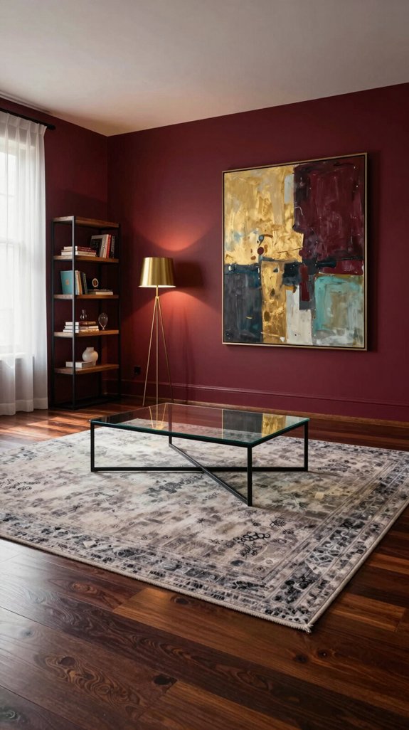
To ground wine-red walls and prevent them from feeling suspended, choose a floor that offers both contrast and harmony with the rich tone. Matte charcoal porcelain tiles provide a modern foundation, their soft, non-reflective surface absorbing light and allowing the red to stand out without visual competition. Wide-plank reclaimed oak finished in a weathered gray brings natural warmth and texture, subtly echoing the earthy undertones in the wine-red hue. For a bolder approach, consider a herringbone pattern in brushed brass-finished concrete—its structured geometry and subtle metallic sheen enhance the room’s drama while maintaining elegance. Alternatively, a high-gloss black epoxy floor can serve as a striking base, reflecting ambient light to add depth and a sleek, contemporary finish. The goal is to create balance: a flooring choice that stabilizes the space, deepens the atmosphere, and complements modern sophistication. Lilac wall paints can be paired with these flooring options to introduce a soft pastel contrast that softens the drama while maintaining a cohesive aesthetic.
Window Treatments That Tie Red to Neutrals or Metals
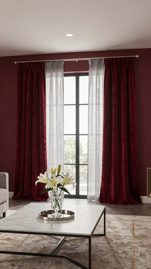
To anchor wine-red walls without overwhelming the space, opt for crisp, sheer window panels that allow natural light to diffuse softly through the room. Pair them with sleek metal curtain rods or brushed-brass finials to introduce a refined, industrial contrast that tempers the warmth of the red. Layer a narrow blackout shade in a neutral tone—like beige or dove gray—beneath the sheers to provide privacy and depth at night, while maintaining daytime brightness. Add visual interest with a subtle taupe or gray valance for texture and dimension. Finish with a slim silver-tinted roller blind for a clean, modern profile. Combining translucent fabrics with lustrous metal accents creates a balanced, sophisticated window treatment that grounds bold color with contemporary elegance. Consider integrating corner-optimized shelving to make the most of adjacent nook spaces while maintaining a cohesive design flow.
Art & Décor That Amplify Drama in a Red Room
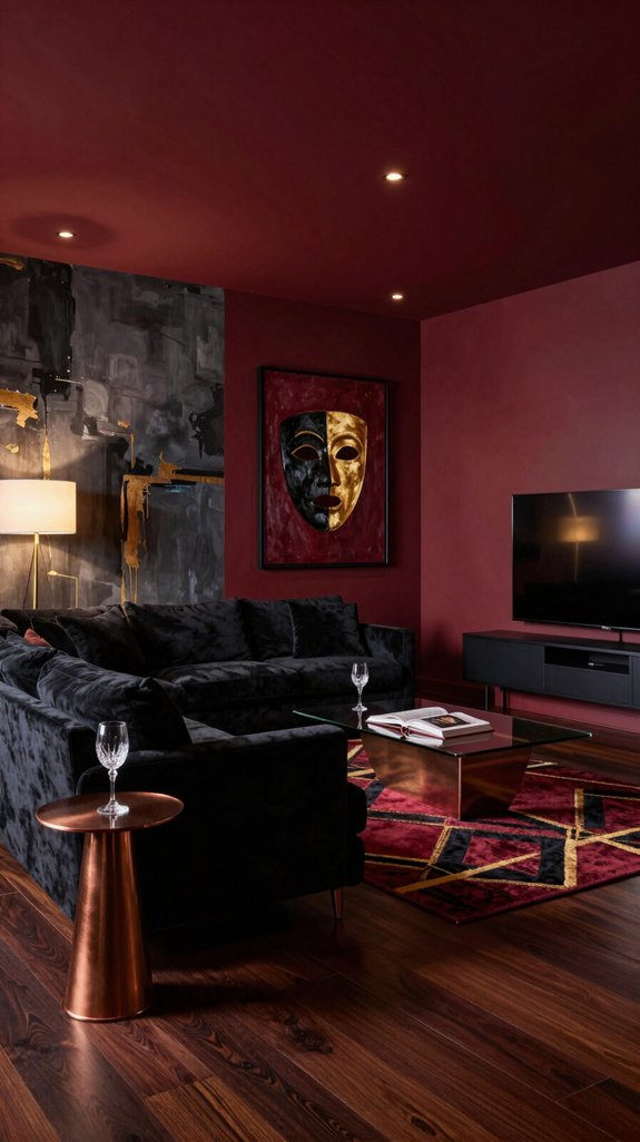
When I step into a wine-red room, I let the walls serve as a bold backdrop for art that commands attention, selecting pieces with high contrast and rich textures to heighten the drama. Oversized abstract canvases in metallic gold or electric teal catch the light, their luster reflecting off the deep red and creating dynamic visual energy. Sculptural ceramics in matte black or brushed copper introduce a tactile dimension, their forms adding depth and contrast. A single, large mirror with a beveled frame amplifies both light and intensity, expanding the room’s presence. Layered beneath, patterned rugs—geometric designs in ivory and charcoal—break up the red floor plane without dulling its impact. Anchoring the space, a striking chandelier of smoked glass and brushed brass casts a fractured glow, slicing through the richness of the walls and transforming the room into a captivating, gallery-like tableau. Integrating a smart lighting hub can further enhance the dramatic effect by allowing precise control of color temperature and intensity.
Keeping Red Walls Fresh Over Time
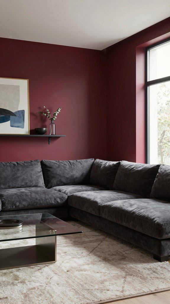
Even after the initial impact wears off, a wine-red wall can begin to feel dull without proper care. To keep the color vibrant, I refresh the space quarterly by rotating accent textiles like patterned throw pillows, woven blankets, or textured area rugs—introducing visual interest without repainting. I originally painted the walls with a matte, low-sheen finish enhanced with nano-ceramic technology, which resists UV fading and repels smudges. Every six weeks, I gently clean the surface with a microfiber cloth and pH-balanced cleaner, then reapply a clear, breathable sealant to protect the paint while allowing the wall to breathe. To maintain the mood, I use dimmable warm-tone LED lighting that enhances the richness of the red in the evening, eliminating harsh glare and preserving the room’s dramatic ambiance.
Budget Red Accents Without Repainting
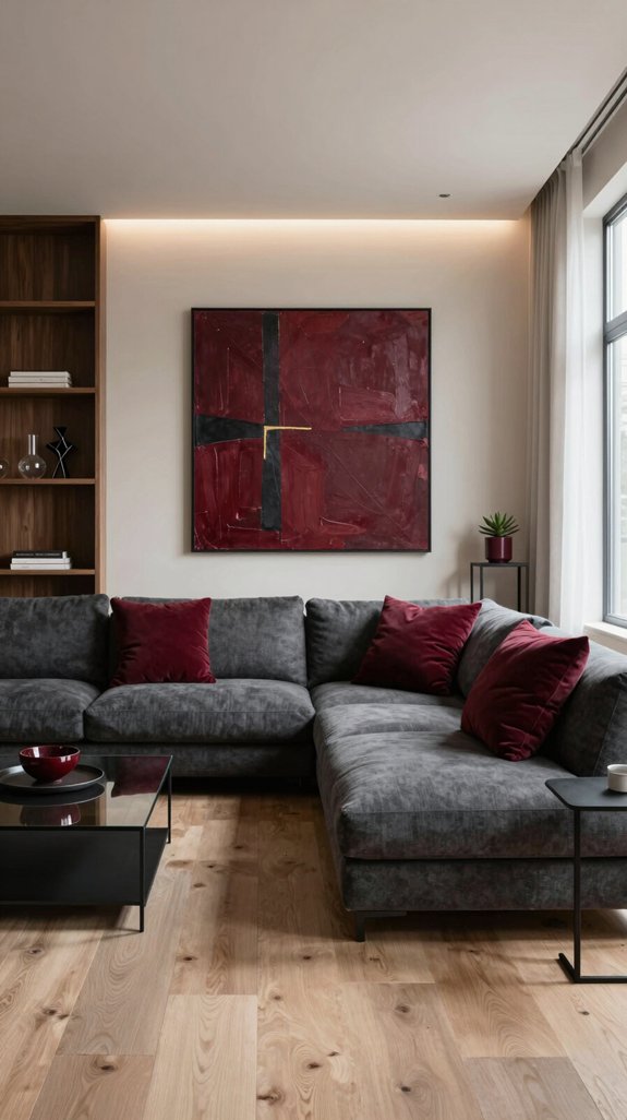
Ever wondered how to keep that wine‑red vibe alive without splurging on a fresh coat? I’ve transformed my living room into a bold statement using affordable, high‑impact accents. A plush velvet throw in deep burgundy draped over a neutral sofa adds instant texture and richness. I replaced old lamp shades with matte black metal ones, then applied a slim, removable glossy ruby vinyl strip to the edge of the bookshelf for a sleek pop of color. Wine‑red cushions are scattered for cohesion, while a reclaimed wood coffee table, updated with a matte black spray paint, grounds the space. Copper‑toned picture frames add warmth and polish. Each update cost under $50, delivering the striking effect of a full repaint—without the commitment or cost. Red wall paint can also be simulated with removable décor, offering flexibility for future redesigns.
Common Mistakes With Wine‑Red Design & How to Fix Them?
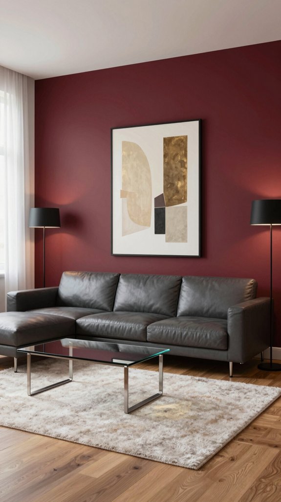
Wine-red walls can overwhelm a space when not balanced with complementary elements. To prevent the color from dominating, pair it with cool neutrals like soft gray, crisp white, or muted teal—these tones create contrast and visual relief. Poor lighting is another common issue; harsh overheads can make red interiors feel heavy or closed-in. Instead, use layered lighting with dimmable wall sconces, warm-toned pendant fixtures, and discreet LED strips to soften the ambiance and highlight the richness of the hue. In smaller rooms, large expanses of red can distort proportions and make the space feel cramped. Counter this by introducing vertical patterns, textured wallpapers, or glossy surfaces like mirrored consoles and metallic accents that reflect light and break up solid color blocks. Lastly, avoid a flat or monotonous look by incorporating varied materials—think linen upholstery, leather side chairs, or brushed brass lamps. These textures add dimension and ensure the room feels dynamic and inviting, not stifling.
Frequently Asked Questions
How Does Wine‑Red Affect a Room’s Perceived Temperature?
Wine-red adds warmth to a room, enhancing the sense of coziness and intimacy. Its rich, deep tone absorbs natural and artificial light, creating a snug ambiance that makes cooler spaces feel more inviting and energetically vibrant.
Can Wine‑Red Walls Improve Acoustics in Home Theaters?
Wine-red walls may not transform your home theater’s acoustics on their own, but their rich, textured finish helps reduce sound reflections, lending a warmer, more enveloping auditory experience. For a truly refined space, combine the deep hue with strategically placed acoustic panels to balance aesthetics and performance, creating a visually striking and sonically soothing environment.
What Plants Thrive Best Against Wine‑Red Interior Paint?
Snake plants, succulents like jade or aloe, deep-green ferns, and bold ZZ plants thrive against wine-red walls, offering rich texture, modern contrast, and effortless care.
Are There Specific Cleaning Products for Wine‑Red Textured Walls?
“Less is more” when caring for wine-red textured walls. Stick to pH-balanced, non-abrasive cleaners and a soft microfiber mop to protect the rich, dimensional finish. Avoid harsh chemicals that can dull or strip the color, ensuring the wall’s depth and texture remain vibrant and intact.
Do Wine‑Red Interiors Influence Energy‑Efficiency Ratings?
Wine-red interiors won’t change a home’s official energy-efficiency rating, but the rich, deep tone can absorb more heat than lighter colors, especially in sunlit rooms. This increased heat absorption may lead to higher cooling demands during warmer months, subtly impacting your home’s overall energy performance. Balancing wine-red walls with reflective flooring or lighter accent elements can help manage temperature while maintaining the cozy, sophisticated ambiance this color brings to living spaces, bedrooms, or dining areas.



