
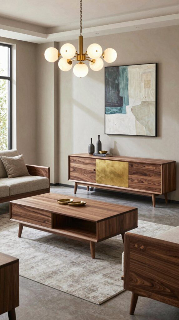
Pair walnut furniture with warm neutrals like dove gray, soft greige, or muted taupe to let its honey‑rich grain breathe, then add jewel‑tone accents—emerald, navy, or blush pink—in cushions, rugs, or art for subtle drama. Choose a low‑pile geometric rug that mirrors the wall hue and incorporates walnut‑colored strands for depth. Ground the space with brass or brushed gold hardware and layered warm‑tone lighting to highlight the wood’s luster. Keep accent colors under 30 % of the visual field, and you’ll discover how to refine the look further.
Warm Neutrals vs. Jewel Tones for Walnut
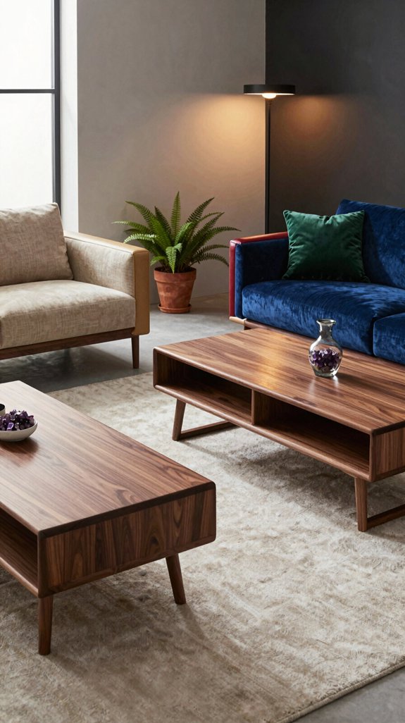
When you pair walnut’s deep, honey‑rich grain with warm neutrals, the space feels grounded and inviting, while jewel‑tone accents inject drama and modern flair. You’ll notice that beige, taupe, or soft gray let the wood’s natural warmth breathe, creating a serene backdrop for sleek furniture. In contrast, sapphire, emerald, or ruby amplify depth, turning the room into a bold statement. Like botanical inspiration for interiors, these jewel tones draw from nature’s richest color palettes to create spaces that feel both sophisticated and alive. Balance is key: anchor jewel tones with muted accessories, or let neutrals pop with a single saturated throw. This duality lets you shift from calm sophistication to vibrant edge, satisfying both classic comfort and avant‑garde ambition.

SOFTNESS & COMFORT: Step into cloud-like comfort with our 8x10 area rugs—unlike thin, mat-like competitors, ours are crafted from ultra-soft microfiber for a soft, cushioned feel underfoot. Perfect as bedroom rugs or cozy additions to high-traffic spaces, these soft, sumptuous rugs elevate everyday living while complementing family life

[OEKO Safe & Non-Slip Underfoot] OEKO-TEX certified stain-resistant faux wool with soft padded interlayer for cozy underfoot feel. Thick TPR rubber backing grips tile, hardwood and laminate floors firmly to prevent sliding and shifting indoors.

Effortless Maintenance & Machine Washable: This durable 3x5 area rug is designed for high-traffic spaces like entryway, kitchen and bedroom beside bed. Easily refresh with regular vacuuming or machine wash for deep cleaning—stays vibrant through everyday use
Pick a Wall Color That Complements Walnut
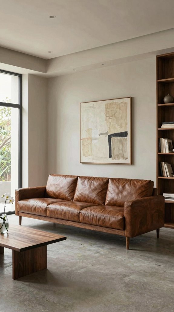
Looking for a wall hue that lets walnut shine without drowning it? Choose a muted charcoal or deep slate to frame the wood’s rich grain while keeping the room airy. If you crave contrast, a crisp, cool mint or sage adds a fresh pop without clashing. For avant‑garde vibes, experiment with a soft metallic pewter that reflects light and accentuates walnut’s natural luster. Pair these shades with subtle matte finishes to avoid glare, and let the furniture remain the focal point. The key is balance: a sophisticated backdrop that highlights walnut’s elegance while embracing contemporary color trends. Among top modern grey shades, soft metallics and deep slates have emerged as particularly effective choices for creating refined spaces that complement rich wood tones.

You Will Receive: 2 pcs brass walnut cabinet handles.

PRODUCT PARAMETERS : Length: 4.7Inch(120mm), Height: 1.3Inch(33mm),Holes Center to Center:3-3/4Inch, Weight: Ca. 2.65 oz/piece

Measurement: Overall Length:140mm(5.51inch) Diameter:18mm(0.71inch) Projection:37mm(1.46inch)
Pair Dove Gray Walls With Walnut Furniture
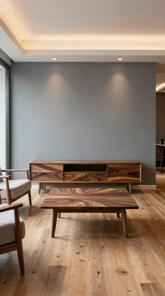
If you pair dove‑gray walls with walnut furniture, the soft, muted blue‑gray backdrop instantly highlights the wood’s warm, rich tones while keeping the space feeling airy and modern. You’ll notice the contrast sharpening without overwhelming, creating a sophisticated yet relaxed vibe. Choose sleek walnut pieces—think low‑profile sofas, streamlined dining tables, or floating shelves—to amplify the minimalist aesthetic. Floating shelves for minimalist wall storage offer an excellent way to maintain clean lines while displaying curated décor. Add subtle metallic accents, like brushed brass or matte black fixtures, to reinforce the contemporary edge. The overall palette feels balanced, allowing natural light to bounce off the gray while the walnut absorbs and diffuses it, delivering an innovative, harmonious environment.

Inspired by Timeworn Stonework: Layers of weathered walnut brown, smoky taupe, and faded stone beige, grounded by subtle charcoal undertones, recall aged masonry and worn courtyard tiles. Framed borders, geometric medallions, and distressed angular motifs create a collected vintage look with quiet depth, fitting naturally into Warm Transitional, Modern Rustic, and Modern Farmhouse interiors

Modern Geometric Area Rug: The living room rug features a colorful geometric pattern, creating a novel, unique, and highly fashionable look. These area rugs 8x10 perfectly complement modern interior design styles and help visually expand the space, making the room appear more open and bright

Machine Washable & Easy Care for Long, Busy Spaces: Designed for long, high-traffic areas, this washable runner helps collect everyday dust, dirt, crumbs, and pet debris along hallways and walkways. Place it in a long hallway, galley kitchen, entryway, laundry room, or bathroom for practical everyday coverage. Vacuum for routine upkeep or machine wash separately in cold water when a deeper clean is needed
Choose Rugs That Match Dove Gray & Walnut
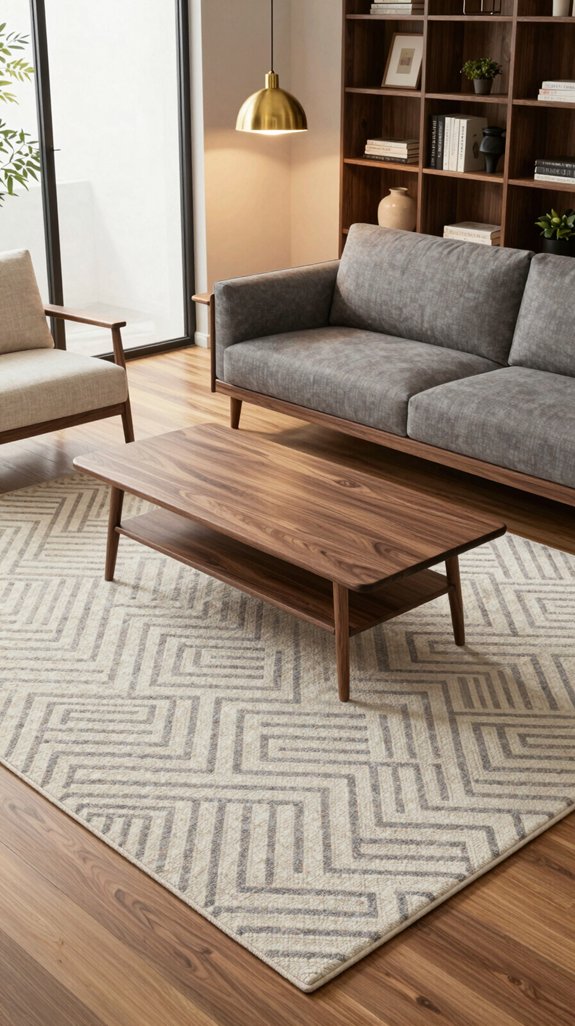
The dove‑gray backdrop and walnut furniture already set a sleek, modern stage, so the rug should anchor the space while echoing those tones. Choose a low‑pile, geometric‑patterned rug in muted dove with subtle walnut‑hued accents; the texture adds depth without competing. Opt for a natural fiber like jute or wool, dyed to match the wall’s cool undertone, then weave in thin, warm walnut strips for continuity. Keep the rug’s scale proportional to the seating area—large enough to define zones, but not overpowering. When selecting your rug, consider size, material, and design as these factors work together to create visual harmony in your space. This balanced approach reinforces the minimalist aesthetic while delivering a fresh, forward‑thinking vibe.

Neutral Vintage Rug: This area rug features a trendy retro design adorned with floral pattern. Its unique tones blend perfectly with your home decor. Its unique texture and patterns add a layer of sophistication and comfort to any room

Vintage-Style Area Rug for Living Room and More: The Louisa Collection is a vintage-inspired area rug with traditional motifs in calm colorways; beautifully designed by Chris Loves Julia x Loloi.
Vintage-Style Area Rug for Living Room and More: The Louisa Collection is a vintage-inspired area rug with traditional motifs in calm colorways; beautifully designed by Chris Loves Julia x Loloi.
Add Warm Taupe Accents to Highlight Walnut Grain
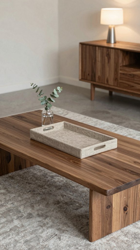
Why not let warm taupe accents breathe life into your walnut grain? Pair a taupe‑hued throw pillow with a walnut sofa, and the subtle earth tone amplifies the wood’s natural ripples. Choose a matte taupe lacquer for side tables; its soft sheen contrasts the walnut’s glossy depth without overwhelming it. Install a taupe‑tinted lighting fixture to cast a gentle glow that highlights the grain’s intricate patterns. Incorporate taupe‑woven baskets for storage, adding texture while maintaining a cohesive palette. For additional seating that complements your walnut furniture, consider comfortable bean bags that offer both style and functionality to your space. These strategic accents keep the space modern, balanced, and unmistakably sophisticated.

You Will Receive: 2 pcs brass walnut cabinet handles.

Premium Material - Our gold cabinet knobs are made of high quality stainless steel, hollow but sturdy and look beautiful and serve your purposes
Measurement: Overall Length:120mm(4.72inch) Diameter:18mm(0.71inch) Projection:37mm(1.46inch)
Use Soft Beige Highlights to Emphasize Walnut
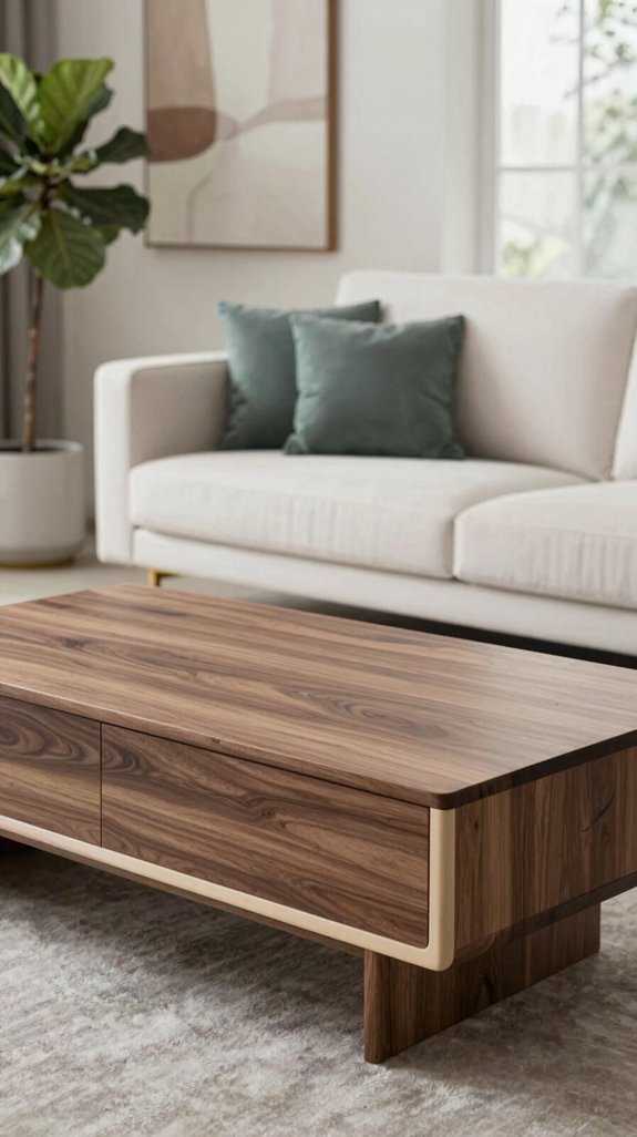
Warm taupe set the stage, now let soft beige take the spotlight. You’ll layer subtle beige accents over walnut surfaces, letting the light‑reflective hue soften the wood’s depth while preserving its rich grain. Choose matte beige upholstery, brushed‑metal hardware, or low‑gloss wall panels to create a seamless visual bridge. The gentle contrast highlights walnut’s natural warmth without overwhelming it, delivering a modern, balanced aesthetic. Pair beige with sleek lines and minimal décor to keep the focus on texture. Strategic table mats can anchor your walnut furniture while introducing additional beige tones that enhance both the visual composition and practical functionality of your space. This restrained palette feels fresh, sophisticated, and instantly adaptable to innovative interior concepts.

Inspired by Timeworn Stonework: Layers of weathered walnut brown, smoky taupe, and faded stone beige, grounded by subtle charcoal undertones, recall aged masonry and worn courtyard tiles. Framed borders, geometric medallions, and distressed angular motifs create a collected vintage look with quiet depth, fitting naturally into Warm Transitional, Modern Rustic, and Modern Farmhouse interiors

Inspired by Timeworn Stonework: Layers of weathered walnut brown, smoky taupe, and faded stone beige, grounded by subtle charcoal undertones, recall aged masonry and worn courtyard tiles. Framed borders, geometric medallions, and distressed angular motifs create a collected vintage look with quiet depth, fitting naturally into Warm Transitional, Modern Rustic, and Modern Farmhouse interiors

Modern Geometric Washable Area Rug: Featuring warm neutral tones and an abstract geometric pattern, this modern indoor area rug creates a cozy and stylish atmosphere for any space. The versatile design blends easily with modern farmhouse, boho, minimalist, Scandinavian, and contemporary home decor. Perfect as a living room rug, bedroom rug, dining room rug, office rug, or entryway rug, it adds warmth, texture, and visual balance without overwhelming your space.
Introduce Emerald Green for a Luxe Walnut Contrast
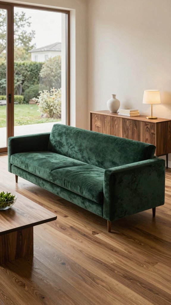
Ever wondered how a burst of emerald green can transform walnut’s deep, earthy tones into a luxe statement? You pair a rich emerald accent wall or a sleek sofa with walnut coffee tables, and the contrast instantly feels upscale. Emerald’s cool vibrancy highlights walnut’s warmth without overpowering it, creating a balanced visual rhythm. Use matte emerald cushions, glossy vases, or a statement rug to inject modern flair. The color’s psychological cue of renewal and sophistication aligns with cutting‑edge interior trends, making your space feel both innovative and timeless. For additional warmth, consider complementing walnut with terracotta-inspired rust tones that echo natural earth pigments and enhance the organic elegance of your design scheme. Embrace this bold yet harmonious combo for a refined, contemporary ambiance.

Vintage-Style Area Rug for Living Room and More: The Louisa Collection is a vintage-inspired area rug with traditional motifs in calm colorways; beautifully designed by Chris Loves Julia x Loloi.

Vintage-Style Area Rug for Living Room and More: The Louisa Collection is a vintage-inspired area rug with traditional motifs in calm colorways; beautifully designed by Chris Loves Julia x Loloi.

Machine Washable & Easy to Clean: This 12x12 area rug is fully machine washable, making cleanup effortless for busy homes with pets and kids. For best results, use a large-capacity washer on a gentle cycle with cold water. If a home washer is too small, spot clean or use a professional service. Air dry or tumble dry on low to keep it looking fresh
Apply Navy Blue Accents for Dramatic Walnut Vibes
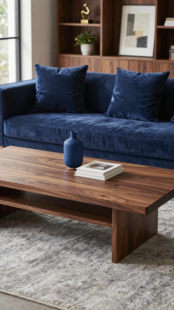
After the fresh pop of emerald, a deep navy accent can pull walnut into a dramatic, sophisticated domain. You’ll notice the contrast instantly: dark walnut grain meets midnight navy, creating visual tension that feels modern and luxe. Use navy cushions, throws, or a sleek side‑chair to break the wood’s warmth without overwhelming it. Pair with brushed brass hardware for a metallic edge, and let lighting highlight the rich tones. Keep accessories minimal—think geometric frames or matte black fixtures—to preserve focus on the color interplay. This calculated splash of navy transforms your space into an avant‑garde showcase of depth and elegance. Navy’s vibrant saturated color intensity makes it an ideal complement to walnut’s warm undertones, creating a sophisticated balance that feels intentional and refined.

Material:Solid Brass.Color:Antique Brass. Screws material:Alloy.

Style and finish: Easily refresh your home with champagne bronze gold cabinet handles and bar style drawer pulls that update kitchen cabinets, bathroom vanities, dressers and cupboards for a clean modern look.
Measurement: Overall Length:220mm(8.66inch) Diameter:18mm(0.71inch) Projection:37mm(1.46inch)
Blend Blush Pink With Walnut for Subtle Sophistication
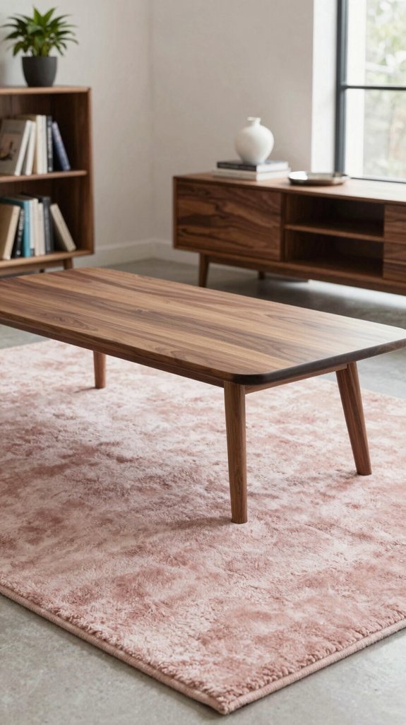
When you pair blush pink with walnut, the soft, muted hue tempers the wood’s depth, creating an elegant, understated contrast that feels both modern and inviting. You’ll notice the pink’s gentle warmth highlighting walnut’s rich grain without overwhelming it, fostering a balanced visual rhythm. Apply blush pink to cushions, throws, or wall art to inject subtle color while preserving the wood’s natural authority. The combination works especially well in open‑plan spaces, where light reflects off the pink accents, amplifying the room’s airy feel. Consider layering stylish decorative cushions in complementary textures to enhance the visual depth and comfort of your seating areas. Embrace this blend for a sophisticated, trend‑forward aesthetic that feels fresh yet timeless.

High Quality Material:Made from sturdy and soft materials,Foldable rug is built to last and provide comfortable support for your feet.The Non slip backing keeps the rug securely in place, preventing slips and falls that can lead to injury and damage to your home.Friendly manufacturing process and non harmful fabric

Inspired by Timeworn Stonework: Layers of weathered walnut brown, smoky taupe, and faded stone beige, grounded by subtle charcoal undertones, recall aged masonry and worn courtyard tiles. Framed borders, geometric medallions, and distressed angular motifs create a collected vintage look with quiet depth, fitting naturally into Warm Transitional, Modern Rustic, and Modern Farmhouse interiors

Super Soft Area Rug: Our 5x7 area rug is crafted from skin-friendly materials that feel gentle and cozy underfoot. Ideal for kids and pets, this black brown geometric area rug feels soft like cotton and provides cushioned comfort for everyday barefoot use. The brown rug for living room features a soft, low-pile surface that is machine washable and easy to clean, designed to resist pet hair and everyday messes for pet-friendly living
Pair Charcoal Accents for Modern Walnut Elegance
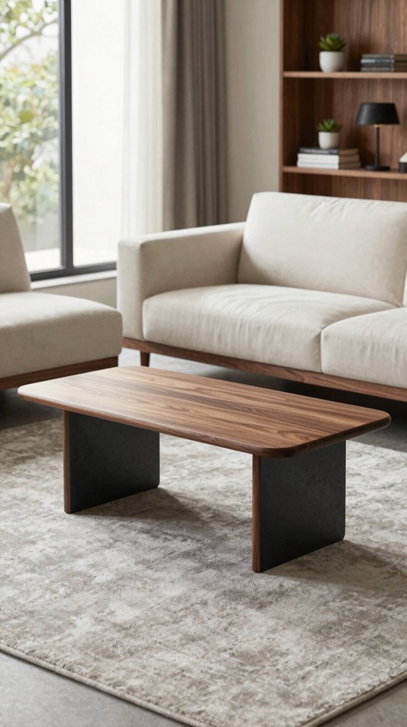
A splash of charcoal against walnut instantly grounds the space, delivering a sleek, contemporary edge that feels both bold and refined. You’ll notice how a charcoal‑stained sideboard or a matte black metal lamp creates visual weight without overwhelming the warm grain. Pairing charcoal cushions or a rug with walnut chairs adds depth, letting the dark hue anchor the room while the wood’s natural tones breathe. Opt for geometric charcoal patterns to echo modern architecture, and use reflective surfaces sparingly to keep focus on texture. Consider complementing this palette with shiplap wall treatments to add architectural interest and further enhance the contemporary aesthetic. This contrast amplifies sophistication, ensuring your interior stays ahead of trends while maintaining balanced elegance.
Pair Gold or Brass Metals With Walnut
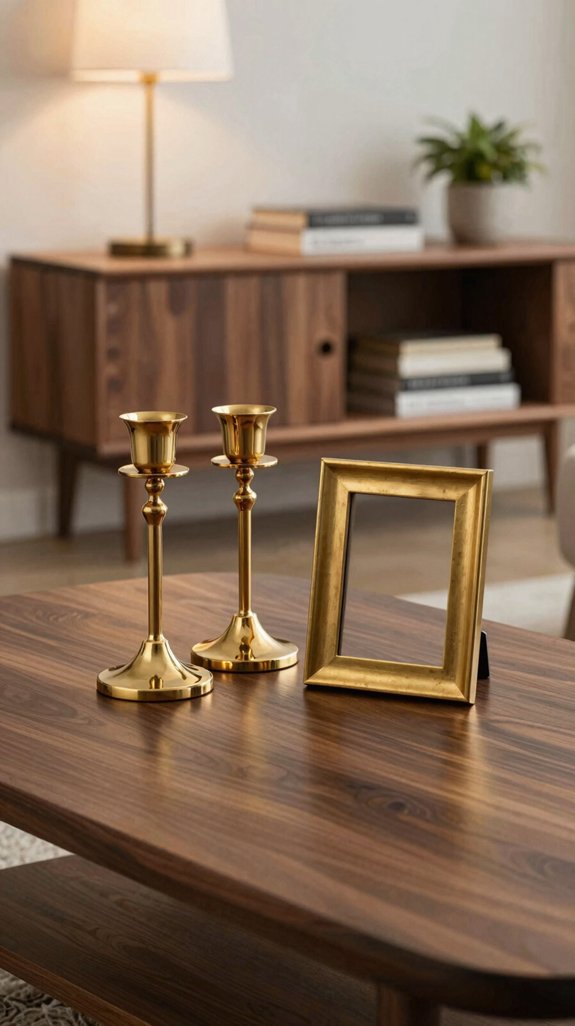
Ever wondered how a touch of gold or brass can elevate walnut’s warm richness? You’ll notice the metallic sheen creates a sophisticated contrast, highlighting walnut’s deep grain while adding a modern luxe vibe. Pair sleek brass handles with walnut cabinets to draw eyes to the natural texture, or use brushed gold legs on a walnut coffee table for a balanced, upscale silhouette. Choose matte finishes for subtlety, or polished accents for bold statements. Mix metals sparingly to avoid visual clutter; let the walnut anchor the palette. Consider using universal smart remote controls to seamlessly manage lighting that highlights your metallic and walnut design elements. This pairing delivers an innovative, timeless aesthetic that feels both fresh and refined.
Choose Lighting That Highlights Walnut Warmth
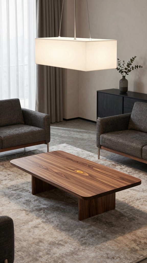
The gleam of brass or gold sets the stage, but the real magic happens when light plays across walnut’s rich tones. You’ll want layered lighting: recessed LEDs with warm color temperature (2700‑3000 K) that wash the grain, plus directional spotlights that accentuate the natural luster. Pair dimmable pendants over a walnut dining table to create depth, and use floor lamps with frosted shades for ambient diffusion. Install under‑cabinet strips behind walnut cabinets to reveal subtle veining. Choose fixtures with matte black or brushed nickel finishes to keep focus on the wood, ensuring a balanced, contemporary ambience. Keep electrical cords and cable management solutions organized behind or within your walnut cabinetry to maintain the clean, elegant aesthetic of your space.
Select Artwork That Reinforces Your Walnut Palette
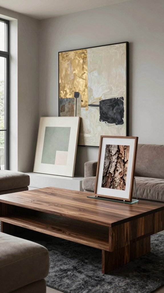
Looking to amplify walnut’s warm elegance? Choose artwork that mirrors its rich, amber tones while introducing contrast. Opt for abstract canvases with metallic gold or copper accents; they echo walnut’s depth and add a futuristic edge. Pair minimalistic line drawings in charcoal or deep teal to create visual tension without overwhelming the space. Incorporate sculptural pieces in brushed brass or matte black to reinforce texture and color continuity. Select prints featuring natural motifs—leaf veins, wood grain, or stone—that resonate with walnut’s organic character. Consider stretched canvas wall art printed with these curated designs to achieve a polished, gallery-quality finish that enhances your space. By curating pieces that balance hue, material, and form, you elevate the palette into a cohesive, avant‑garde statement.
Balance Small Spaces With Light Walls & Walnut
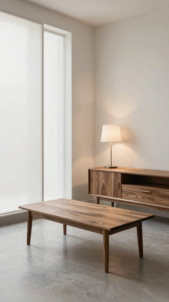
When you pair light walls with walnut accents, you instantly expand a cramped room’s feel, letting the warm wood anchor the space while the bright backdrop reflects light and creates visual breathing room. Choose high‑gloss whites or soft greiges to amplify natural light, then introduce walnut coffee tables, shelving, or slim console units. The contrast sharpens depth, making corners appear larger. Keep proportions tight—opt for slender walnut legs and minimal hardware to avoid visual clutter. Add reflective accessories, such as chrome lighting or glass vases, to bounce light across the walnut surfaces, reinforcing a balanced, airy ambience that feels both modern and inviting. For additional storage solutions, consider boxes for storing and organizing your media collections and personal items to maintain the uncluttered aesthetic.
Coordinate Walnut Across Open‑Plan Zones
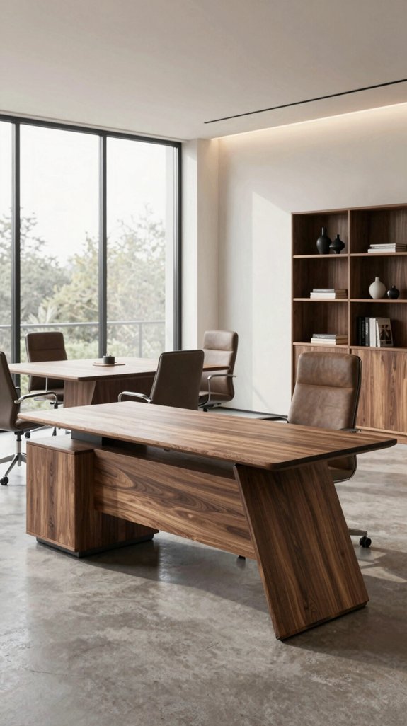
If you let walnut flow through an open‑plan layout, you’ll instantly tie together living, dining, and work zones with a cohesive, upscale vibe. Choose a walnut coffee table that extends visually into the dining area, then echo its grain in a walnut desk frame. Pair each piece with matte black metal or brushed brass accents to keep the palette sleek. Use walnut shelving to delineate zones without blocking sightlines, and integrate walnut‑finished lighting trunks for continuity. Complement these anchors with matching accent table sets positioned at zone boundaries to strengthen visual flow and add layered depth throughout your open space. Keep color contrast minimal—soft neutrals, muted greys, and occasional deep teal—so the wood remains the focal point while the space feels airy and modern.
Swap Seasonal Accents for Spring, Summer, Fall, Winter
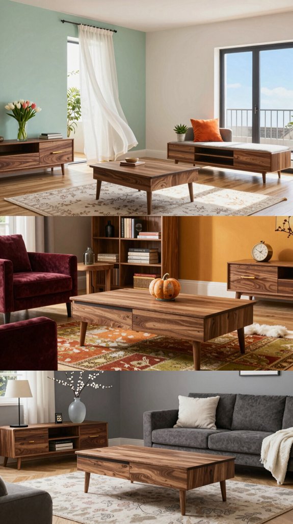
Even as the seasons shift, you can keep your walnut‑centric space fresh by swapping out accessories that echo spring’s pastel greens, summer’s sunny yellows, fall’s rusted oranges, and winter’s cool blues. In spring, replace heavy drapes with sheer linen curtains in mint and sage, then add ceramic vases in soft teal. Summer calls for woven baskets, bright cushions, and brass lamp shades that amplify sunlight. For fall, introduce textured throw blankets in burnt sienna, leather poufs, and copper wall art to echo foliage. Winter demands sleek metal frames, deep‑blue glassware, and faux‑fur accents that contrast the walnut’s warmth while preserving a refined, modern vibe. To enhance the ambiance across all seasons, incorporate light diffusers to soften and spread illumination throughout your space, creating a cohesive and welcoming environment that complements your seasonal updates.
Avoid Common Mistakes When Mixing Walnut With Bold Colors
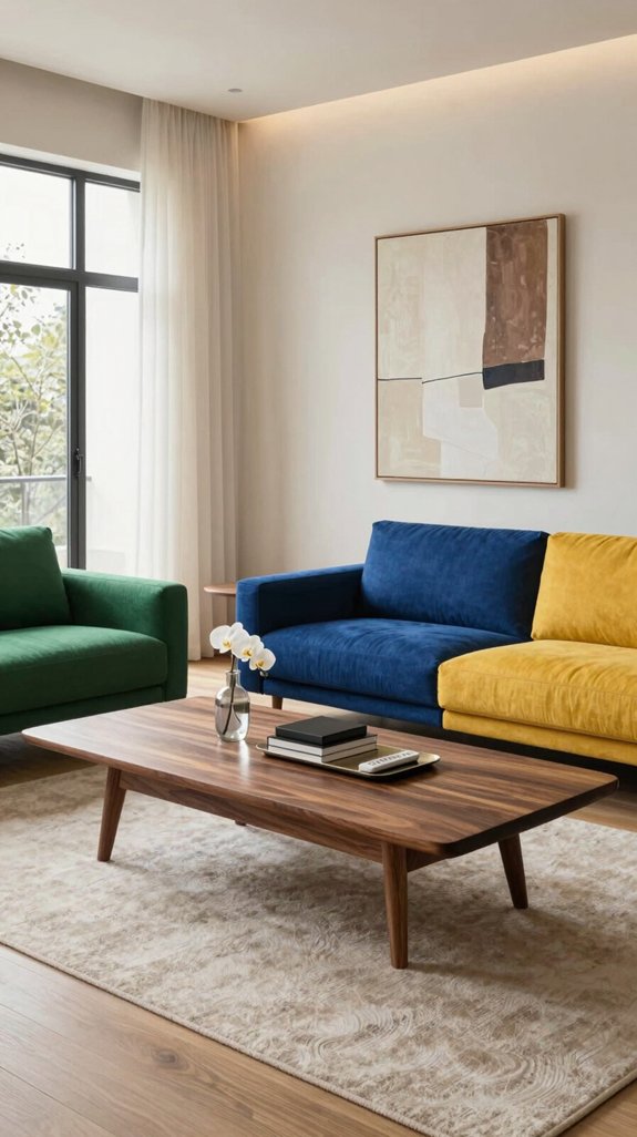
Because bold hues can overwhelm walnut’s natural depth, you’ll want to balance intensity with restraint. First, avoid pairing saturated reds directly against walnut grain; the contrast becomes harsh and masks wood’s warmth. Instead, choose muted terracotta or rust with a matte finish to let walnut breathe. Second, steer clear of neon accents that clash with walnut’s organic tones; they distract rather than enhance. Third, limit the number of bold shades in a single room—two at most—so the space feels cohesive. Consider pairing walnut with subtle elegant decor through softer wall colors that enhance rather than compete with your furniture’s richness. Finally, test lighting conditions; harsh fluorescents amplify bold colors, while warm LEDs preserve walnut’s richness and keep the palette elegant.
Test Color Combos on a Budget Before Committing
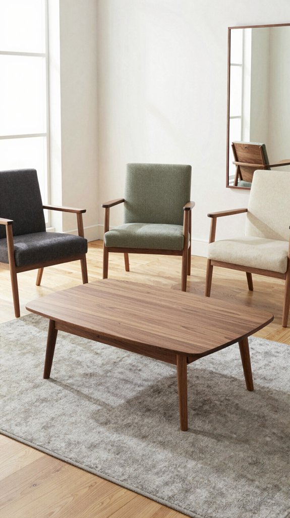
After cutting back on saturated reds and neon accents, you’ll want to see how a color scheme feels in real life before splurging on paint or furniture. Grab inexpensive swatches, poster board, or fabric scraps and arrange them around your walnut pieces. Use removable wall decals or magnetic paint chips to simulate larger surfaces without commitment. Photograph each setup under natural and artificial light, then compare how the hues interact with walnut’s warm grain. Swap items weekly to notice subtle shifts, and note which combos sustain visual balance. Consider using stylish coaster holders to keep your test swatches and fabric samples organized during this experimentation phase. This low‑cost trial lets you iterate rapidly, ensuring the final palette feels both innovative and elegant.
Final Checklist: Elegant, Balanced Walnut Color Scheme
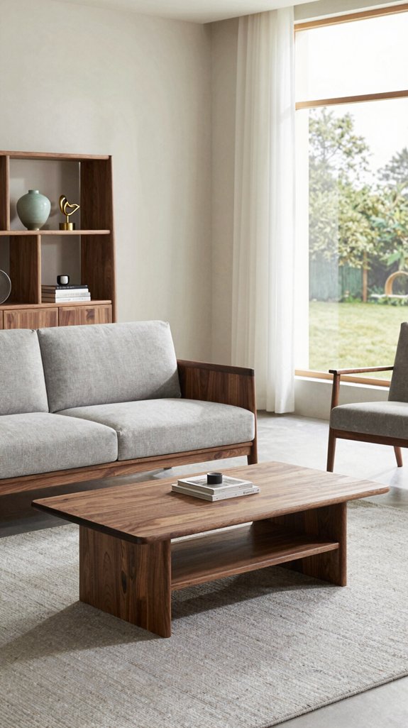
When you’ve narrowed down your palette, run through this quick checklist to confirm the scheme stays elegant and balanced with walnut’s rich tone. First, verify contrast: pair walnut with muted neutrals or deep jewel tones, not overly bright shades. Second, assess proportion: limit accent colors to 20‑30 % of the visual field, letting walnut dominate. Third, test texture harmony—matte walls against glossy walnut surfaces create depth without clash. Fourth, check lighting impact; warm LEDs enhance walnut’s warmth, while cool light can mute it. Consider pairing walnut with soft gray-white paint shades to achieve a sophisticated, timeless foundation that complements the furniture’s depth. Finally, guarantee consistency across accessories, fabrics, and hardware, maintaining a unified, forward‑thinking aesthetic.
Frequently Asked Questions
How Do I Protect Walnut Furniture From Sunlight Fading?
Research shows 70% of wood fading occurs within the first year of UV exposure. Shield your walnut pieces with UV‑blocking window film, use low‑light curtains, and apply a matte, UV‑resistant finish regularly.
Can Walnut Be Combined With Matte Black Hardware?
Yes, you can pair walnut with matte black hardware; the contrast highlights walnut’s warmth while the sleek black adds modern edge. Choose brushed‑finish knobs or handles for a balanced, sophisticated look.
What Is the Best Way to Clean Walnut Stains?
Think of sunrise on polished wood; you’ll clean walnut stains by gently blotting with a microfiber cloth, then applying a diluted lemon‑oil solution, wiping with a soft damp rag, and polishing with walnut oil.
Should I Use Scented Candles Near Walnut Pieces?
Yes, you can use scented candles near walnut pieces, but keep them at least a foot away and choose low‑smoke, non‑oil‑based fragrances. This prevents residue buildup while preserving the wood’s natural luster.
Is Walnut Safe for Homes With Pets?
Yes, walnut’s natural finish is generally pet‑friendly, but you should seal it with a non‑toxic varnish to prevent chewing or staining. Regularly clean paw prints, and avoid placing toxic plants nearby.



