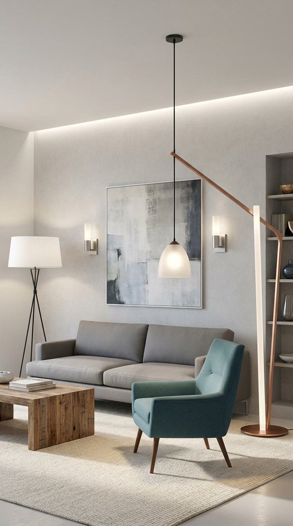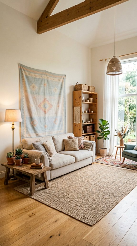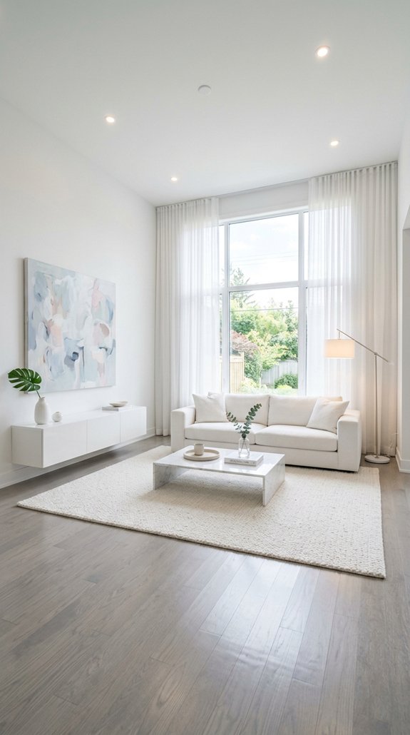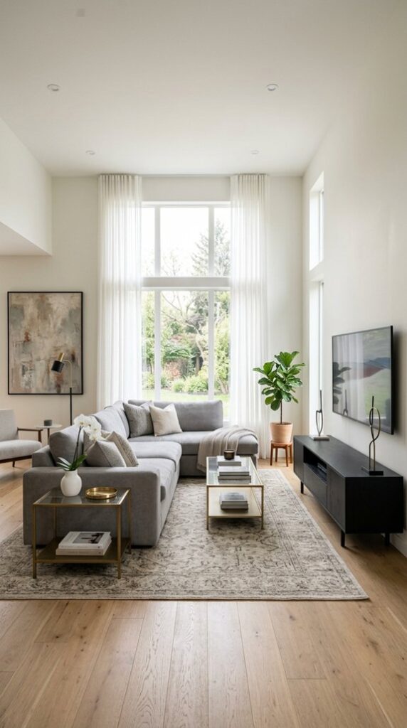
I’ll show you how to turn your living room into a high‑energy pop‑design haven by first picking a bold accent wall in electric teal or neon magenta, then layering graphic wallpaper with oversized, high‑contrast motifs. Next, I’ll guide you on stacking a muted base rug with a patterned, geometric rug that matches your furniture grid. Choose neon pendant lights or LED strips for a vibrant glow, add metallic trim finishes, and finish with a vintage poster gallery. Keep the palette balanced, and the next tips will reveal even more ideas.
Why Pop Design Works: Quick Intro
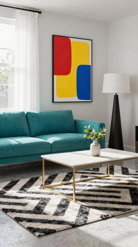
Because pop design blends bold color, playful geometry, and nostalgic references, it instantly energizes a living room while staying grounded in modern aesthetics. I notice that the high‑contrast palettes—electric teal, hot pink, mustard yellow—trigger a dopamine response, making the space feel alive. The geometric motifs, from oversized hexagons to staggered chevrons, create visual rhythm that guides the eye across walls and furniture without overwhelming. Nostalgic cues—mid‑century modern silhouettes, retro‑inspired lighting fixtures—anchor the avant‑garde vibe, preventing it from feeling gimmicky. I also appreciate how pop design leverages proportion: a single statement sofa can dominate a room, while minimalist accessories keep the composition balanced. This calculated boldness satisfies trend‑hungry homeowners who crave a fresh, yet cohesive, visual narrative. The strategic use of accent lighting can further amplify the vivid color scheme and add depth to the geometric patterns.

Ideal for use on interior/exterior surfaces including wood, plastic, plaster, metal, masonry and unglazed ceramic

Ideal for use on interior/exterior surfaces including wood, plastic, plaster, metal, masonry and unglazed ceramic

Extremely durable interior paint ideal for use on properly prepared interior walls, ceilings or trim composed of new or previously painted drywall, plaster, masonry, wood and metal
Add Vibrant Accent Wall Color Pops
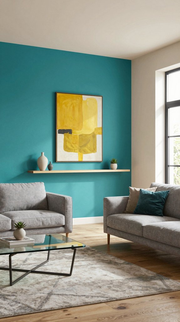
I’ve seen how the bold geometry and nostalgic touches of pop design instantly lift a room, and the next step is to let the walls do the heavy lifting with color.
I start by picking a single wall that already anchors the space—often the one behind the sofa or TV—then choose a hue that contrasts sharply with the surrounding palette: electric teal, neon magenta, or sunny chartreuse. I test the shade under both natural daylight and warm artificial light to guarantee it stays vivid without overwhelming.
I apply a matte finish for a soft, tactile feel, or a subtle satin for a whisper of sheen that catches eye‑level light.
I integrate accent pieces—cushions, art, or a rug—in complementary tones to reinforce the pop, creating a cohesive, high‑energy backdrop that feels fresh and daring.
Faux trees can serve as striking statement décor elements, adding depth and texture to the vibrant wall scheme.
Consider placing a faux tree beside the accent wall to enhance visual interest while maintaining a cohesive design narrative.

[Interesting Design]: This cute pendant light features a metal iron lamp body with a creatively designed 3-layer appearance. The metal shade is processed using advanced wire cutting techniques, resulting in a beautiful light reflection

【Decorative Art】This glass plug in pendant light adopts a retro design, UL certified lamp holder and UL certified wire,with a perfect combination of E26 lamp holder and transparent glass. We recommend installing E26 bulbs to add a touch of elegance and sophistication to your home. Retro and stylish, refined and steady and elegant

Product Size: Plug-in Pendant light Size(MAX): 8 inch W x 8 inch D x 15.6 ft H, Shade Size: 8"Wx 8"Dx 6"H,Base Size(MAX): 4.9 inch W x 4.9 inch D x 15.1ft H.
Choose Graphic Wallpaper for a Statement Backdrop
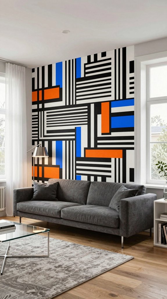
Want a wall that instantly grabs attention? I pick graphic wallpaper that transforms a plain surface into a bold, curated backdrop.
I start by measuring the wall, accounting for windows and trim, then I map the pattern’s repeat scale to avoid misalignment. I choose high‑contrast, oversized motifs—geometric bursts, abstract brushstrokes, or retro‑futurist prints—because they echo current pop‑culture aesthetics while anchoring the room’s palette.
I test swatches under both natural daylight and warm LED lighting to guarantee color fidelity. I opt for eco‑friendly, peel‑and‑stick vinyl for easy installation and future updates.
I align the design with furniture placement, letting the wallpaper dictate focal points without overwhelming the space. This method guarantees a statement wall that feels fresh, intentional, and unmistakably modern.

Modern Geometric Area Rug: The living room rug features a colorful geometric pattern, creating a novel, unique, and highly fashionable look. These area rugs 8x10 perfectly complement modern interior design styles and help visually expand the space, making the room appear more open and bright


Modern Geometric Area Rug: The living room rug features a colorful geometric pattern, creating a novel, unique, and highly fashionable look. This area rug 6x9 perfectly complements modern interior design styles and helps visually expand the space, making the room appear more open and bright
Layer Geometric Rugs for Visual Rhythm
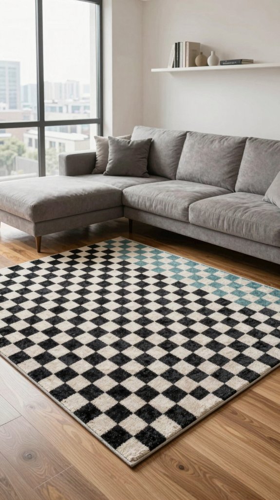
One‑step layering of geometric rugs instantly injects visual rhythm into a living room.
I start with a base rug in a muted, tonal hue, then overlay a contrasting piece featuring sharp angles or interlocking circles. I align the secondary rug’s pattern to the furniture grid, ensuring the motifs echo the room’s architectural lines.
I choose high‑contrast color pairings—electric teal with charcoal, or mustard with navy—to amplify kinetic energy without overwhelming the space. I stagger the edges, letting a strip of the base rug peek out, creating a deliberate “unfinished” feel that feels modern and playful.
I anchor the composition with a low‑pile texture under a plush sofa, balancing visual motion with tactile comfort. This approach keeps the floor dynamic, on‑trend, and unmistakably pop‑forward.

Preppy Posters:The retro wall decor size is 12x16 inch ,not include frames. You to choose your preferred frames to showcase them.Assemble and install by yourself, fully enjoy the fun of DIY

What You Will Get: the vintage posters includes 60 pieces of botanical and tarot aesthetic poster prints; Enough quantity allows you to choose combinations at will, and easily create vintage wall decorations

Classic French country house style: Inspired by the idyllic homes of Provence, France, this vintage room decor poster set combines imaginative feminine details with the rustic elements of an antique farmhouse. Vintage portrait art print is sure to stand out in your room
Choose the Right Rug Size for Your Pop‑Design Space
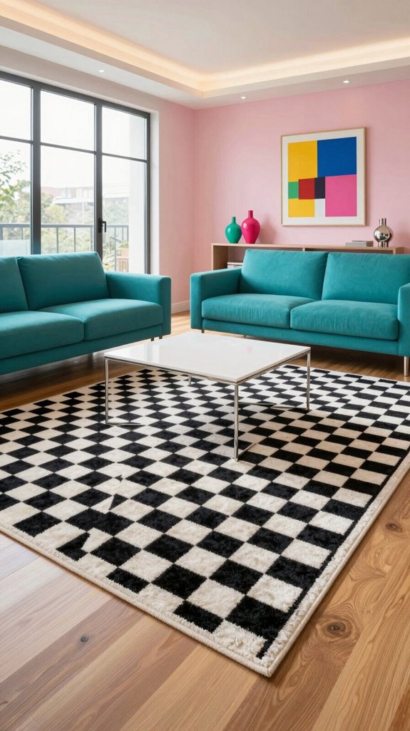
Choosing the right rug size is the first step in grounding a pop‑design living room, and I’ll break it down with precise measurements and visual cues.
I start by measuring the furniture footprint: the rug should extend at least 12‑18 inches beyond each sofa leg and chair arm, creating a visual “breathing room.” For a standard 12‑ft. sectional, a 9 × 12 ft. rug works; for a compact 3‑seater, a 5 × 8 ft. rug maintains proportion.
I then align the rug’s edge with the coffee table’s perimeter, ensuring the table sits entirely on the rug for cohesion. When the room features a bold, graphic pattern, I opt for a larger size to avoid visual fragmentation.
Finally, I cross‑check the rug’s scale against ceiling height—higher ceilings tolerate larger rugs, while low ceilings benefit from tighter, grounded dimensions.
Area rugs compared by size help ensure the chosen dimensions complement the room’s overall layout.

Use for a variety of indoor and outdoor project surfaces including wood, metal, plaster, masonry or unglazed ceramic

Easy Metallic Accents: Add a touch of shimmer and sophistication to furniture, décor, and home accessories with this richly pigmented metallic wax.

Effortless Peel & Stick: Transform your home with ease using our DIY-friendly metal trim. Simply peel the backing and stick it onto any surface for an instant touch of elegance. No hassle, just cut, peel, and apply. (Please wear gloves when handling sharp metal.)
Add Funky Pop‑Design Lighting Fixtures
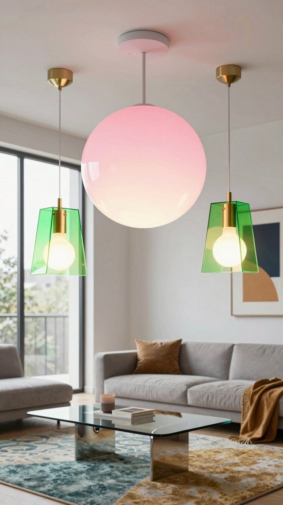
After nailing the rug’s scale, I turn my attention to lighting—because a pop‑design room needs fixtures that punch above their size while still syncing with the floor plan.
I start with a sculptural pendant that mirrors the bold geometric motifs of the era; a 20‑inch, matte‑black dome with neon‑blue trim draws the eye upward, creating vertical tension.
Next, I layer a recessed LED strip along the ceiling perimeter, programmable to pulse in sync with a retro synth soundtrack, ensuring ambient color shifts without overpowering the space.
I add a vintage-inspired floor lamp, its tripod legs finished in glossy pink lacquer, topped with an oversized frosted globe that diffuses soft, even light.
Finally, I integrate a smart dimmer hub so I can toggle intensity and hue on the fly, keeping the room adaptable for every pop‑culture vibe.
Consider using accent lighting kits to enhance mood and decorative illumination throughout the space.

12 Vibrant Colors in One Set – Match Any Décor Effortlessly:Say goodbye to mismatched switches! This 12-in-1 panel set includes every trendy shade, from matte black to pastel pink, so you can color-coordinate each room or create fun accent walls. Ideal for home renovation, rental upgrades, or kids’ rooms.

Standard Size: 2 Gang Combo Toggle/Decorator Electrical Switchplate Outlet Cover-4.5 X 4.5 Inches.

Standard Screwless 2 Gang Decorator/GFCI/Rocker Outlet Light Switch Cover WidthX Height: 4.6 X 4.7 In. Inner WidthX Height: 1.3 X 2.6 In
Incorporate Pop‑Art Prints and Wall Décor
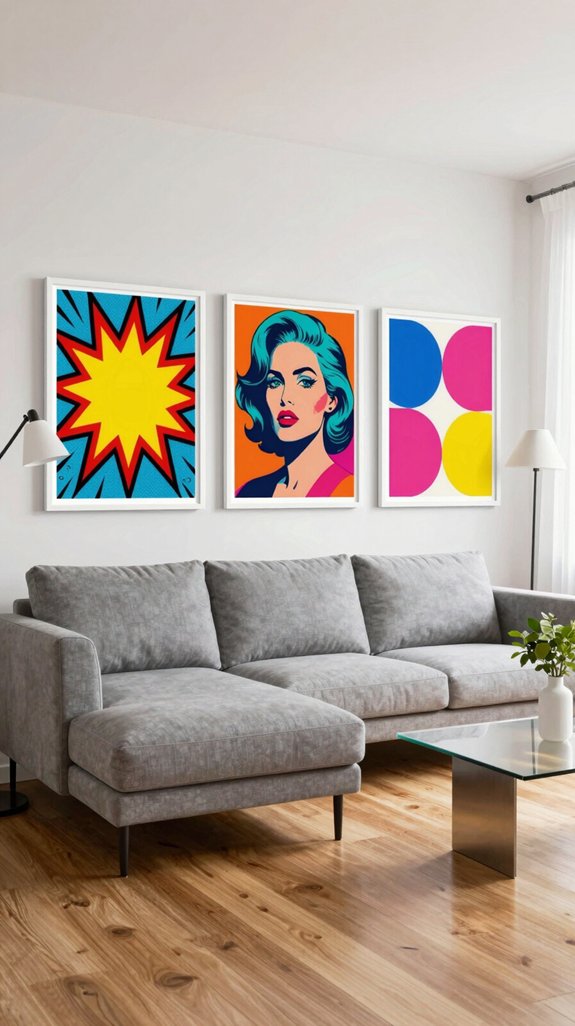
Three bold pop‑art prints can instantly transform a bland wall into a visual anthem of the era, so I start by selecting pieces that echo the saturated palettes and graphic silhouettes that define the style.
I measure the wall space, note the existing furniture’s scale, then map a grid to guarantee each print sits at eye level and balances the room’s symmetry.
I choose a mix of iconic Warhol portraits, Lichtenstein comic panels, and contemporary street‑art mash‑ups, each printed on museum‑grade archival paper for color fidelity.
I frame them in thin, matte black or brushed metal to keep the focus on the imagery while adding a subtle industrial edge.
I stagger the widths—small, medium, large—to create visual rhythm, and I anchor the arrangement with a single, oversized canvas that repeats a signature pop‑art motif, unifying the composition without overcrowding the space.

【 Dimensions & Colors】Lampshade diameter: 8inch/20cm,Adjustable Chain Length: 67"/170cm;And multiple colors are available to match different styles

Timeless Glamour and Modern Flair:Elevate any room with this stunning crystal chandelier that marries classic elegance with contemporary design elements. The elegantly curved arms, paired with sleek candlesticks adorned with high-transparency K9 crystal pendants, create a mesmerizing display of light and brilliance. This chandelier is not just a lighting fixture; it's a work of art that adds charm and sophistication to your space

Modern Pendant Light:This glass pendant light merges mid century modern pendant light appeal with vintage chandelier elegance.Ideal for kitchen islands,dining rooms,bedrooms,and hallways,its emerald floral shade and brass-toned metal hardware delivers a warm,nostalgic ambiance.
Add Bold, Patterned Throw Pillows for Color Kicks
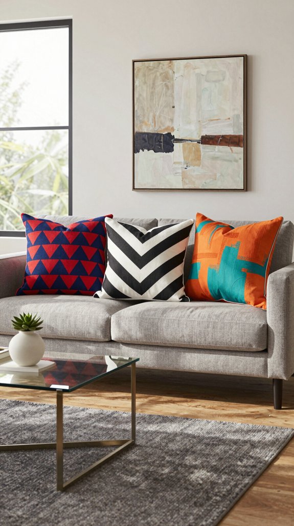
I’ve already set the visual tone with striking pop‑art prints, so now I’m layering in bold, patterned throw pillows to inject instant color kicks.
I choose geometric, oversized motifs in saturated teal, magenta, and electric yellow, pairing them with subtle metallic thread for depth. Each pillow’s fabric—high‑density velvet, brushed cotton, or woven silk—adds tactile contrast, while the pattern scale aligns with the room’s 60‑inch sofa width, preventing visual crowding.
I arrange pillows in a staggered rhythm: one solid block, one graphic, one textured, repeating the sequence to guide the eye.
I also mix matte and glossy finishes, ensuring light reflects variably across the seating area. This calculated layering creates a dynamic, modern pop ambience that feels both fresh and cohesive.
decorative cushions for sofas and chairs enhance comfort while reinforcing the visual theme.

Used Book in Good Condition

MODERN DESIGN: Featuring either arranged color-block accents or flowing rows of oval forms, this abstract rug brings a playful modern rhythm to your floor. The geometric print adds visual interest while maintaining a clean and versatile decorative look.

Modern Area Rug: This area rug is designed with a Bohemian and Moroccan style pattern using a combination of geometric lines and shapes, able to integrate into any interior design style easily, it can add elegance and fashion to your home space.
Add Oversized Floor Cushions for Playful Seating
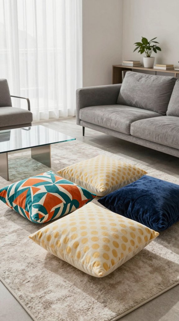
I’m swapping the traditional coffee table for a set of oversized floor cushions that double as playful seating and visual anchors. I choose high‑density foam cores wrapped in sustainably sourced, boucle‑textured fabrics that resist wear while echoing the tactile trends of 2024.
The cushions measure 48 × 48 × 12 in., allowing multiple guests to lounge, game, or read without crowding the space. I stagger them in a modular layout, using a muted charcoal base with a single bold accent stripe to maintain visual hierarchy.
I anchor the arrangement with a low‑profile rug that defines the zone and prevents slippage. By integrating hidden zip pockets for magazines and a subtle LED strip underneath, the cushions become multifunctional, tech‑savvy focal points that keep the room dynamic and inviting. Adding floor seating pillow sets can also enhance the room’s comfort and style.

Style--A simple vintage wall art designed for Paris,France.
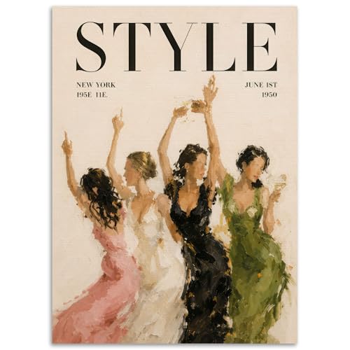
Vintage & Modern Fashion Magazine Canvas Collection: set of stylish art prints blending retro couture, modern coastal and luxe animal motifs in iconic magazine cover style

8x10 UNFRAMED PRINTS - NOT Canvas or Tin Sign
Select Sculptural, Colorful Coffee Tables
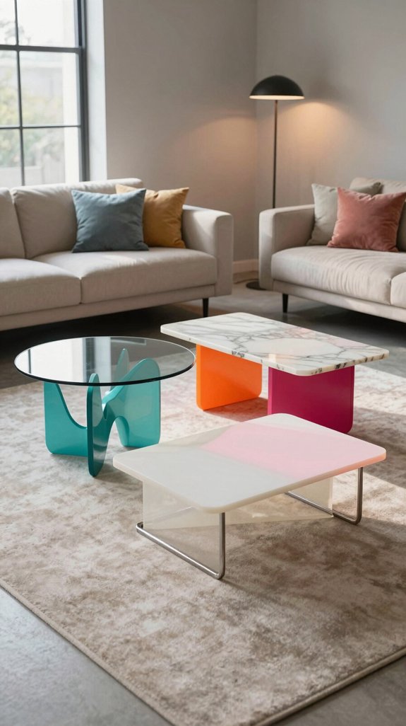
The floor‑cushion arrangement already anchors the zone, so the next piece should pull the eye upward and outward—enter a sculptural, colorful coffee table that doubles as art.
I choose a table whose base resembles a twisted metal helix, painted in a gradient of neon teal to magenta, because the kinetic form energizes the room while staying grounded. The tabletop is tempered glass with a subtle frosted pattern that reflects light without competing with the bold hue.
I measure the table’s height at 18 inches to keep a comfortable reach from the cushions, and I keep the footprint under 36 inches square to preserve circulation.
I pair it with a low‑profile rug that echoes the table’s color palette, ensuring visual cohesion while maintaining the pop‑culture edge.
Adding a wall‑mounted accent lighting fixture can further highlight the table’s sculptural lines.


Easy Metallic Accents: Add a touch of shimmer and sophistication to furniture, décor, and home accessories with this richly pigmented metallic wax.

Mix Mid‑Century Furniture With Modern Pop Pops
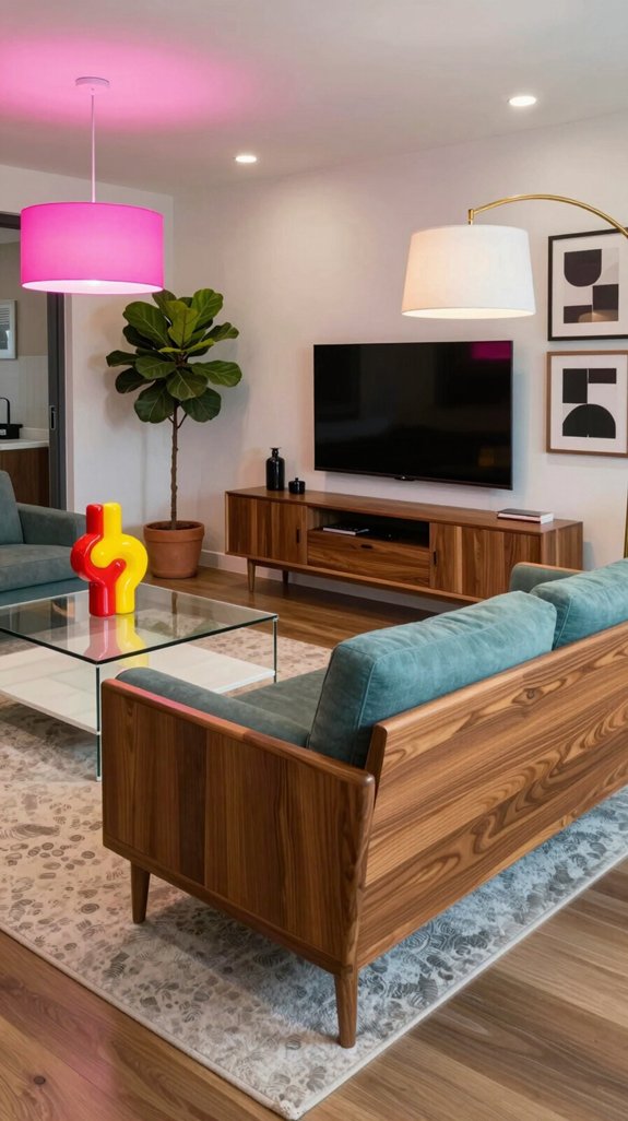
Because the clean lines of mid‑century pieces already demand attention, I juxtapose them with bold, neon‑accented accessories that scream modern pop culture.
I start with a teak lounge chair, its tapered legs and low profile anchoring the room, then drape a pixel‑patterned throw in electric pink across the back.
Next, I place a chrome‑finished side table beside a low‑slung sofa, topping it with a holographic coasters set that reflects LED strip lighting.
I swap classic walnut shelving for a floating unit painted in matte black, inserting a series of limited‑edition vinyl record frames that pop with saturated colors.
The result feels like a curated museum exhibit, where vintage sophistication meets kinetic, eye‑catching pop energy without sacrificing cohesion.
Consider using curated kits to streamline the design process and ensure a harmonious layout.
Put Up Color‑Blocking Shelves for a Fun Look
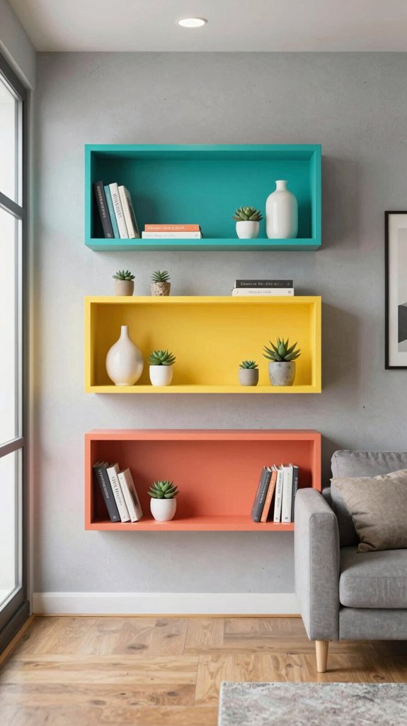
Two bold color‑blocking shelves can instantly turn a plain wall into a playful focal point.
I start by measuring the wall, mapping a 12‑inch grid, then selecting matte lacquer in primary hues—electric blue, hot pink, sunny yellow. I cut each board to a uniform 18‑inch depth, sand edges, and apply a two‑coat spray for flawless coverage.
I stagger the shelves, alternating colors to create a rhythmic visual pulse that echoes pop‑art graphics. I anchor each bracket with hidden wall plugs to preserve the clean line.
I stock the shelves with monochrome ceramics, sculptural books, and metallic accents that echo the chromatic theme without clutter. The result feels fresh, daring, and instantly Instagram‑ready, aligning with current avant‑garde interior trends.
wall shelves with integrated lighting add a functional glow while highlighting the vibrant colors.
Introduce Neon Accents Through Lamps or Art
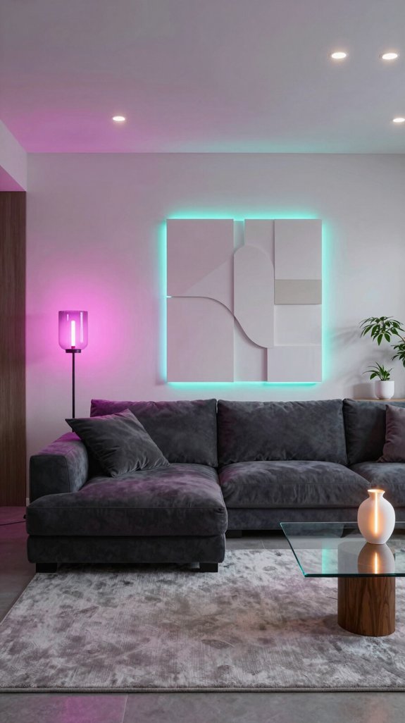
Vibrancy spikes when I swap a plain ceiling fixture for a neon‑lit sculpture, because the electric glow instantly rewires the room’s energy.
I choose a slim, rechargeable LED neon lamp that mimics classic tube neon but offers adjustable color temperature and intensity via a smart app. Position it on a side table or mount it as a wall sconce to create a focal point without overwhelming the space.
For art, I commission a minimalist neon sign that incorporates a single word or geometric shape, ensuring the line weight matches the room’s existing trim.
I sync the lamp’s pulse with the sign’s rhythm using a Bluetooth controller, so the glow shifts with ambient music.
This coordinated neon scheme adds a futuristic pop punch while staying cohesive with my overall design palette.
Acoustic panels can be integrated as decorative wall art, blending sound absorption with visual appeal.
Apply Metallic Trim Finishes for Pop‑Design Shine
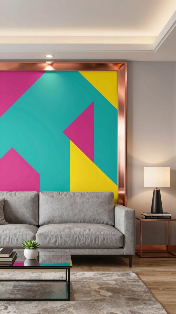
I start by selecting a thin, high‑gloss metallic trim—brushed brass, matte copper, or pewter—that fits the room’s color scheme and adds a reflective edge without bulk.
I measure each molding piece to the exact length of the shelf, window frame, or ceiling line, then sand lightly to guarantee adhesion.
I apply a high‑bond primer, followed by two coats of the chosen metal finish, allowing each layer to cure for 15 minutes to prevent drips.
I use a micro‑trowel to press the trim into the joint, creating a seamless, razor‑sharp line that catches ambient light.
Finally, I install LED backlighting behind the trim, amplifying the pop‑design shine while preserving a sleek, futuristic aesthetic.
Create a Vintage Poster Gallery Wall
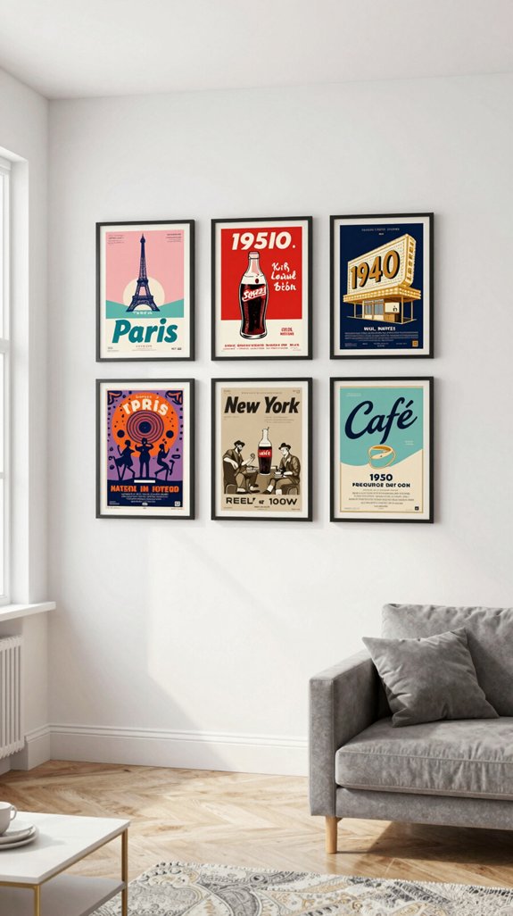
Ever wonder how a curated vintage poster wall can instantly anchor a room’s aesthetic while delivering nostalgic flair?
I start by measuring the wall’s exact dimensions, then map a grid of 12‑inch squares on paper to visualize spacing. I select posters with a cohesive color temperature—muted teal, rust, and mustard—to echo current retro‑futurist trends. Each print is printed on heavyweight matte stock, then mounted on thin, archival‑grade board to prevent warping.
I use a laser‑level and stainless‑steel picture hooks spaced 1‑inch apart, ensuring perfect alignment. I stagger the frames by one‑inch vertically to create a dynamic rhythm, but keep the overall silhouette rectangular for balance.
Finally, I add a subtle LED strip behind the lower row, giving a soft backlight that highlights texture without overwhelming the space.
Consider using frame collage sets to streamline the layout and maintain a cohesive visual flow.
Wrap up With a Balanced Color Palette
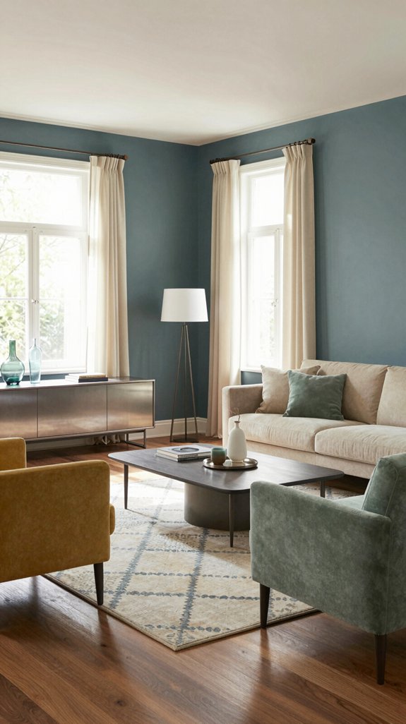
After the vintage poster wall is set, I turn my attention to the room’s overall color balance, ensuring the hues from the frames, furniture, and accents harmonize without competing.
I start by extracting the dominant tones—often a bold magenta or electric teal—from the posters, then map them onto a 60‑40 split: 60 % neutral base (soft gray or warm sand) and 40 % accent color.
I introduce a third, muted shade—like a pastel mustard—to bridge the high‑energy pigments and the neutral field, preventing visual fatigue. I test the palette under varied lighting, using a spectrophotometer app to verify that the contrast ratio stays within 4.5:1 for accessibility.
Finally, I apply the accent sparingly on throw pillows, a rug, and a single piece of sculptural lighting, achieving a cohesive, forward‑thinking vibe.
Floating shelves provide minimalist wall storage while adding visual interest.
Frequently Asked Questions
How Do I Maintain Pop‑Design Fabrics Against Wear and Tear?
I protect pop‑design fabrics by rotating cushions weekly, spot‑cleaning stains promptly, using low‑pile, breathable covers, and applying a UV‑resistant spray. I also avoid harsh abrasives and limit direct sunlight exposure.
Can Pop Design Work in Small Apartments Without Feeling Cramped?
I think pop design can thrive in small apartments if you prioritize minimalist color palettes, modular furniture, and strategic accent lighting; these choices create visual openness, preventing the space from feeling cramped.
What Lighting Temperature Best Complements Neon Accents?
Like a neon sign humming at dusk, I recommend cool‑white (≈6,500 K) lighting to let your neon accents pop. It sharpens colors, feels futuristic, and keeps the space vibrant without overwhelming.
Are There Eco‑Friendly Materials for Pop‑Style Furniture?
I’ll tell you, eco‑friendly pop‑style furniture exists: reclaimed wood, bamboo, recycled plastics, and low‑VOC foam. I source certified sustainable fabrics, use non‑toxic finishes, and prioritize modular, up‑cyclable designs.
How Can I Integrate Smart Home Devices Without Disrupting Pop Aesthetics?
Think of your living room as a vibrant playlist—each smart device is a subtle bass line that supports the pop rhythm without stealing the spotlight; I embed speakers, lights, and thermostats behind sleek panels, use wireless chargers disguised as art, and select minimalist controls that match the bold colors and geometric patterns.