
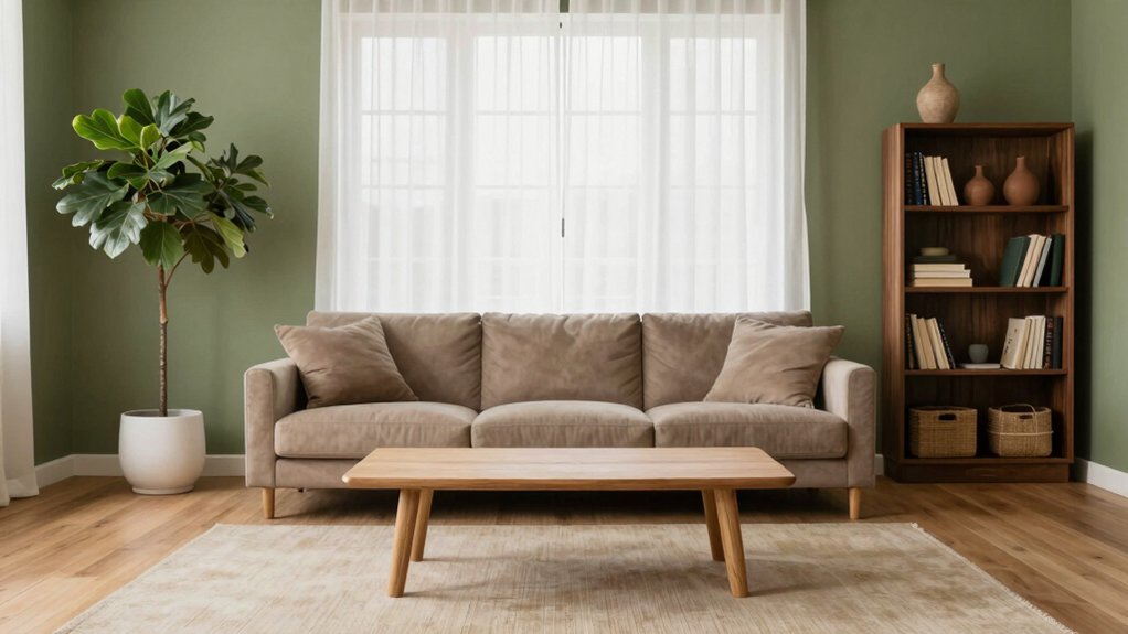
Olive green walls create a serene, earthy foundation that feels both grounded and light.
Paired with warm ivory or light taupe, the space opens up, allowing olive’s soft yellow-brown undertones to shine.
For contrast, charcoal or muted navy in furniture or decor adds quiet depth without weighing down the atmosphere.
Introduce terracotta, mustard, or blush through accent pieces like ceramics, artwork, or side stools to infuse subtle warmth and quiet elegance.
Texture plays a key role—layer jute or sisal rugs, linen curtains, and chunky knit throws to enhance the relaxed, organic feel.
Finish with warm LED lighting at 2700 K to softly highlight surfaces and deepen the cozy ambiance.
Explore room-specific combinations and thoughtful details ahead to bring this calming palette to life throughout your home.
Olive Green Basics – What Makes It Feel Natural
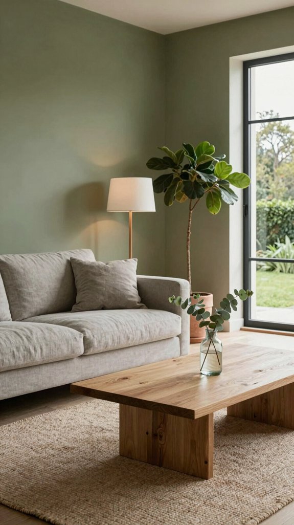
When a room is dressed in olive green, the color immediately creates a sense of grounding, drawing from nature’s own spectrum. Its soft, yellow-brown undertone mirrors the hues of leaves, moss, and rich soil, fostering a serene and balanced atmosphere. With its low saturation, olive green absorbs light gently, enhancing the feeling of space while still maintaining a cozy, enveloping warmth. I often combine olive with matte black finishes to introduce a crisp, contemporary contrast, while touches of brushed brass bring out the color’s natural, earthy depth. In today’s interior design, olive serves as a versatile neutral—perfect beneath layered textures like woven rattan furniture, exposed wood grains, and raw concrete surfaces. Used as a foundational tone, olive green offers a timeless canvas that equally supports sleek, modern minimalism and inviting, eco-conscious interiors. Stylish trays designed to sit on ottomans add a functional yet decorative element that complements the natural aesthetic.

Includes 30 featured and newest released color card. Sprayed on color to see our colors in your homes lighting for more accurate color choices.

Includes 30 featured and newest released color card. Sprayed on color to see our colors in your homes lighting for more accurate color choices.

Extremely durable interior paint ideal for use on properly prepared interior walls, ceilings or trim composed of new or previously painted drywall, plaster, masonry, wood and metal
Warm Ivory & Light Taupe – Soft Neutrals for Olive
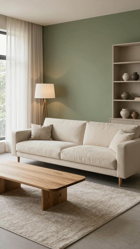
Olive’s earthy depth finds perfect harmony when paired with warm ivory or light taupe, as these soft neutrals enhance its grounded essence without overpowering it. The gentle contrast brings balance: warm ivory bounces natural light, lifting spaces and softening shadows, while light taupe offers a cozy, warm base that allows olive’s green undertones to stand out. In modern interiors, this trio forms a versatile foundation for layered textural interest—think linen upholstery, jute rugs, woven wall baskets, and matte ceramic accents. Opting for a matte finish in warm ivory keeps walls feeling calm and inviting, while a hint of satin in the taupe adds subtle dimension without glare. Together, they create a serene, refined palette that aligns beautifully with sustainable home design, encouraging the use of natural materials and eco-conscious decor choices. Incorporating stylish wall protectors further enhances the aesthetic while safeguarding surfaces.

4 PIECE DESIGN: This innovated sofa slipcover is 4 Piece style, including 1 piece base cover and 3 individual cushion pieces which will provide all-round protection. Best fit sofa 72-90 inches wide (outside arm to outside arm, straight across). Best Choice for both leather and fabric furniture Please be informed that the elasticity of this fabric product is limited.kindly measure before ordering!

【CHENILLE FABRIC】: Made of solid thick durable chenille, very comfortable and supersoft, creating a cozy and warm atmosphere in your living room.

GET COZY EMBROIDERED QUOTE: The phrase Get Cozy is embroidered in raised muted gold thread on an ivory cotton ground; a warm, tactile accent for a bed, sofa, bench, or reading nook.
Deep Charcoal Accents for Olive Green – Adding Depth Without Darkening the Mood
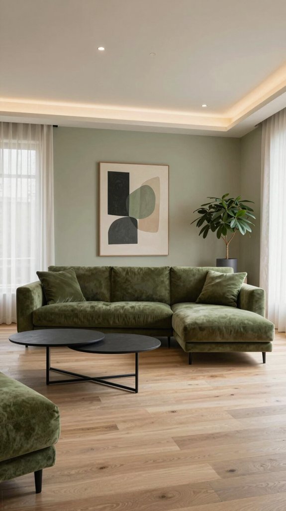
For a rich, layered look that enhances olive green without overwhelming the space, deep charcoal accents offer the perfect balance. Incorporate charcoal through shelving, light fixtures, and soft textiles to add depth while maintaining an airy ambiance. The interplay between olive green and charcoal creates a refined contrast—distinct yet harmonious, modern but never stark. Pairing charcoal with brushed metal hardware and matte finishes enhances the tactile quality of the room, blending industrial elements with organic warmth. This dark, grounding hue allows olive green’s natural vibrancy to stand out, enriching the overall palette. Use charcoal in focused ways—a sculptural armchair, a bold geometric rug, or framed wall art—to establish visual weight and sophistication. The result is a contemporary, balanced space that feels intentional, serene, and subtly layered. Consider the lumens output of smart bulbs to ensure the charcoal accents are properly illuminated.
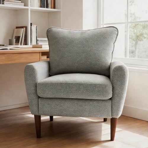
Timeless Midcentury Modern Style: Elevate any room with this chic lounge chair’s sleek silhouette, clean lines, and minimalist design. It blends effortlessly into living rooms, bedrooms, or offices, adding a sophisticated midcentury touch to your decor

Mid-Century Modern Accent Chairs: The Barrel Accent Chairs set of 2 feature eye-catching round armrests paired with solid walnut wood legs, sculptural silhouette perfectly blends minimalist wabi-sabi, boho and neutral farmhouse decor. Rounded arm and backrest of the armchair create soft enveloping lines, this statement accent chair instantly elevates living room, entryway, reading nook or bedroom as an artistic focal point.

Comfortable padded seat and back for relaxing moments
Muted Navy Touches for Olive Green – Sophistication Meets Calm
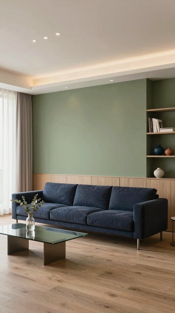
Even subtle navy accents can transform an olive-green room into a sanctuary of refined calm, as the muted hue adds depth without overpowering the natural warmth. A navy-gray throw pillow or a low-gloss navy sideboard effortlessly anchors the space, lending a quiet sophistication that feels both modern and timeless. The shift toward desaturated, softened palettes allows navy and olive to coexist in perfect harmony—evoking the tranquil tones of coastal dunes at dusk and creating a soothing visual rhythm. Introducing matte navy wall art, brushed-metal hardware, and softly textured woven rugs brings layered dimension while maintaining the room’s airy lightness. This understated contrast elevates the entire interior, resulting in a serene, thoughtfully curated aesthetic that feels fresh, balanced, and deeply grounded. Pairing olive green with muted navy creates a timeless, earthy look.

[COLOR & DESIGN]: SAFAVIEH's Natural Fiber area rug showcases a chunky, hand-woven looped texture in natural tones; actual color may appear darker or lighter than shown, depending on lighting and screen settings.

Rug measures 22 x 60" (approximately 0.5" thick), made of durable 100% Jute, a shiny vegetable fiber spun into coarse threads.

100% NATURAL JUTE : This rug has been carefully handmade using 100% natural jute fibers, which can result in slight variations in color and weave. These variations add to the rug's individuality and uniqueness.
Combining Deep Accents – Charcoal and Navy Together
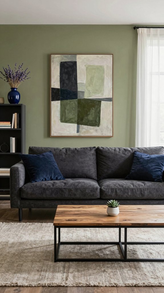
Pairing charcoal with navy creates a strikingly deep accent scheme that feels both grounded and dynamic, building on the subtle navy-olive harmony previously explored. Charcoal acts as a stabilizing force, anchoring the space with depth, while navy introduces a quiet sense of energy, resulting in a modern yet timeless visual tension. In practice, matte charcoal walls are layered with navy throw cushions, a sleek navy-finished pendant light, and brushed-steel decor accents that subtly mirror the charcoal undertones. This interplay enhances textural contrast, allowing the olive base elements in the room to appear more vibrant and lush. With the trend moving toward rich monochrome depth, reflective surfaces—such as glass tabletops, lacquered wood consoles, and mirrored trays—are strategically placed to lighten the palette and prevent visual heaviness. By balancing matte finishes with glossy accents, the space achieves a sophisticated atmosphere that fosters both serene relaxation and creative inspiration. Pull-out trundle bed frames provide an extra sleeping solution that fits seamlessly under the main bed, maximizing space without compromising style.

Material : Made of ceramic, the vintage vase is sturdy and durable, making it the best choice for fireplace decor. Take the monotony out of your home life with this ceramic vase for home decor

【Handcrafted Ceramic Artistry】Made of high-quality, 100% hand-painted ceramic with high-temperature firing, this vase combines durability with unique artistry. Its waterproof interior allows for fresh flowers, while the rustic terracotta finish adds timeless charm.

【Non-slip Vase】This ceramic vase measures 10.7" H x 6" W. It is not just a vase, but also an exquisite piece of home decor.
Natural Wood Elements – Earthy Texture for Olive Spaces
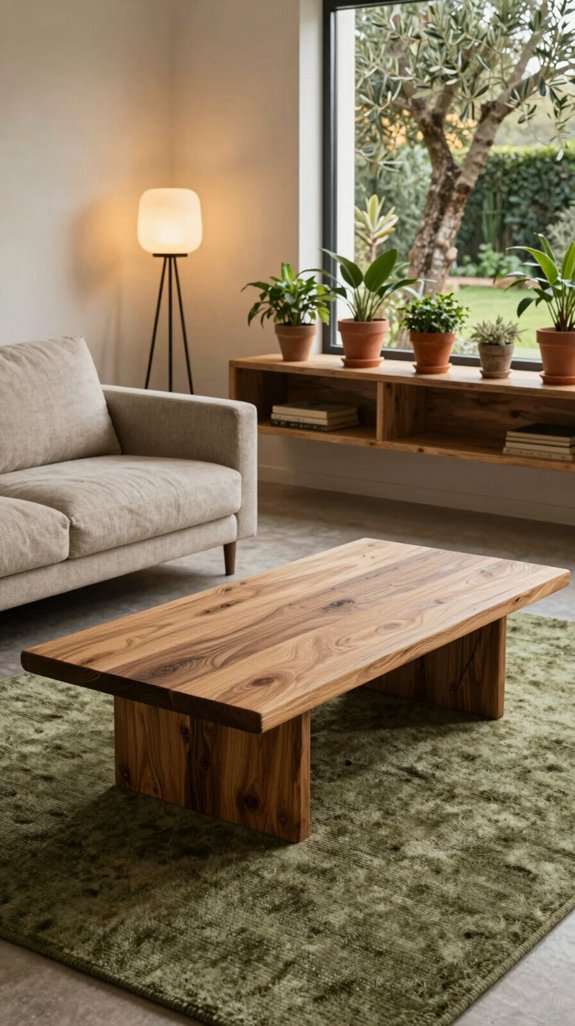
When natural wood meets an olive-dominated space, the earthy grain brings instant warmth and balance, enhancing the room’s organic essence. Reclaimed oak or sustainably sourced walnut work beautifully, adding rich depth without overpowering the soothing olive tones. I incorporate slim wooden slats into shelving, allowing sunlight to glide over knots and textures, creating a gentle, rhythmic play of light and shadow. Matte finishes preserve the material’s authentic feel, supporting the minimalist-nature aesthetic that’s both calming and intentional. To modernize the look, I pair wood elements with matte black fixtures—drawer pulls, shelf brackets, or lighting—introducing a refined contrast while keeping the ambiance grounded. From a streamlined coffee table to a floor-to-ceiling accent wall, careful scaling ensures harmony and prevents clutter. The final space feels thoughtfully layered, rooted in nature, and elegantly unified.

ALL-IN-1 PAINT & PRIMER: A hardy multi-purpose and multi-surface one-coat paint and primer in one for almost any indoor or outdoor surface. A wall, ceiling, floor, skirting board, cabinet, furniture and door paint for your bathroom, kitchen, home and garden.

DURABLE FINISH: Ensures a long-lasting finish that stands the test of time. Ideal for interior walls, ceilings, bedrooms, dining rooms, family rooms, bathrooms, kitchens, hallways and offices.

ALL-IN-1 PAINT & PRIMER: A hardy multi-purpose and multi-surface one-coat paint and primer in one for almost any indoor or outdoor surface. A wall, ceiling, floor, skirting board, cabinet, furniture and door paint for your bathroom, kitchen, home and garden.
Woven Rattan Details – Light, Airy Counterparts to Olive Walls
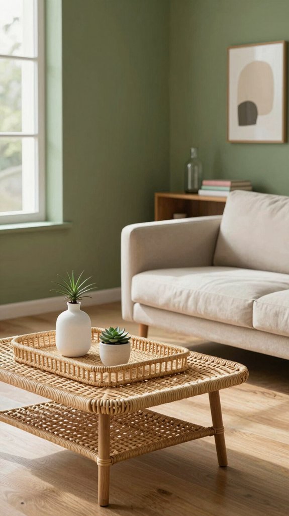
To keep olive walls feeling light and airy without sacrificing their earthy essence, incorporate woven rattan elements throughout the space. Introduce rattan chairs, baskets, and wall panels that mirror the natural warmth of the walls while adding delicate texture. The open weave of rattan catches and softens natural light, lending a breezy, organic feel that’s both contemporary and timeless. Combine rattan coffee tables with slender metal legs to blend soft, natural forms with a touch of modern structure. For overhead interest, install rattan pendant lights or ceiling fixtures that cast intricate, gentle shadows, enriching the room’s dimension without competing with the green tone. By layering these tactile, handcrafted details, the space remains rooted in nature while achieving an uplifted, thoughtfully relaxed ambiance. A well‑designed system can also enhance bass response for a richer audio experience.

Soft Chenille Feel: Made with cozy chenille, these 18x18 pillow covers add a warm, soft touch to your home; They make any sofa or bed feel a little more comfortable and welcoming

NATURAL LINEN LOOK: Textured woven fabric creates a natural linen-like look with subtle depth and dimension, bringing a warm, relaxed feel to modern, farmhouse, boho, and neutral interiors.
Terracotta Pops for Olive Green – Warm Earth Tones That Complement
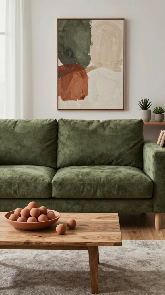
Rattan’s airy texture softens the olive green backdrop, while terracotta accents enrich the space with warmth and depth. Terracotta planters, woven throws, and glazed ceramic tiles introduce a subtle, earth‑toned glow that harmonizes with the muted green without overpowering it. The reddish‑orange base of terracotta echoes natural clay, forging a tactile connection between surfaces like floors and walls. Opting for matte finishes brings a modern, understated elegance, while glossy terracotta vases reflect light, creating gentle visual contrast. This interplay supports biophilic design principles, fostering a serene, nature‑inspired interior. By layering terracotta through accessories and accent walls, the palette achieves balance—rooted in earthiness, yet fresh and enduring, drawing the eye into a quiet dialogue between organic tones and greenery. A well‑chosen wall paint can amplify this effect, especially when it features a deep wine‑red hue that adds dramatic luxury to the overall scheme.

Comfortable Fabric: This living room chair is made with fluffy chenille fabric, resilient foam cushions with steel springs, a sturdy metal backrest, and plastic legs. With a weight limit of 380 lbs, it ensures exceptional stability and comfort.

Wide Barrel Chair: This 55.12"w round chair arc-shaped structure seamlessly fits into corners, optimizing space more effectively than traditional sofas. This oversized accent chair is an ideal choice for compact apartments or expansive balconies, striking a perfect balance between comfort and functionality.You can recline on it comfortably in any position to enjoy watching TV, reading magazines, or simply resting.

【Sturdy construction】Founded on a solid & manufactured wood frame, this club chair is padded with elastic foam fills and soft-to-the-touch polyester boucle upholstery. This sturdy and cute armchair can easily hold up to 300lb/136kg, which is perfect for all ages to use.
Mustard Yellow Highlights – Subtle Warmth for a Relaxed Vibe
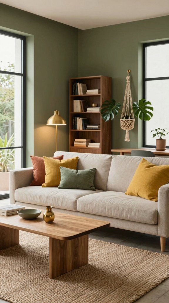
Ever wondered how a touch of mustard yellow can transform an olive-green room into a serene retreat? A single mustard accent—like a throw pillow, lamp shade, or geometric rug—adds subtle warmth without overpowering the earthy base. Its golden undertones mimic the glow of late-afternoon light, creating a cozy, sun-kissed atmosphere that feels both contemporary and timeless. Paired with matte black fixtures and reclaimed wood, the palette stays grounded while the yellow serves as a quiet focal point, inviting calm. The gentle contrast maintains tranquility, yet adds a hint of modern energy. This harmony makes the space feel welcoming, refined, and naturally relaxed.

NO SHEDDING, NO ODOR - Enjoy the textured look of natural jute without the prickly fibers or constant sweeping. This faux jute runner rug is woven from softer polypropylene, finished with designer custom-tone edge stitching, resists shedding, fading, and fraying - elevating any Farmhouse, or Coastal decor

SUSTAINABLE MATERIALS: Made from a durable blend of natural jute braids and recycled cotton yarns, this beige jute rug is a planet-friendly option. Its boho chic and modern organic design adds conscious style to any home.

DURABILITY: Our jute rugs are the perfect solution for any busy family; They are handmade yet their heavy natural fibers make them durable and resistant to slippage; Their rough cross-weave textures mean they're built to last
Muted Blush Accents – Soft Pink Hues for Gentle Contrast
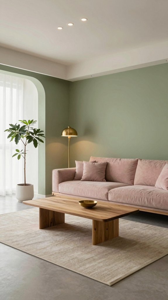
I love how a muted blush accent can soften the depth of olive green, introducing a gentle, romantic contrast that feels both modern and timeless. When I layer in pale rose wall art or a blush-tinted ceramic vase, the olive backdrop instantly gains warmth without losing its earthy anchor. This hue pair thrives in open-plan lofts, where natural light amplifies the subtle pink glow, and in boutique-inspired living spaces seeking a sophisticated, gender-neutral palette. I’ve noticed designers pairing blush with matte black fixtures to heighten the contrast, while still preserving a serene ambiance. The key is to choose low-saturation pinks—think dusty petal or soft coral—that echo sunrise tones, creating a cohesive, forward-thinking interior narrative. Incorporating a childproof outlet cover ensures safety while maintaining the room’s elegant aesthetic.

1、Dimensions: 20.08 inches (51 cm) This Tall rustic style vase boasts a moderate size, making it suitable for various settings such as dining rooms, living rooms, bedrooms, beside fireplaces, offices, hotels, and more.

Rustic Look- This small vase is finished with rustic furface which adding character and an earthiness to this potter's vase. Tips: handmade piece, each one is different.

Distressed Texture, Rustic Artistic Charm: The vase features a warm white-gray-brown glaze, with black veins resembling time-worn elegance. Each vase boasts a one-of-a-kind, organic silhouette and distinct pinch pot texture. Subtle variations in glaze and form are inherent to its creation
Layering Textiles – Tying Rugs, Cushions, Throws to Olive
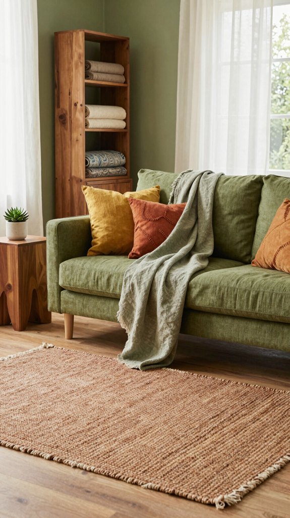
Ever wonder how a single rug can anchor an entire olive‑green room while still inviting texture play? Start by selecting a natural‑fiber rug in muted ochre or sand, letting its earthy tone echo the olive walls without competing. Layer cushions in varied fabrics—linen, boucle, and woven silk—incorporating deep terracotta, soft sage, and subtle gold to create visual depth. Drape a chunky knit throw in cream or muted rust over the sofa to add tactile contrast while reinforcing the color palette. Arrange these textiles in intentional clusters, allowing each piece to complement the next. Maintain balanced proportions: larger rugs set the foundation, medium cushions build rhythm, and throws offer the final accent. This thoughtful layering results in a space that feels both contemporary and effortlessly harmonious. Consider using cable organizers to keep cords tidy and prevent visual clutter.
Lighting Choices – Soft Ambient Light Enhancing Olive Serenity
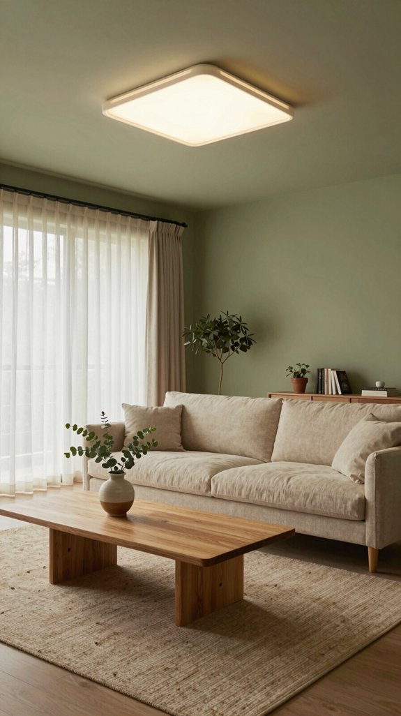
When the lights are dimmed just enough to let the olive walls come alive, the room transforms into a calm, inviting retreat. LED panels with a 2700 K warm tone work especially well, enriching the earthy depth of the olive without dulling its richness. Layering these with diffused floor lamps produces a smooth, even glow reminiscent of natural twilight, deepening the sense of serenity. Smart dimmers that follow circadian patterns add a thoughtful touch—offering a soft, awakening light in the morning and easing into a warmer, cozier ambiance by evening. Frosted glass pendants contribute a delicate textural glow, gently dispersing light to accentuate the nuanced green tones while minimizing harsh glare. This layered lighting strategy turns the space into a dynamically serene environment, where illumination supports mood and atmosphere with quiet elegance. High‑quality streaming accessories ensure creators can capture this ambiance flawlessly.
Room‑by‑Room Pairings: Living, Bedroom, Kitchen, Bathroom
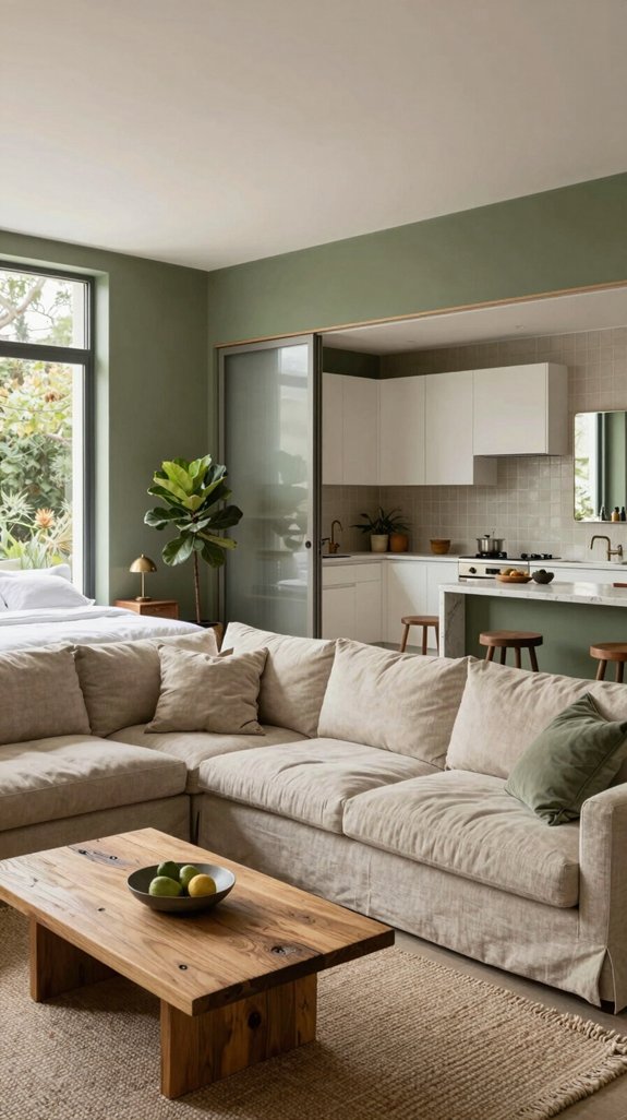
Olive green finds its truest expression in thoughtfully layered interiors. In the living room, it harmonizes with warm natural wood and matte gold accents, forming a rich, grounded backdrop that elevates modern art and sculptural furnishings. For the bedroom, olive is paired with soft terracotta and brushed brass, introducing a tranquil warmth that fosters rest and renewal. The kitchen embraces olive as a cabinetry choice, contrasting it with crisp white quartz countertops and stainless steel finishes—this interplay sharpens the space’s geometry while maintaining an inviting, organic essence. In the bathroom, olive walls or tiles meet pale stone and muted teal, crafting a serene, spa-inspired retreat grounded in nature’s palette. Across each space, olive green anchors the design with depth and sophistication, proving its versatility in shaping a cohesive, contemporary home rooted in calm and intention.
Frequently Asked Questions
Can Olive Green Be Used on Ceilings Without Overwhelming a Room?
Olive green can bring quiet elegance to ceilings when chosen thoughtfully. Opt for a soft, muted shade to maintain balance and prevent the space from feeling closed in. Paired with light walls—like warm whites, cream, or pale gray—the color adds depth without heaviness. The key is subtlety: a whisper of green that enhances the room’s atmosphere while keeping it bright and inviting. Ideal for living rooms or bedrooms, this ceiling choice creates a grounded, nature-inspired feel that feels modern and serene.
How Does Olive Green Affect Acoustic Properties in Open‑Plan Spaces?
Olive green subtly absorbs high-frequency sounds, helping to reduce echo and soften reverberation in open-plan living areas. This rich hue enhances acoustic comfort while maintaining an airy, open feel, fostering a calm and inviting atmosphere ideal for relaxation and creative living.
Are There Pet‑Friendly Paint Finishes for Olive Green Walls?
Low-VOC, washable matte or satin paint finishes are ideal for olive green walls in pet-friendly homes—durable enough to resist scratches and stains while maintaining the rich, soothing depth of the color.
What Is the Best Way to Maintain Olive Green Upholstery?
Spot-clean olive green upholstery with a gentle, pH-neutral detergent, and vacuum weekly using a soft brush attachment to preserve the fabric’s texture. Rotate cushions regularly to prevent uneven wear and maintain shape. For added protection and sustained color, apply a breathable fabric protector every three months.
Can Olive Green Be Paired With Metallic Fixtures Without Clashing?
Olive green pairs beautifully with metallic fixtures in home decor, as its warm, earthy tone complements the cool shine of chrome or the richness of brass. This combination creates a balanced, modern aesthetic that feels both grounded and stylish, adding depth and elegance to bathrooms, kitchens, or living spaces without clashing.



