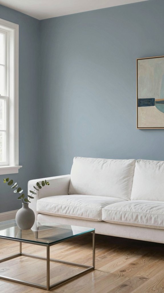
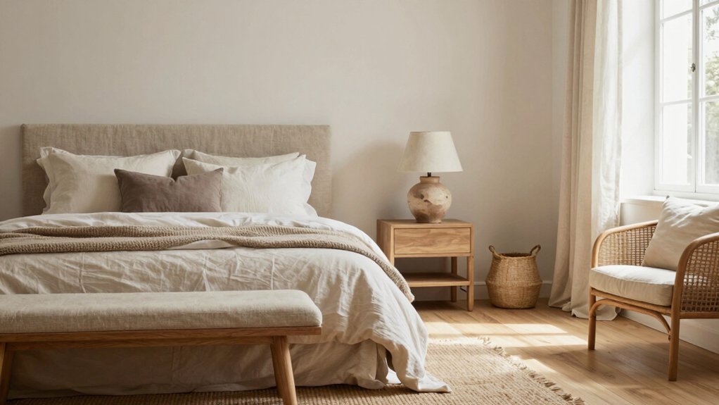
I blend beige, warm grey, and taupe to create a calm, neutral backdrop that shifts with daylight, letting morning light turn beige to crisp ivory and evening lamps mute it to soft sand. I match matte finishes to room function, pair nude walls with dark wood or brushed‑metal accents, and sprinkle in blush‑pink or sage pops for subtle contrast. By testing swatches at different heights and times, I guarantee the palette stays cohesive, and the next sections show how lighting, shelving, and seasonal swaps keep the look fresh.
Why Nude Pairings Feel Calm & Neutral
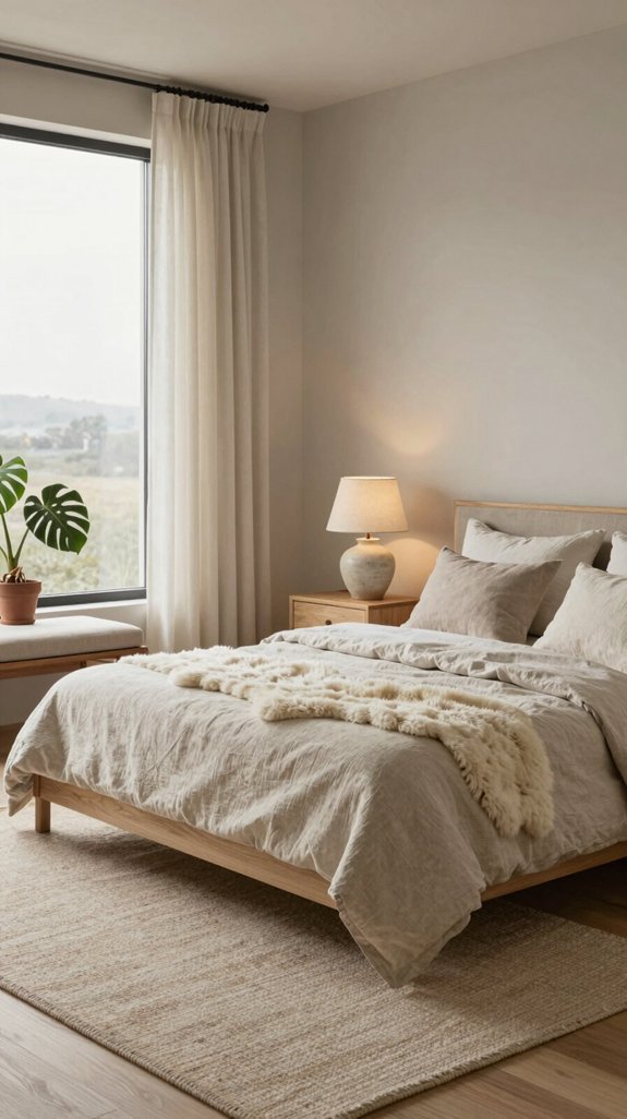
When I blend nude tones in a living space, the result instantly feels calm and neutral because these colors mimic the natural palette of skin and earth, creating a soothing visual backdrop that recedes rather than dominates. I’ve learned that the brain interprets these muted hues as low‑stimulus zones, reducing visual noise and promoting relaxation. Designers leverage this psychological effect to craft interiors that feel spacious yet intimate, aligning with the current trend toward minimalist luxury. By pairing nude shades with subtle textures—linen, brushed metal, or matte wood—I amplify depth without breaking the serene equilibrium, delivering an innovative, timeless aesthetic. While nude creates this tranquil foundation, complementary accent colors like pistachio green wall paint can introduce playful sophistication and visual interest without compromising the overall sense of calm.

ALL-IN-1 PAINT & PRIMER: A hardy multi-purpose and multi-surface one-coat paint and primer in one for almost any indoor or outdoor surface. A wall, ceiling, floor, skirting board, cabinet, furniture and door paint for your bathroom, kitchen, home and garden.

Whether you are restoring, customizing or completely revamping, this leather paint the perfect way to transform boots, jackets, athletic shoes, purses and more
Core Nude Palette: Beige, Warm Grey & Taupe Explained
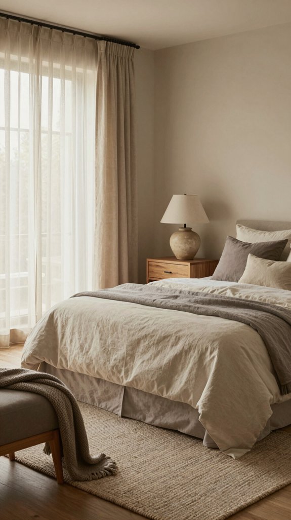
If you want a reliable foundation for any soft‑neutral interior, start with the three core nude shades—beige, warm grey, and taupe—each offering a distinct undertone that anchors the space while allowing texture and accent colors to shine. I explain how beige delivers a sun‑kissed, earthy base that pairs effortlessly with natural fibers. Warm grey injects subtle depth, creating a modern backdrop for metallic or matte finishes. Taupe bridges the two, offering a muted, sophisticated hue that balances light and shadow. For spaces seeking an even more refined aesthetic, smokey grey paints provide an elegant alternative that deepens the neutral palette while maintaining the serene quality these core shades establish. Together they form a flexible, trend‑ready palette that supports innovative layering, sculptural furniture, and unexpected pops of color without compromising serenity.

ALL IN ONE COAT - Natura Onecoat Wood Stain Oil is a hardwax wood oil available in a 25 ml size for sampling and testing. A single coat provides comprehensive protection for all kinds of interior wooden surfaces, flooring, and furniture. Available in various colors, it offers outstanding yield and coverage. Depending on the wood type and sanding, 0.84 oz of the product can cover up to 15 ft².

ALL-IN-ONE MINERAL PAINT - Silk All-in-One Mineral paint is true to its name with a built-in water-based primer and built-in topcoat along with the beautiful pigments to help your piece stay protected from water, grease, and more. The durability of this paint is perfect for kitchen cabinets, bathroom cabinets, as well as painting furniture. Our 16oz container will cover 60-80 sq. feet.

20 YEARS OF NORTH-AMERICAN EXCELLENCE: The preferred choice of professional woodworkers and DIYers in North America. SamaN also promotes greener products.
How Light Changes Nude Shades in Every Room
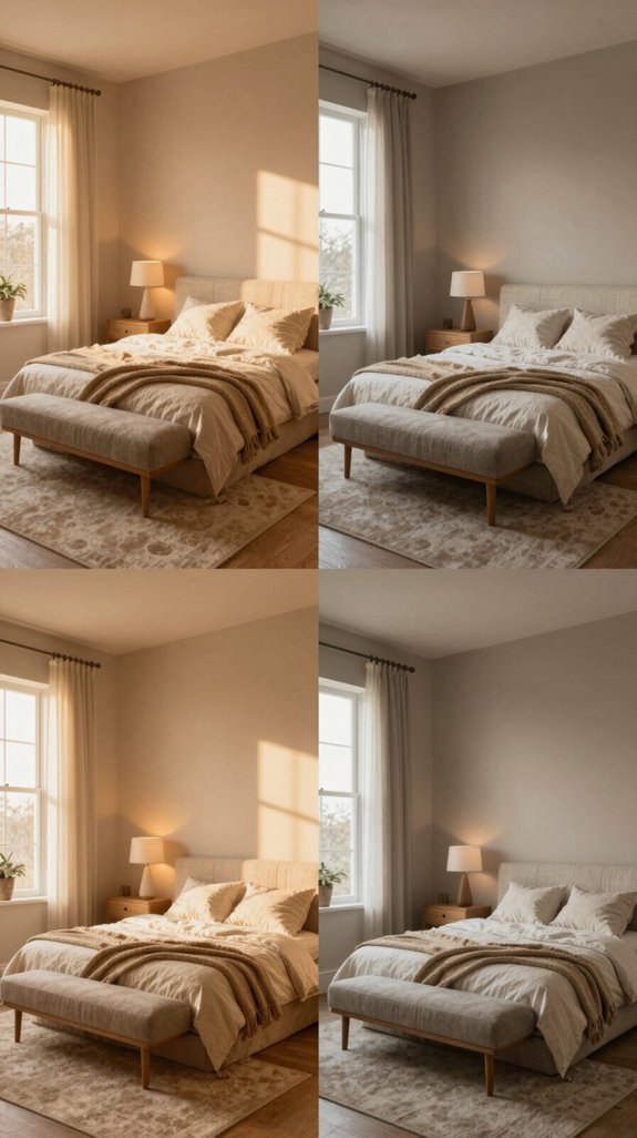
I’ll show you how natural daylight, warm artificial light, and directional spotlights each shift the hue, depth, and perceived temperature of beige, warm grey, and taupe, so you can predict exactly how a room will look from sunrise to sunset. In morning light, cool blues in the sky pull beige toward a crisp, almost ivory tone, while warm grey deepens into a subtle slate. Midday sun adds golden warmth, turning taupe into a sun‑kissed caramel. Evening lamps introduce amber glows, muting beige to a soft sand and enriching warm grey with a cozy, velvety finish. Spotlights create dramatic contrast, highlighting texture and revealing hidden undertones that keep interiors fresh and on‑trend. These neutral palettes work harmoniously with modern grey wall shades that offer sophisticated depth without overwhelming your space.

Modern Industrial Style: Elevate your decor with the X-frame kitchen island lighting, boasting a stylish brushed gold finish and clear glass shade, creating a modern industrial look, It is not just a pendant light, but also an art decoration

Design: Thoughtfully-designed 3 light vanity light with satin etched cased opal glass shades and champagne bronze finish featuring premium finishes; transforms spaces with sophisticated bathroom vanity lights for traditional and transitional decor
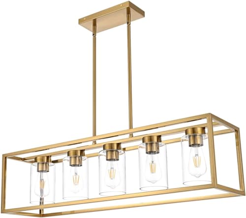
【5-Light Rectangular Kitchen Island Chandelier】The simple rectangle openwork metal frame outlines the beauty of geometry, and the full of industrial style design linear chandelier with clear glass will creates contemporary yet rustic atmosphere for your sweet home, it's the perfect ceiling light to illuminate your kitchen, foyer, dining room, bedroom, living room, cafe bar, club, warehouse, hallway, etc.
How to Choose Nude Paint for Different Spaces
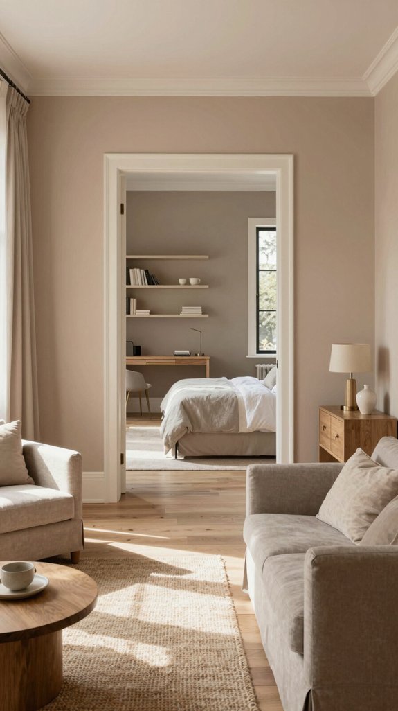
Choosing the right nude paint for each space starts with understanding the room’s function, lighting, and surrounding palette. I assess whether the area is a high‑traffic hub, a tranquil retreat, or a showcase wall, then match the hue to the light temperature—warm LEDs demand cooler taupes, while natural daylight embraces richer sand tones. I prioritize undertones with contemporary finishes: matte for serenity, satin for subtle reflection, and low‑gloss for depth. I test swatches at different heights, observing how the color shifts from sunrise to dusk. For bedrooms and nurseries where air quality matters, selecting non-toxic interior paints ensures that your neutral palette maintains a healthy indoor environment. By integrating texture, furniture, and accent pieces, I craft a cohesive, forward‑thinking nude scheme that elevates any interior.
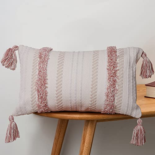
Stylish Boho Design: Features textured tufting, tribal accents, and tassels crafted with care; blends seamlessly with Moroccan, shabby chic, or retro interiors to add dimension and warmth to sofas, beds, or reading nooks

Premium Chenille: Crafted from substantial, high-grade chenille, these decorative pillow covers offer a luxuriously soft, velvety touch and a beautiful drape. Features impeccable stitching with zero loose threads, delivering a premium, heavyweight feel that elevates any space.

Choosing the Right Nude Base for Small Rooms (Nude Pairings)
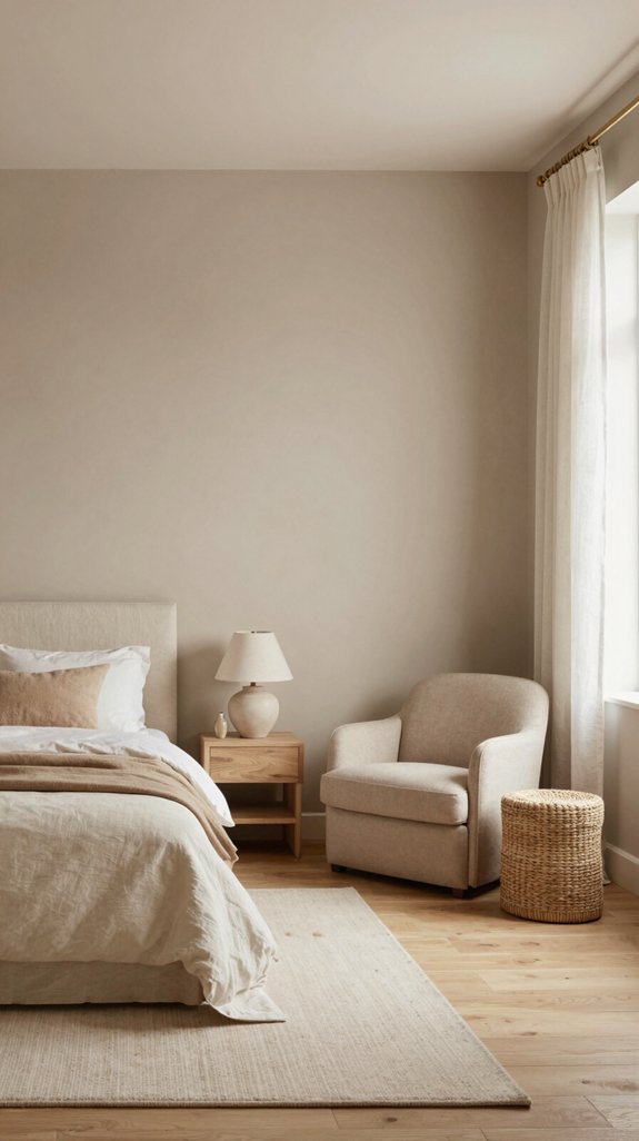
When a small room feels cramped, I start by selecting a nude base that visually expands the space—light, warm neutrals with subtle undertones that reflect natural light while keeping the palette cohesive. I favor soft ivory, muted sand, and gentle greige because they create an airy backdrop that amplifies ceiling height. Pairing these hues with high‑gloss finishes maximizes light bounce, while matte textures add depth without weight. I recommend testing paint swatches at different times of day to guarantee consistency. Bright white interior paints can also serve as an excellent complement to nude bases, offering additional luminosity for rooms that need maximum light reflection. By anchoring the room in a refined nude, I set a versatile stage for accessories, furniture, and evolving trends.

TRUE ALL-IN-ONE PAINT & PRIMER – Skip the extra steps. Evolve Tru Coat combines paint and primer in one, delivering excellent adhesion and coverage on wood, metal, masonry, and concrete with minimal prep.

Includes 30 featured and newest released color card. Sprayed on color to see our colors in your homes lighting for more accurate color choices.

Extremely durable interior paint ideal for use on properly prepared interior walls, ceilings or trim composed of new or previously painted drywall, plaster, masonry, wood and metal
Pair Nude Walls With Dark Wood for Depth (Nude Pairings)
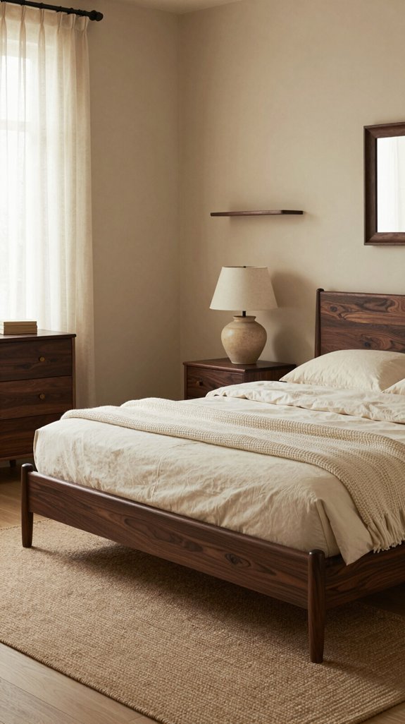
A light nude backdrop instantly gains dimension when you introduce dark wood accents, turning a simple space into a sophisticated, layered environment. I recommend selecting walnut or ebony flooring, reclaimed beams, or matte‑finished cabinets to anchor the palette. The contrast deepens visual interest, creates intimate zones, and highlights architectural details. Pairing nude walls with dark wood also amplifies natural light, as the light tone reflects while the wood absorbs, balancing warmth and drama. I choose sleek hardware, geometric textiles, and brushed metal lighting to keep the look contemporary. For outdoor extensions of this palette, consider weather-resistant wicker furniture to maintain design cohesion across interior and exterior spaces. The result feels luxurious yet grounded, a forward‑thinking design that feels both timeless and avant‑garde.

Ideal for use on interior/exterior surfaces including wood, plastic, plaster, metal, masonry and unglazed ceramic

All-in-One Formula: This furniture paint includes a built-in primer and top coat, providing seamless application on wood, metal, laminate, and more surfaces for a hassle-free painting experience.
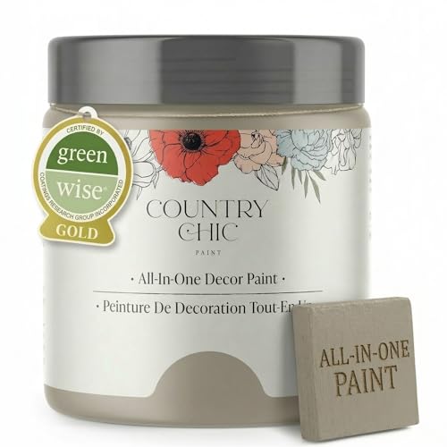
All-in-One Formula: This furniture paint includes a built-in primer and top coat, providing seamless application on wood, metal, laminate, and more surfaces for a hassle-free painting experience.
Mix Nude and Soft White for an Airy Feel (Nude Pairings)
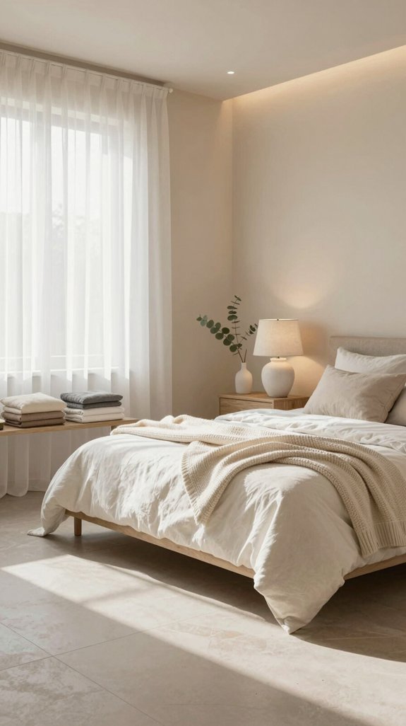
I love how mixing nude with soft white instantly lifts a room, giving it an airy, breathable vibe that feels both serene and sophisticated. I recommend pairing a warm beige sofa with crisp white trim to create a seamless horizon that expands visual space. Introduce subtle texture—linen cushions, matte plaster—to prevent flatness while preserving the ethereal palette. Light reflects off the soft white, amplifying the nude’s gentle undertones and enhancing natural daylight. This contrast respects minimalism yet feels cutting‑edge, aligning with contemporary design trends that favor calm, uncluttered environments. Just as smart cable management keeps spaces visually serene by hiding unsightly cords, thoughtful color coordination maintains the tranquil aesthetic of your interior. Apply the scheme in living areas, bedrooms, or open‑plan offices for a universally uplifting effect.
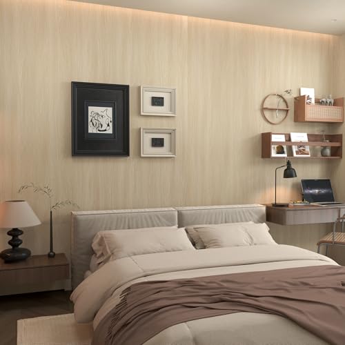
Light wood wallpaper is backed with adhesive technology for strong adhesion, no need for additional adhesives, just peel and stick, even a beginner can do it, it can be used as a replacement for paint, wallcoverings and wallboards, it's a cost-effective and easy way to renovate

CHALK MINERAL PAINT - Driftwood is a light gray chalk mineral paint. Whether it’s in your bedroom, bathroom, or home office, use this soft color to create a soothing space. Our chalk mineral paint is ideal for wood, metal, plastics, brick, stone, glass, concrete, and so much more. Driftwood is a neutral gray perfect for your beach bungalow or vintage Victorian home. This serene color is effortless and elegant. An 8oz container of this paint should cover about 38 sq. ft.

20 YEARS OF NORTH-AMERICAN EXCELLENCE: The preferred choice of professional woodworkers and DIYers in North America. SamaN also promotes greener products.
Add Warm Metallics That Complement Nude Pairings
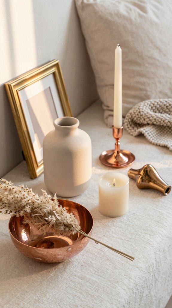
If you layer warm metallic accents over nude tones, the subtle sheen instantly lifts the whole space without sacrificing its calm elegance. I recommend brushed brass lamp bases, copper‑finished picture frames, and gold‑tone hardware to inject kinetic energy while preserving softness. These metals echo the undertones of beige, sand, and cream, creating a seamless dialogue between light and material. Pair a copper side table with a linen sofa, or choose a brass chandelier above a neutral rug, and you’ll see texture multiply without visual clutter. Consider incorporating decorative frames into your scheme to frame artwork or media within your neutral palette. The key is restraint: one or two focal pieces, strategically placed, generate depth, keep the palette cohesive, and signal forward‑thinking design.

Brush Nickle Ceiling Mount Light Fixture: Designed with a brushed nickel finish metal, this semi-flush mount chandelier light with an elegant and modern looking. Perfect for your home lighting and decoration

Modern & Stylish Design: The outer layer of the bathroom vanity light is metal with a brushed gold finish, and the inner layer is a cylinder clear glass. This double-layer design offers a modern yet elegant aesthetic that blends seamlessly with a variety of bathroom decor styles

Exquisite Marble: Modern alabaster wall sconce, Modern alabaster wall sconces adopt oval design allows the light to pass through the alabaster lampshade, which is bright but not dazzling, adds to the atmosphere of the wall, Adding a timeless charm to any space
How to Choose Nude Rugs That Anchor a Room’s Look
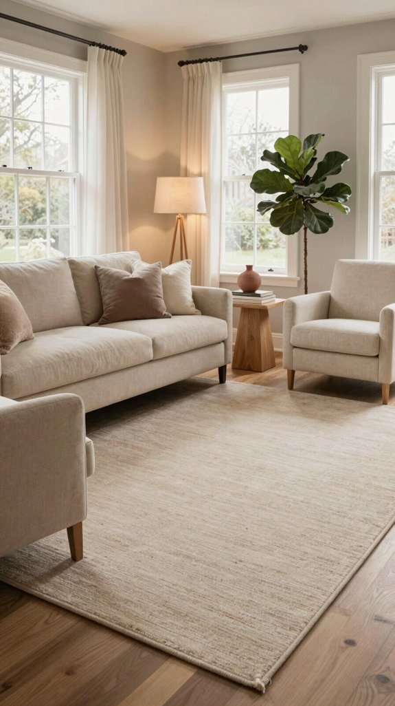
Choosing the right nude rug starts with understanding the room’s scale and light. I measure the floor area, then select a rug that fills the space without overwhelming it, balancing proportion with the natural luminance. I favor low‑sheen, high‑pile textures that absorb light, creating depth while preserving a soft palette. I match the rug’s undertone to adjacent walls or upholstery, ensuring a seamless visual flow. I consider sustainable fibers—recycled wool or bamboo blends—to align with cutting‑edge eco trends. High-pile textures offer superior durability for everyday wear while maintaining their soft aesthetic. Finally, I anchor focal points by placing the rug beneath coffee tables or seating clusters, cementing the room’s cohesive, contemporary aesthetic.

1. Premium Fabric: Made from a sturdy cotton-blend material, these vintage pillow covers feel cozy while offering excellent durability. The fabric is thick, strong, and naturally resistant to fading — perfect for everyday use in any home that values comfort and long-lasting quality.

SOFT MATERIAL: The couch fall pillow covers are well made from luxurious and solid thick chenille material, which is super soft and comfortable

✨ 【Luxurious Jacquard, Artistic Texture】: Elevate your home decor with our exquisite jacquard pillow covers. Crafted from a premium blend of 50% cotton and 50% polyester, the intricate woven pattern creates a stunning dimensional texture that feels as luxurious as it looks. It's not just a pillow cover; it's a piece of art for your sofa or bed.
Incorporate Nude Furniture Without Making It Dull
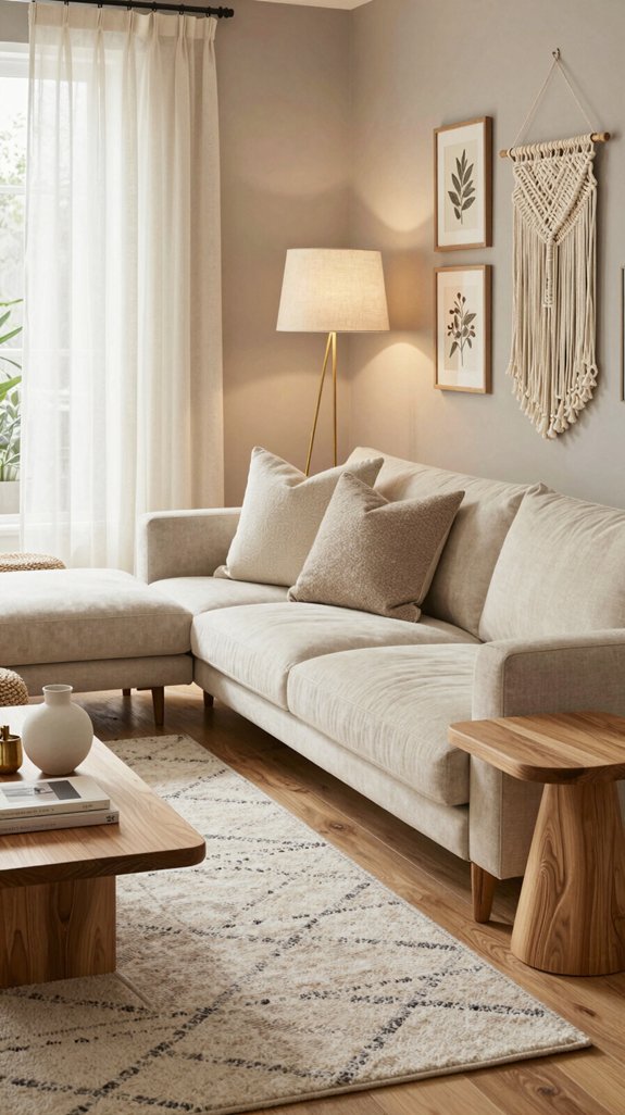
Often, the key to keeping nude furniture from slipping into monotony is to layer texture and contrast strategically. I start with a matte linen sofa, then add a woven jute ottoman and a brushed‑metal coffee table; each material injects depth without breaking the palette. I sprinkle patterned cushions in subtle geometric prints, letting their raised fibers catch light. I choose a sculptural lighting fixture in brushed brass, its reflective surface amplifying shadows. I finish with a reclaimed‑wood sideboard, its grain breaking the uniformity. By mixing tactile finishes, I preserve the serene nude vibe while ensuring every piece feels dynamic, fresh, and undeniably modern. Incorporating handmade decor styles with artisanal character further elevates the space by adding authentic craftsmanship and individuality to your neutral palette.
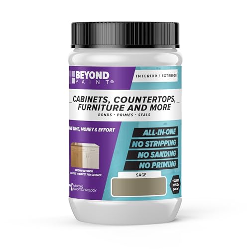
Beyond Paint furniture, cabinets and more all-in-one refinishing paint - quart - color: Sage

SUPERIOR COVERAGE ON VARIOUS SURFACES: Dive into your next DIY project with our all-in-one paint, designed for superior coverage on multiple surfaces. Tackle wood, laminate, metal, glass, resin, or cement with ease. Achieve a smooth finish with fewer coats for maximum impact. Whether you’re after white wood paint for furniture, matte black paint, or pink paint for walls, our versatile furniture paint no sanding all in one works with spray guns and airbrushes for seamless application.

Extremely durable interior paint ideal for use on properly prepared interior walls, ceilings or trim composed of new or previously painted drywall, plaster, masonry, wood and metal
Balance Nude With Subtle Color Pops for Personality (Nude Pairings)
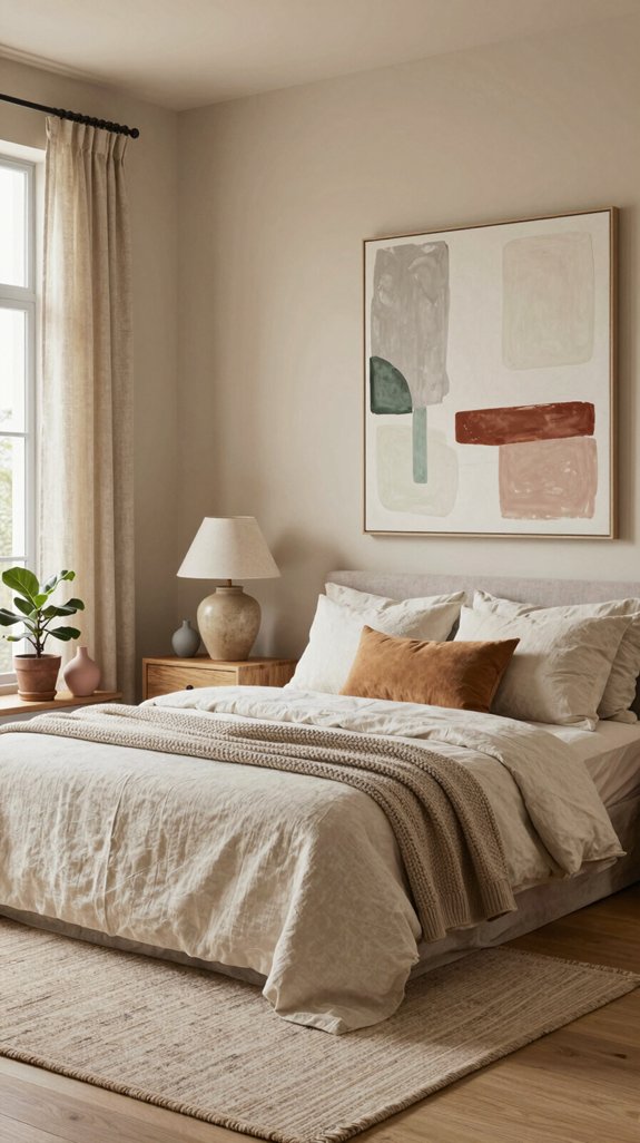
I keep the nude base alive by slipping in small, unexpected hues that catch the eye without overwhelming the calm. I pair blush‑pink cushions, muted sage throws, or warm mustard vases with a neutral sofa, creating a whisper of personality that feels intentional, not forced. I choose pigments that echo seasonal palettes—soft coral, dusty lilac, or pale teal—so the space evolves with trends while retaining serenity. I balance each pop with restrained accessories, ensuring the color never dominates. To further enhance organization and visual flow, I incorporate modular cube storage that keeps accessories and décor items neatly arranged while maintaining the soft aesthetic. This method delivers a curated, forward‑thinking aesthetic that feels fresh, cohesive, and unmistakably yours.
Create Contrast With Black or Charcoal Accents in Nude Pairings
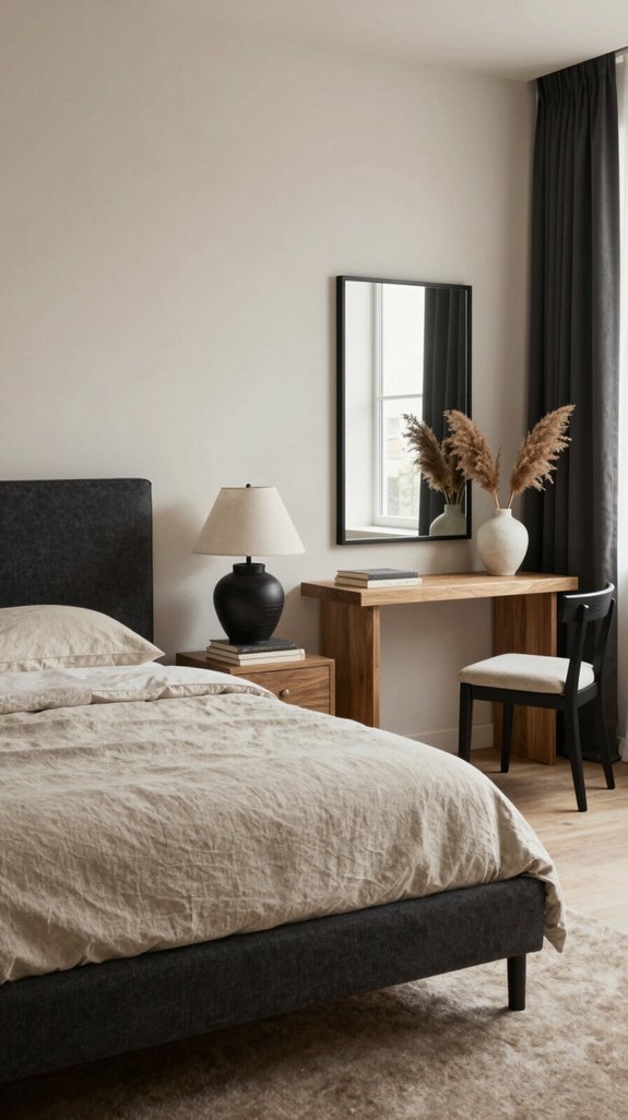
When I layer black or charcoal accents onto a nude foundation, the contrast instantly sharpens the room’s visual hierarchy, turning subtle serenity into a bold statement. I pair matte black picture frames with creamy walls, letting edges bite through soft textures. Charcoal velvet cushions on a sand‑tone sofa create depth without overpowering. I choose sleek metal lighting in gunmetal finishes to echo the dark hue, reinforcing a modern edge. While burgundy interiors showcase how wine-red paint tones can add richness to spaces, the high-contrast nude and black approach offers a more minimalist alternative. The key is restraint: one or two statement pieces, balanced by ample neutral space, keep the design sophisticated. This high‑contrast strategy satisfies trend‑savvy interiors seeking daring, yet refined, innovation.
Use Green Plants to Freshen Nude Interiors (Nude Pairings)
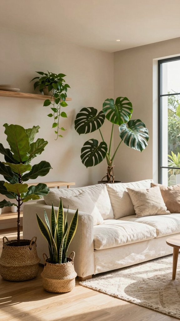
Can a single leaf transform a muted, nude‑toned space into a lively sanctuary? I’ve learned that strategic greenery does exactly that. I select sculptural succulents, tall fiddle‑leaf figs, and cascading pothos to punctuate soft beige walls, creating kinetic contrast without breaking the palette. I place plants at eye‑level, near windows, and on floating shelves, letting natural texture and fresh chlorophyll breathe life into the room. I pair matte pots in warm ivory or brushed gold to maintain cohesion while amplifying the organic vibe. This approach follows the latest interior‑design trend: minimalist neutrals energized by purposeful, living accents.
How to Use Nude in Kitchen Cabinets & Backsplashes (Nude Pairings)
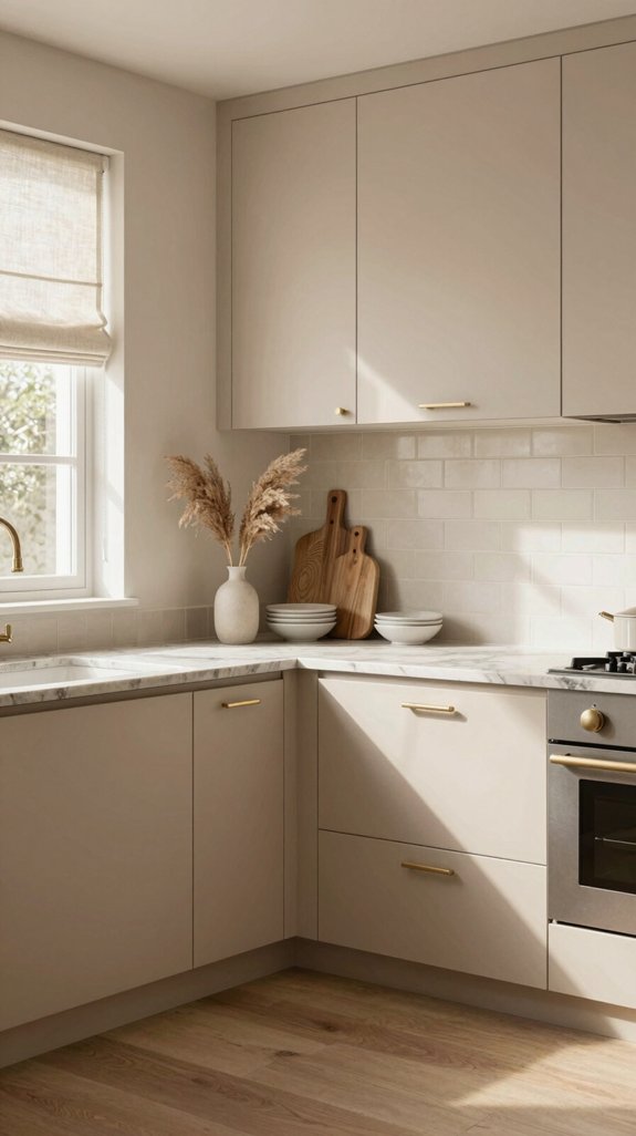
If you want a kitchen that feels both timeless and effortlessly modern, start by coating the cabinets in a warm, muted nude and pairing them with a subtly textured backsplash. I recommend matte-finish veneer for sleek reflectivity, then choose a linear stone or brushed metal tile that echoes the nude’s undertones. The key is contrast without clash: a soft beige against a pale ivory mosaic creates depth while preserving serenity. Integrate brass hardware to inject contemporary warmth, and consider hidden LED strips behind the backsplash for ambient illumination. This palette balances heritage with innovation, allowing appliances to recede and the space to breathe. Each element—from the handmade tile details to the brushed metal accents—showcases the artisanal techniques that elevate a kitchen from merely functional to genuinely inspiring.
Design Nude‑Focused Bathrooms for Spa‑Like Calm (Nude Pairings)
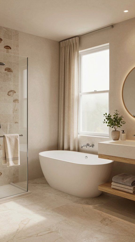
I’ll start by layering soft nude tiles on the floor and walls, then introduce subtle texture through matte‑finish stone or pebble mosaics that echo the same warm undertones. Next, I install a freestanding tub framed by brushed brass accents, letting the nude palette amplify its sculptural presence. I pair sleek, backlit vanity mirrors with muted beige countertops, ensuring reflections stay gentle yet crisp. I weave in organic elements—bamboo shelving, linen‑soft towels—while maintaining a seamless chromatic flow. Finally, I integrate dimmable LED strips beneath floating shelves, creating a hushed glow that transforms the space into a spa‑like sanctuary, all while staying on the cutting edge of interior design trends. To further enhance the serene atmosphere, I layer in accent lighting kits that provide subtle mood illumination without disrupting the tranquil nude color scheme.
Pick the Right Nude Paint Finish: Matte, Satin or Eggshell
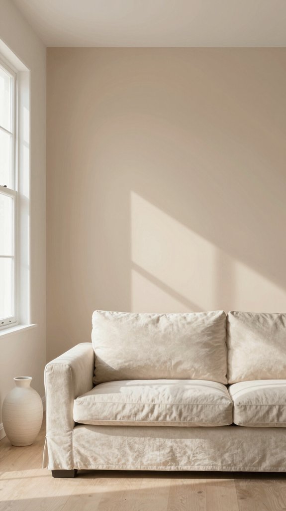
When choosing a nude paint finish, I weigh how each surface treatment interacts with light and texture to achieve the desired mood. Matte absorbs illumination, creating a velvety, understated backdrop that feels intimate and modern. Satin reflects a subtle sheen, adding depth and a tactile whisper that works in high‑traffic zones without sacrificing softness. Eggshell strikes a balance, offering a gentle luster that hides imperfections while maintaining a refined, contemporary edge. I match the finish to the room’s function: matte for serene retreats, satin for dynamic living spaces, eggshell for versatile zones. Versatile beige wall paints adapt seamlessly across multiple rooms, making them ideal for creating cohesive color schemes throughout your home. This nuanced approach guarantees the nude palette stays fresh, sophisticated, and on‑trend.
Test Nude Paint Samples Before You Commit (Nude Pairings)
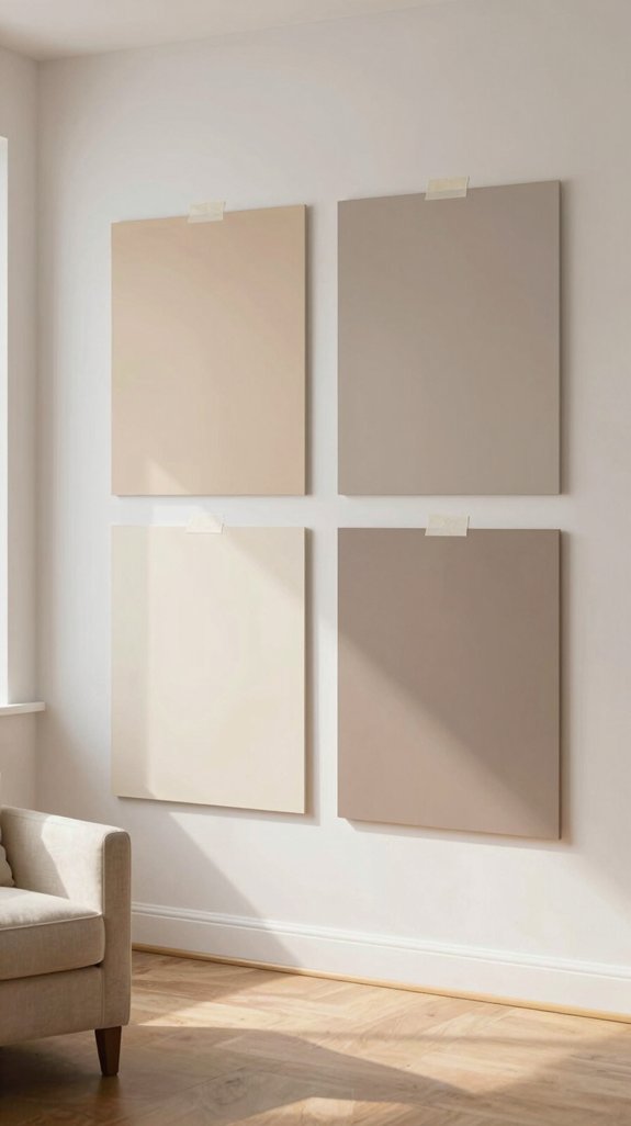
Even before I settle on a shade, I slap a few swatches on the wall and let them live for a full day, because natural light shifts dramatically from sunrise to sunset and can turn a perfect nude into a washed‑out gray. I then photograph each panel at dawn, noon, and dusk, comparing hue fidelity on my phone’s calibrated screen. I also press a fingertip to gauge texture, ensuring the finish won’t clash with matte furniture or glossy accents. By rotating samples weekly, I observe how the room’s color temperature evolves, confirming that the nude remains soft, cohesive, and on‑trend before I commit to a full‑wall application. For the healthiest indoor environment, I prioritize low-VOC paints that maintain color vibrancy while minimizing air pollution and odors throughout the space.
Budget‑Friendly DIY Nude Projects for Instant Updates (Nude Pairings)
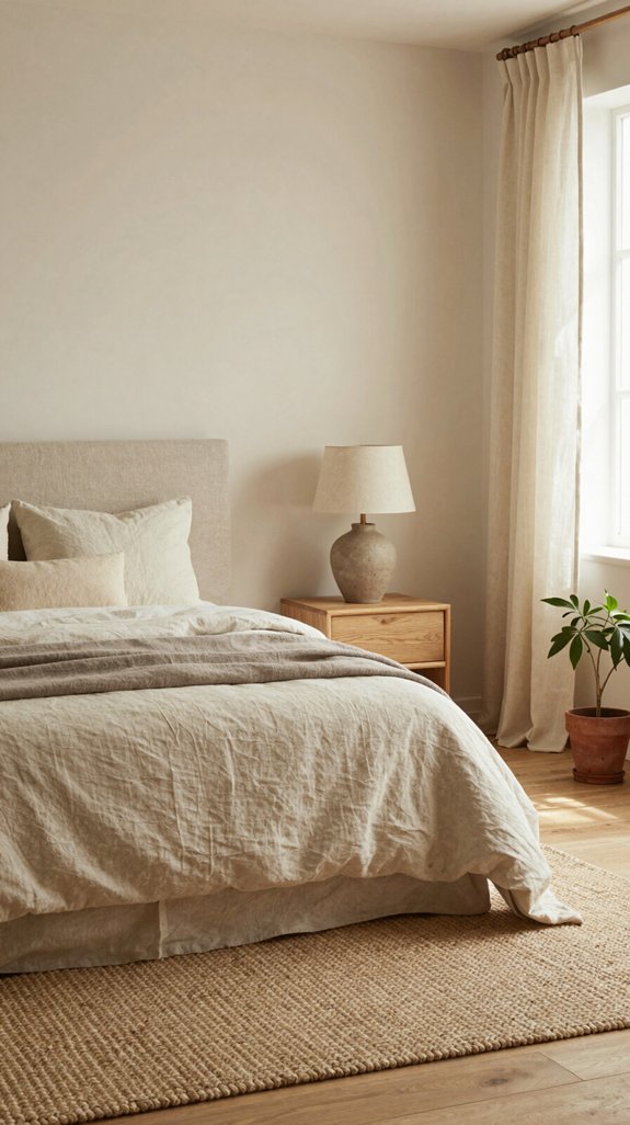
After testing swatches on the wall, I move straight to quick, low‑cost updates that let a nude palette transform a space without a full repaint. I replace dated trim with matte‑finished, sand‑papered molding painted in a warm taupe, instantly grounding the room. I swap out heavy drapery for sheer linen panels in soft ivory, letting natural light amplify the subtle hue. Sheer panel curtain sets create an airy, refined aesthetic while maintaining the warmth of the nude color scheme. I apply peel‑and‑stick wall tiles in brushed stone finish, creating texture without demolition. I reupholster a side chair using affordable, high‑grade linen in muted sand, stitching a modern silhouette. These projects deliver immediate, on‑trend impact while keeping the budget tight.
Avoid Common Mistakes When Working With Nude Hues (Nude Pairings)
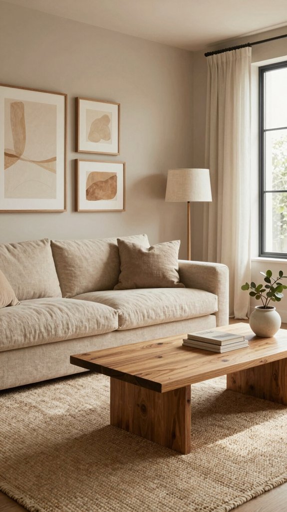
I’ll walk you through the most common slip‑ups that sabotage a nude‑centric design, so you can keep the palette looking fresh instead of flat. First, I avoid monotone layering; I mix warm caramel with cool taupe to create depth. Second, I don’t let beige dominate— I add a pop of muted coral or sage to energize the space. Third, I steer clear of mismatched undertones; I match undertones across textiles, walls, and accessories. Fourth, I resist over‑lighting; I use soft, diffused fixtures to preserve subtlety, similar to how ceiling fans with integrated lighting can provide gentle illumination without overwhelming neutral tones. Finally, I limit heavy patterns; I choose fine textures and geometric accents that reinforce a contemporary, airy vibe.
Style Nude Shelving With Books & Decorative Objects (Nude Pairings)
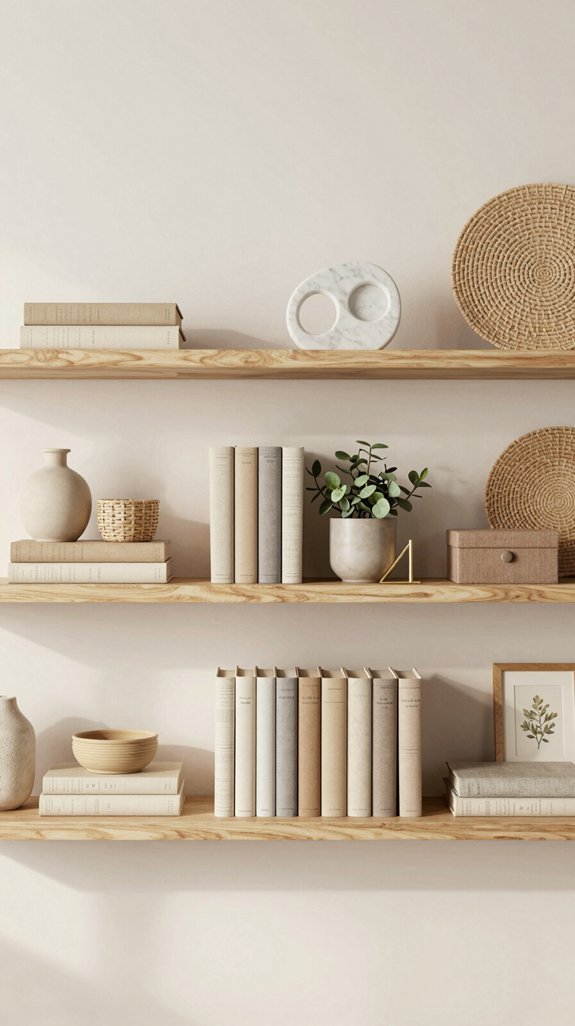
Three simple rules keep nude shelving from feeling sterile: balance weight, introduce texture, and play with subtle color accents. I start by arranging heavier, matte‑finished books on the bottom tier, then layer lighter paperbacks and glossy coffee‑table books upward to create visual equilibrium. Next, I intersperse woven baskets, brushed‑metal figurines, and hand‑carved wooden bowls, letting each material speak against the soft backdrop. Finally, I add muted‑green succulents, pale‑gold vases, or blush‑pink ceramics as accent pieces that echo the nude palette without overwhelming it. This curated mix transforms a plain shelf into a dynamic, trend‑forward focal point.
Seasonal Decor Swaps That Keep Nude Interiors Fresh (Nude Pairings)
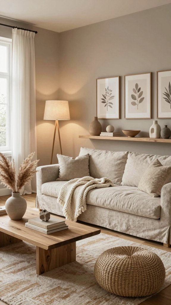
I keep my nude interiors lively by swapping out seasonal pieces that echo the same soft palette while introducing fresh texture and hue. In spring I layer ivory linen throws with pastel sage cushions, then replace them with muted terracotta vases and woven rattan trays for summer. Autumn arrives, I introduce warm walnut bowls, brushed‑metal candle holders, and deep‑gray wool rugs that maintain neutrality yet add depth. Winter calls for sleek marble accents, frosted glass jars, and subtle blush‑toned velvet pillows that reflect low light. Decorative centerpieces serve as anchor pieces that can be easily rotated throughout the seasons while maintaining your neutral aesthetic. Each swap respects the nude foundation, refreshes the space, and aligns with cutting‑edge interior trends without sacrificing harmony.
Match Nude With Lighting Fixtures for Mood Control (Nude Pairings)
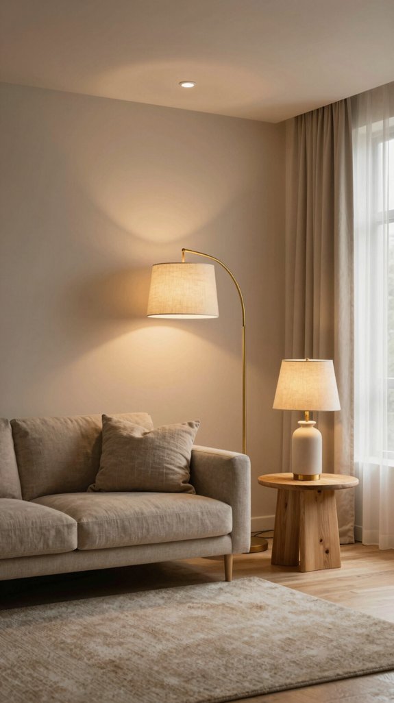
When I pair nude walls with the right lighting fixtures, I instantly shape the room’s mood while preserving the soft, neutral palette. I choose dimmable LED recessed lights that bathe the space in a warm 2700 K glow, then layer pendant lamps in brushed brass to add subtle contrast. For kinetic impact, I integrate smart color‑changing strips behind sheer curtains, letting me shift from sunrise amber to cool moonlit blue with a voice command. Minimalist track lighting highlights texture without overwhelming the nude backdrop, while sculptural floor lamps become artful focal points, reinforcing a curated, innovative ambience. Ceiling light fixtures designed for general illumination can anchor a neutral interior while maintaining the soft aesthetic throughout the space.
Final Checklist: Cohesive Nude Pairings Throughout Your Home
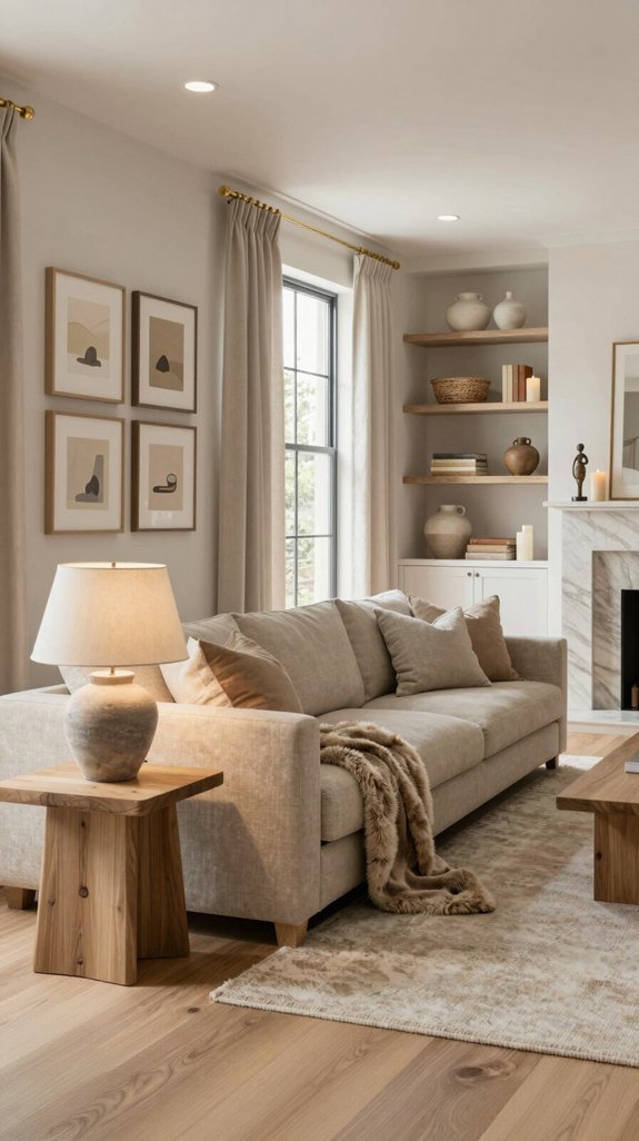
If you want every room to feel like a seamless extension of your nude‑centric vision, start by confirming that each element—walls, textiles, lighting, and accessories—shares a unified undertone and intentional contrast. I verify that my base palette (warm ivory, soft taupe, muted sand) repeats across spaces, then layer accent tones—blush, mushroom, graphite—to create depth. I check that finishes (matte, satin, brushed metal) echo the tactile language of the interiors. I guarantee lighting temperature aligns with the nude hue, avoiding harsh cool whites. Finally, I walk the house, confirming visual flow, balanced proportion, and cohesive narrative before declaring the design complete.
Frequently Asked Questions
Can I Combine Nude Walls With Bright Artwork Without Clashing?
I say yes—pairing nude walls with bold artwork works when you choose pieces that echo a hue from the room’s palette, balance scale, and anchor the composition with subtle metallic or matte accents.
Do Nude Paint Colors Affect Perceived Room Temperature?
I’d say nude paint can make a room feel cooler, especially when the walls reflect soft, diffused light like a misty sunrise; the subtle hue tricks your eye, creating a breezy, modern atmosphere.
How Often Should I Reapply a Matte Nude Finish for Durability?
I recommend reapplying a matte nude finish every 3‑5 years, depending on traffic and exposure; high‑traffic zones may need a touch‑up at the three‑year mark to maintain durability and fresh, modern appeal.
Are There Pet‑Friendly Nude Paint Options for High‑Traffic Areas?
I’ve seen a boutique hotel use a low‑VOC, washable matte nude that survived daily pet traffic; it’s pet‑friendly, stain‑resistant, and retains a soft, neutral vibe while meeting high‑traffic durability standards.
Can I Use Nude Tones in Home Offices Without Reducing Focus?
I assure you nude tones can boost focus by minimizing visual clutter; I pair them with crisp whites or muted blues, using subtle texture contrasts to keep energy high while preserving a calm, professional vibe.