

Leopard print finds harmony in interiors when paired with soft charcoal, warm ivory, muted navy, or dove-gray—nuanced neutrals that anchor the bold pattern while allowing it to stand out with elegance.
Walls painted in low-VOC matte finishes enhance the sense of calm, reflecting light gently and creating a serene backdrop.
Introduce subtle warmth with brushed copper or gold accents in lighting fixtures, hardware, or framed decor for a touch of refinement.
For a delicate contrast, layer in muted mint, blush rose, or powdery sky blue through throw pillows, area rugs, or a single upholstered chair, limiting the palette to three pastel tones to maintain cohesion.
When balanced thoughtfully, leopard print becomes a striking yet livable focal point—timeless, curated, and full of quiet confidence.
Best Colors to Pair With Leopard Print
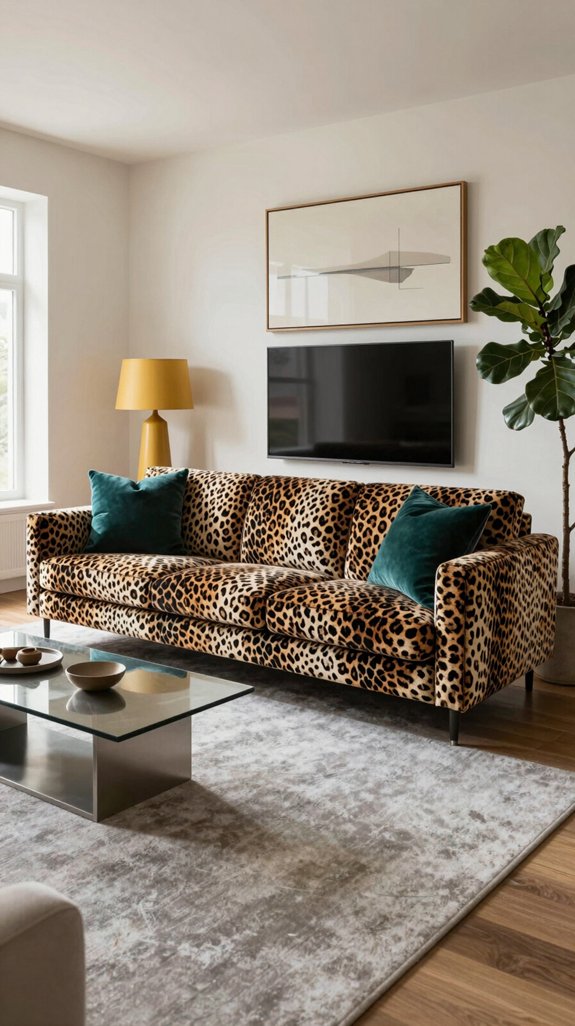
To keep leopard print from overwhelming a space, start by anchoring the pattern with a neutral base—soft charcoal, warm ivory, or muted navy—then introduce accents that complement its energy without vying for attention. Incorporate finishes like a sleek teal sofa, a brushed copper floor lamp, or a matte gold area rug to add subtle metallic sheen that feels modern and grounded. Pairing leopard with unexpected hues such as electric lime or deep plum in a single statement piece—like a decorative vase or throw pillow—creates a deliberate pop of color. Layer in textured materials such as linen curtains, velvet cushions, or woven wool throws to enhance visual depth. Choose furniture with clean, minimalist lines to maintain balance and prevent clutter. This thoughtful combination allows the leopard print to stand out while blending into a cohesive, stylish interior scheme. Opt for paints with low VOC emissions to improve indoor air quality and support a healthier home environment.
Neutral Shades That Calm the Print
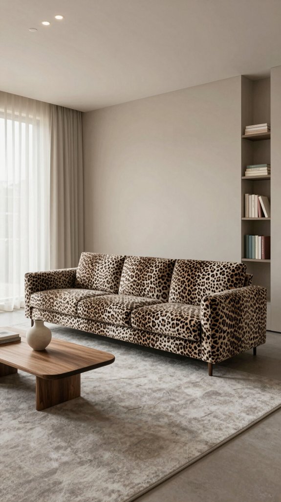
I’ve found that anchoring leopard print with soft, muted neutrals instantly tames its wild energy in interior spaces. I pair the pattern with warm ivory, dove-gray, and sand-beige to create a calm backdrop that lets the print breathe without overwhelming the room. These shades absorb excess visual noise, allowing the texture to become a sophisticated accent rather than a focal storm. I also experiment with brushed taupe and gentle mushroom tones, which echo natural surfaces and add depth while preserving serenity. By layering these neutrals in upholstery, wall paint, or flooring, I achieve a balanced composition that feels both dynamic and inviting. The result is a space where boldness coexists with understated elegance, perfect for contemporary interiors. The durability of weather‑resistant resin ensures that outdoor furniture retains its color and shape despite exposure to sun and rain.

Ideal for use on interior/exterior surfaces including wood, plastic, plaster, metal, masonry and unglazed ceramic

ALL-IN-1 PAINT & PRIMER: A hardy multi-purpose and multi-surface one-coat paint and primer in one for almost any indoor or outdoor surface. A wall, ceiling, floor, skirting board, cabinet, furniture and door paint for your bathroom, kitchen, home and garden.
How to Choose the Right Neutral for Leopard Print
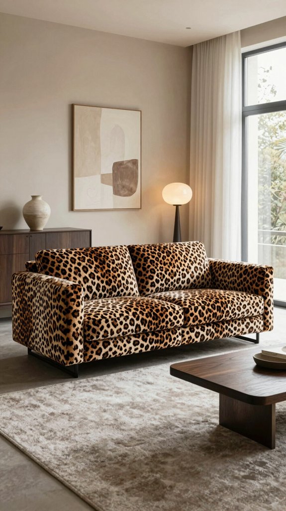
When choosing a neutral to pair with leopard print in a room, begin by assessing the lighting and existing color scheme, as these elements determine whether a warm ivory or a cool dove-gray will best enhance the pattern without dulling its impact. Consider the direction and quality of natural light—whether it casts a golden or bluish tone—and observe how it interacts with fixed elements like flooring, walls, and built-in furnishings. In spaces flooded with warm sunlight, ivory helps amplify the print’s golden undertones, creating a cohesive, inviting atmosphere. In rooms dominated by cool artificial lighting or north-facing light, dove-gray provides a modern, balanced contrast that allows the leopard print to stand out with clarity. Always test paint or fabric swatches at eye level on multiple walls, observing them from morning to evening to see how they evolve with changing light. This method ensures the chosen neutral complements the boldness of leopard print while maintaining a sophisticated, contemporary interior. The texture of 3D wall art can also influence the perceived depth and richness of the surrounding colors.

Mid Century Modern Floor Lamp : This mid-century modern floor lamp is a perfect blend of function and art. The gold floor lamp not only provides warm, layered ambient lighting but also instantly elevates the style of a room. Whether placed beside a sofa, in a reading nook, or in a corner of the bedroom, the brass floor lamp’s elegant vintage lines and modern minimalist texture harmonize with various home décor styles, becoming an indispensable touch of tasteful elegance in your home

Exceptional Support: Proudly based in California, O'Bright offers direct and personal customer service. Reach out to us by phone or email for any inquiries or warranty needs. Experience the peace of mind that comes with accessible, real-person support from an established American company.

Modern Floor Lamp with 0-100% Fully Dimmable Brightness :Compared to traditional non-dimmable living room floor lamps, our unique floor lamp offers a full stepless dimming function(0 - 100%), making it adaptable to various room styles and lighting requirements you need. This brass floor lamp with linen shade has a convenient knob switch – simply twist it to customize your favorable lights of floor lamps for living room and bedrooms
Soft Pastels That Complement Leopard Print
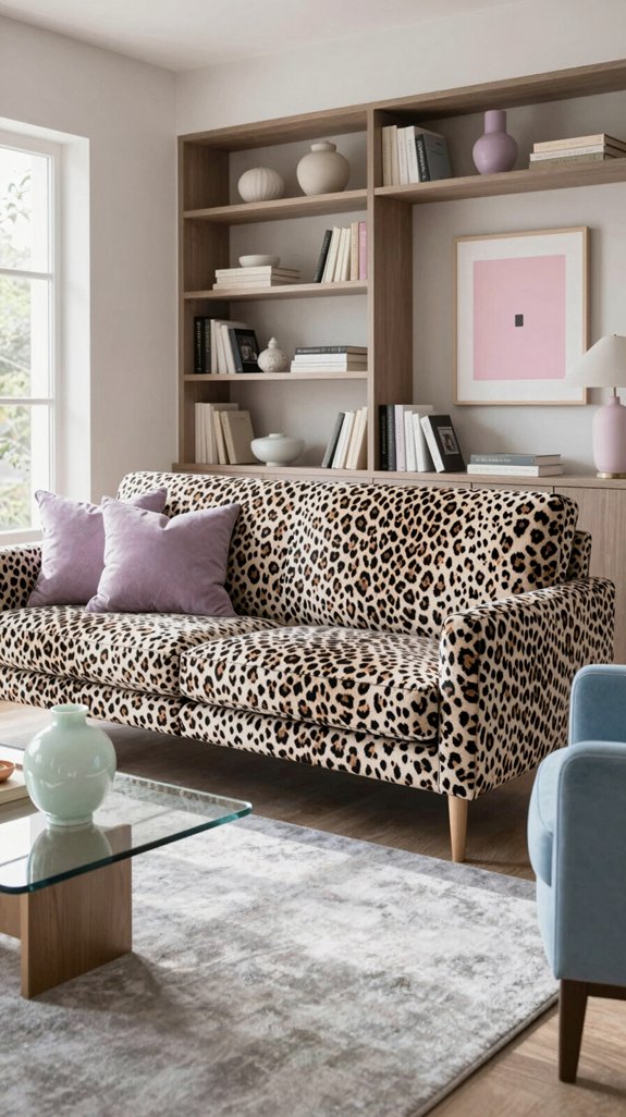
Some soft pastels—like muted mint, blush rose, and powdery sky blue—pair beautifully with leopard print in home decor, tempering its boldness while maintaining a fresh, contemporary feel. A touch of mint in a throw pillow adds a cool, refreshing contrast that feels both spirited and serene. Blush rose brings a warm, earthy glow, harmonizing with the natural undertones of the print without competing with it. Powdery sky blue lends an airy, open quality, helping to lighten the visual weight of the pattern and enhance the room’s sense of space. These hues work well in accent pieces such as ceramic vases, area rugs, curtains, or tabletop decor, offering a subtle counterbalance that keeps the design dynamic yet cohesive. The goal is to let the pastels play a supporting role—soft, understated touches that highlight the leopard print’s richness without drawing attention away from it. Consider using decorative bins to keep pet supplies organized while complementing the overall aesthetic.

Unique and Adorable Spring Blooming 3D Flower Design: Handmade flower throw pillow cover with modern style, serves as an accessory for home decoration

Premium Flannel Pillow Cover :Made of soft flannel fabric with single-sided HD printing. Each pillow cover measures 18 × 18 inches (45 × 45 cm) and fits most standard throw pillows.

FACRIC: The pillow cover is made of ultra soft velvet, comfortable and skin friendly, and also not easy to fade. The throw pillow is filled with PP cotton, high fluffiness, not easy to deform.
Applying Pastels to Walls and Furniture
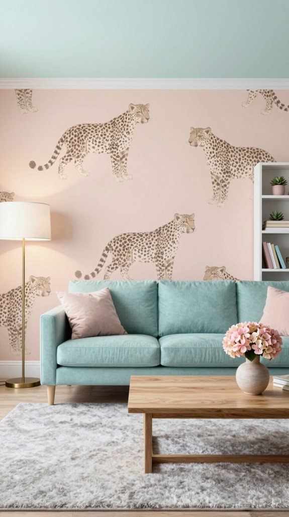
The soft pastels that complement a leopard-print sofa can also serve as the foundation for an entire room’s color scheme. A muted mint wall pairs beautifully with a sleek ivory sideboard, allowing the pastel tone to echo the sofa’s subtle hues while maintaining an open, breathable atmosphere. A blush-pink armchair introduces warm contrast, its rounded silhouette softening the bold geometry of the leopard pattern. A light sage ceiling enhances the sense of vertical space, creating a smooth transition from walls to ceiling. To add depth, a pastel-tinted woven rug rests beneath the sofa, its textured fibers grounding the space and tempering the print’s visual impact. By restricting the palette to three harmonized pastels, the design stays cohesive, ensuring the leopard print remains the focal point without dominating the room. Moisture‑resistant paint helps protect walls in humid areas, especially in bathrooms where mold is a concern.

Machine Washable & Stain-Resistant: Effortlessly clean this rug in your washing machine on a gentle cycle; made from high-quality faux wool fibers that resist stains, spills, and shedding, making it ideal for busy households with kids and pets.

The Alie Collection area rug has an underlying traditional motif overlaid with a slightly higher pile for a softening effect and distressed look. Designed by Amber Lewis in collaboration with Loloi.

The Ember Collection by Loloi Angela Rose x Loloi is a soft flatweave area rug that’s space-dyed for a dynamic range of neutral colors, with a timeless plaid pattern that adds depth to any room.
Deep, Grounding Tones for a Sophisticated Look
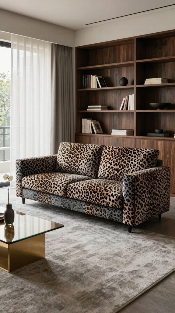
If you want the leopard-print sofa to feel grounded rather than overpowering, pair it with deep, rich tones that bring sophistication to the space. Opt for charcoal, midnight navy, or espresso as foundational colors; these shades temper the boldness of the print while enhancing its inherent elegance. A matte finish on walls or larger furniture pieces helps diffuse light, adding quiet depth that feels both contemporary and enduring. Introduce textured fabrics—like velvet cushions or woven throws—in complementary hues to build tactile interest without disrupting the visual harmony. The outcome is a thoughtfully balanced room where the leopard motif stands out as a striking centerpiece, not a chaotic element. This method appeals to bold design tastes while preserving a calm, unified interior. Consider using an antiviral surface to protect high‑touch areas while maintaining the sophisticated aesthetic.

ACRYLIC PAINT & PRIMER (2 in 1) – PRO matte black paint with 35%+ high-performance binder delivers strong adhesion, smooth coverage and a rich charcoal-black, low-sheen finish on properly prepared surfaces.

ALL-IN-ONE PAINT AND PRIMER: Saves time and effort by priming, sealing, and finishing in one step for smooth, efficient coverage

PAINT + PRIMER IN ONE: Evolve’s paint-and-primer formula helps you get great coverage from the start, sealing your surface and reducing the extra work of multiple coats.
Using Grounding Tones on Ceilings and Accents
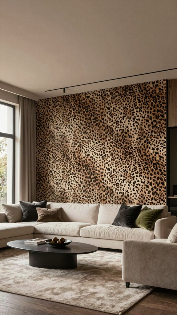
When drawing the eye upward, a subtle grounding tone on the ceiling softly neutralizes the leopard print below, creating a seamless visual flow. Muted taupe, warm greige, or soft slate are ideal choices—calm, earthy hues that anchor the space without competing with the bold pattern. These tones mirror natural pigments, allowing the print to remain vibrant while the ceiling recedes into a soothing backdrop. To extend the harmony, repeat the same grounding color on trim, built-in shelving, or a sculptural floor lamp. This repetition fosters continuity and minimizes visual clutter. The secret lies in restraint: using one consistent tone across ceilings, moldings, and select accents unifies the room, letting the leopard motif stand out as a deliberate design statement rather than a clash of elements. The result is a balanced interior that feels curated, modern, and enduring.

ALL-IN-1 PAINT & PRIMER: A hardy multi-purpose and multi-surface one-coat paint and primer in one for almost any indoor or outdoor surface. A wall, ceiling, floor, skirting board, cabinet, furniture and door paint for your bathroom, kitchen, home and garden.

PAINT + PRIMER IN ONE: Evolve’s paint-and-primer formula helps you get great coverage from the start, sealing your surface and reducing the extra work of multiple coats.

Enjoy comfort and fashion at the same time with this unique Men's graphic T Shirt from Jurassic World.
Bold Jewel Tones That Add Drama
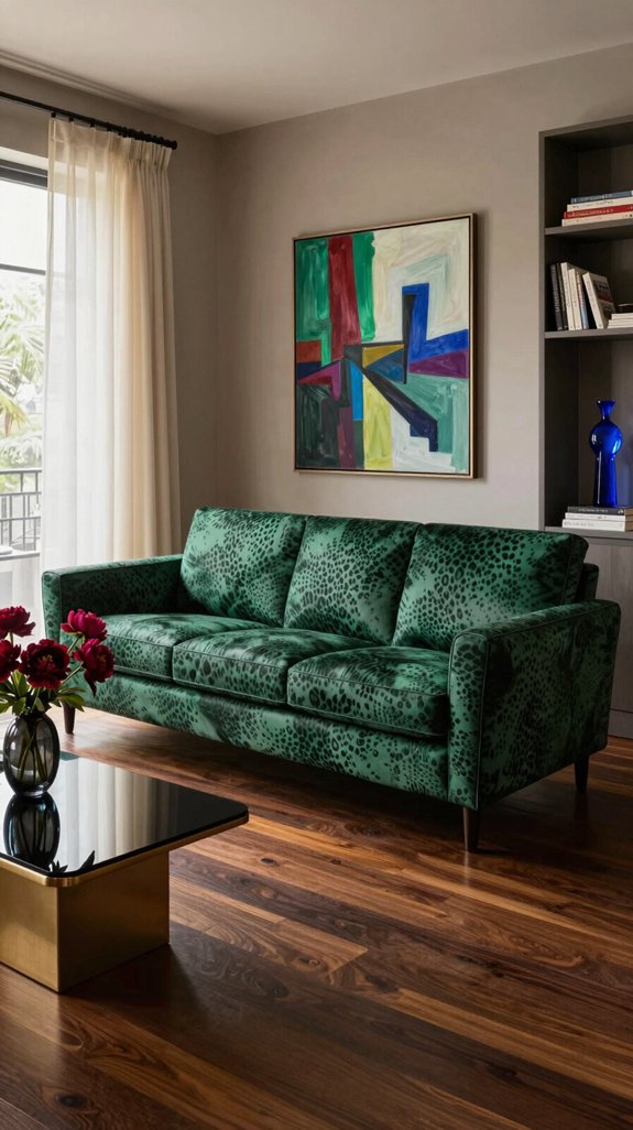
Bold jewel tones like sapphire, emerald, and amethyst instantly inject drama into a leopard-print interior, transforming the daring pattern into a refined backdrop rather than a competing focal point. These rich hues are best paired with sleek, low-gloss finishes to enhance their depth without overpowering the space. A sapphire velvet sofa, for instance, introduces a striking contrast that feels both contemporary and luxurious, while an emerald-toned accent wall lends a soft, enveloping glow. Introducing metallic accents—think brushed gold or copper—adds a subtle luminosity that mimics the inner radiance of gemstones. By limiting the color palette to just two or three intense tones, the design remains balanced, letting the leopard print recede slightly and allowing the jewel tones to take center stage. The result is a bold, modern aesthetic that aligns seamlessly with today’s evolving interior design sensibilities.

This art piece is hand-crafted and coloured by our artisan who puts great passion on this work, the lantern frame of this country floor lamp is sure to bring a touch of the outdoors right inside. Coming in a distressed red copper finish for a well-worn look that lends it some French country appeal, height 60.2~67.7 inches adjustable, perfect for living room,bedroom,foyer,hallway,dining room,office,study and any room you like.

【Elegant metal+wood body 】Full body metal material, with real wood decoraion design, elegant and stylish, a beautiful decoration for your home lighting.
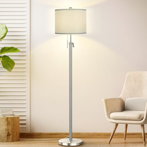
Customizable Height for Every Space: Featuring a flexible 54"-67" adjustment range, this tall lamp adapts to your furniture arrangement with ease. It excels in any setting-whether brightening a living room corner, providing comfortable light beside a sofa, serving as a functional workstation lamp for your office, or bringing a cozy glow to the bedroom. This elegant home decor lamp fits effortlessly into any space, ideally suited to your unique lifestyle
Incorporating Jewel Tones Through Textiles
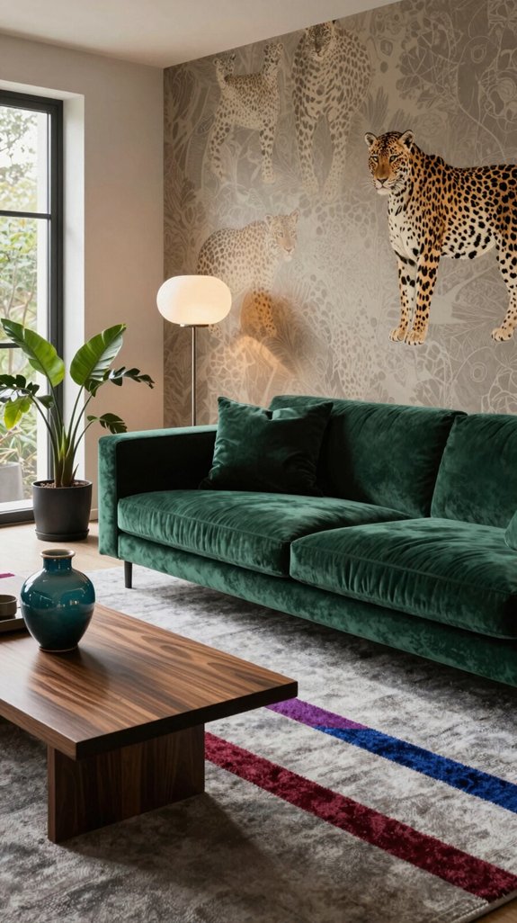
I’ll let the jewel tones anchor the walls, then introduce them through the room’s textiles, allowing the pattern to remain the focal point while fabrics add dimension. Velvet throw pillows in sapphire, silk curtains in emerald, and a handwoven rug layered with amethyst and flecks of gold create rich tactile contrast. Each textile complements and grounds the leopard print, building a layered yet harmonious palette that feels bold yet sophisticated. By combining high-contrast jewel tones with diverse textures, the space gains rhythm without visual clutter. The secret lies in balance—limiting to one standout textile per category, maintaining clean architectural lines, and placing each element with intention. This method elevates the room into a modern retreat where the pattern takes center stage and the textiles deliver sumptuous depth. Sturdy headphone stands provide a solid base that keeps décor elements securely displayed.

100% Premium Chenille Design: Our decorative throw pillow covers are crafted from high-quality chenille fabric, soft, skin-friendly and breathable, perfect for couch, bedroom and indoor home use. Sturdy, durable and long-lasting for daily indoor decoration.

1 pc 12x20 inch (30x50cm) Flannel Corduroy Striped Velvet Pillow Cover. Please note: No pillow insert, just pillow cover.
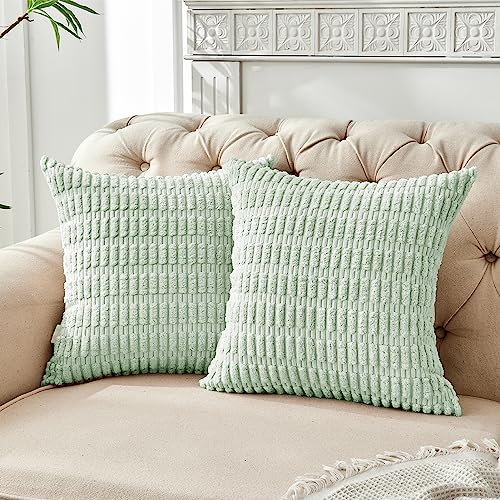
⭐【Size & Color】: 18 x 18 Pillow Covers ONLY (Pack of 2). No Insert. And this throw pillow cover is available in a variety of colors, so you can match it to your home decor to meet your preferences!
Metallic Accents That Enhance Leopard Print
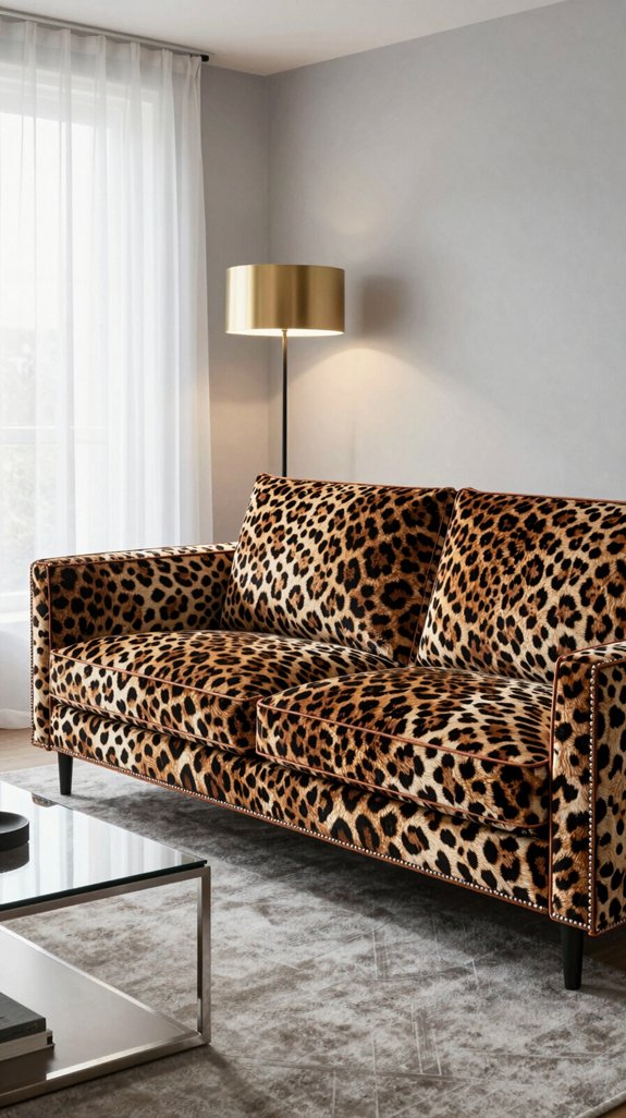
I love how a flash of brushed gold or polished copper can instantly elevate a leopard-print interior, allowing the bold pattern to take center stage while metallic accents introduce a sleek, modern sophistication. I pair matte brass lamp bases with a leopard-print sofa, where the warm glow subtly mirrors the print’s amber undertones without competing with it. A copper-finished coffee table anchors the space, its reflective surface catching the light and adding dimension. Chrome drawer pulls and silver-toned picture frames offer crisp, subtle contrast, bringing a clean, contemporary note to the warmth of the print. When incorporating a metallic wallpaper border, I keep it minimal—just a slim band to echo the rhythm of the pattern without overwhelming it. These deliberate metallic touches harmonize wild, organic energy with refined elegance, resulting in a daring yet balanced room that feels both dynamic and curated.
Machine Washable & Stain-Resistant: Effortlessly clean this rug in your washing machine on a gentle cycle; made from high-quality faux wool fibers that resist stains, spills, and shedding, making it ideal for busy households with kids and pets.
Machine Washable & Stain-Resistant: Effortlessly clean this rug in your washing machine on a gentle cycle; made from high-quality faux wool fibers that resist stains, spills, and shedding, making it ideal for busy households with kids and pets.
Machine Washable & Stain-Resistant: Effortlessly clean this rug in your washing machine on a gentle cycle; made from high-quality faux wool fibers that resist stains, spills, and shedding, making it ideal for busy households with kids and pets.
Balancing Light and Scale With Color Choices
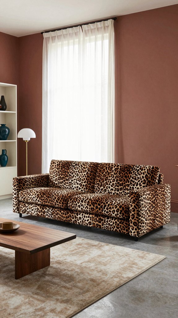
When pairing a deep-brown leopard print accent wall with a soft, buttery-yellow adjoining wall, the space immediately feels more open, as the light-enhancing qualities of the yellow prevent the pattern from dominating the room. I let natural light guide the scale of design elements; a bright, matte finish on walls softens the print’s intensity, allowing the eye to move freely and giving each spot room to stand out. Complementary pastel tones—like sage, lavender, or muted teal—on upholstery, curtains, or decorative accessories reflect ambient light, creating a sense of flow and airiness. I avoid high-contrast combinations that create shadowed corners, opting instead for tonal layering that boosts brightness throughout. Painting ceilings and trim in light-reflective hues acts like a mirror for daylight, spreading illumination further into the space. By aligning color temperature with the room’s natural and artificial lighting, I create a balanced environment where the leopard print serves as a dynamic yet refined focal point, enhancing the room’s character without overwhelming it. A well‑chosen white interior paint can amplify this effect by reflecting even more light across the room.
【Use Freely Furniture Paint】No need for time-consuming polishing or primer, our wood one step paint can be directly applied to your furniture,saving you time and effort in your DIY or refurbishment

Ultra premium paint and primer in one

All-in-One Formula: This furniture paint includes a built-in primer and top coat, providing seamless application on wood, metal, laminate, and more surfaces for a hassle-free painting experience.
Common Mistakes When Pairing Colors With Leopard Print
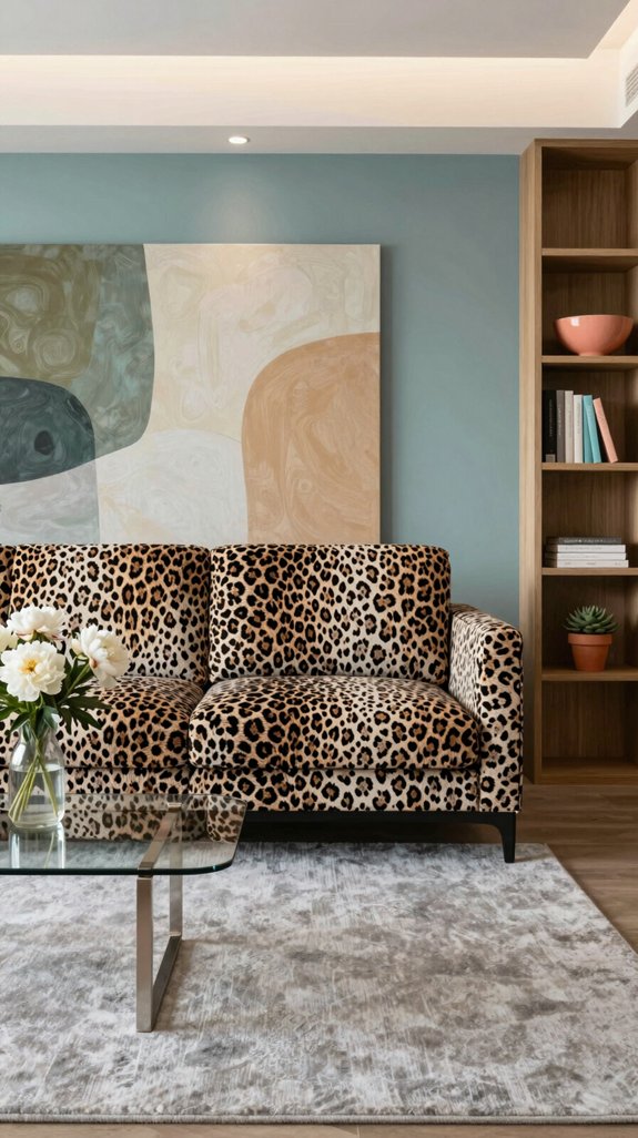
Mixing the wrong hues with leopard print can instantly tip a room from chic to chaotic. Avoid neon pinks and overly bright tones that create visual noise and overwhelm the space instead of enhancing it. Pairing the print with too many contrasting colors is another frequent mistake—it distracts from the pattern’s natural flow and leaves the room feeling disjointed. Steer clear of heavy, flat neutrals that dull the print’s energy; opt instead for soft, warm grays or muted taupes to let the leopard stand out. Over-matching the browns in the print with identical shades can make the design feel one-dimensional, so introduce a single accent hue—like terracotta, deep teal, or olive green—for added depth. Finally, avoid clashing metallics; brushed brass or matte gold finishes bring refined warmth without competing with the pattern’s rhythm, maintaining balance and elegance in the space. Selecting the right coaster set can further protect your table while complementing the overall décor.
Quick Tips to Make Leopard Print Work Anywhere
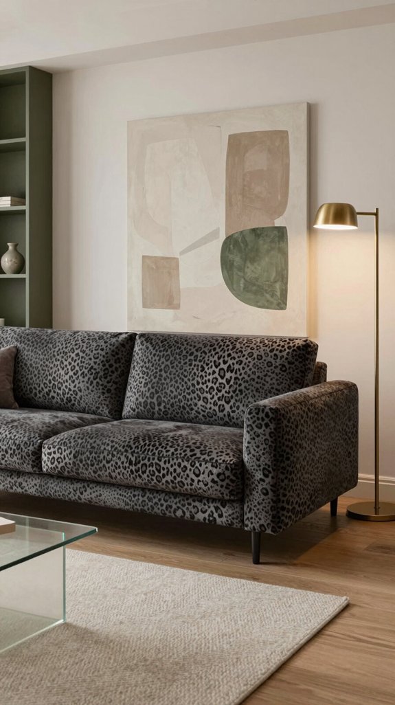
To make leopard print work in any room, start by grounding it with a serene, neutral base—soft beige, muted gray, or warm ivory—and build from there. Choose one key piece, such as a cushion, lamp shade, or throw blanket, to serve as your statement element, and keep surrounding decor intentionally minimal. Add depth with understated textures like a matte metal frame, a woven rattan basket, or a nubby wool rug, ensuring they complement rather than compete. Introduce just one rich accent color—emerald, navy, or mustard—through a vase, artwork, or ceramic piece to create a deliberate focal point. When layering, stick to no more than two complementary textures at a time so the print stays bold and clear. Finally, evaluate the lighting: natural daylight tames the print for a relaxed feel, while warm artificial light deepens its tones, helping the space feel balanced, inviting, and thoughtfully designed. Use a candle snuffer for safe flame extinguishing when adding ambient lighting.
Final Checklist for a Harmonious Leopard Print Room
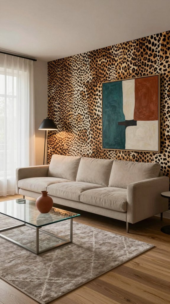
Is your leopard‑print room feeling cohesive or chaotic? Use this checklist to craft a space that’s bold yet balanced. First, choose a grounding neutral—soft dove, warm sand, or muted charcoal—to anchor the print. Second, limit complementary colors to two, applying them through textiles, wall art, or decor accents for visual harmony. Third, mix textures: pair matte cushions with glossy lacquered furniture to add depth without clutter. Fourth, maintain scale balance—anchor a large leopard-print rug with streamlined, low‑profile furnishings. Fifth, install one statement lighting fixture that echoes the pattern’s dynamic rhythm. Finally, step back, assess the lighting, and refine as needed—elegant drama emerges when daring design meets disciplined restraint. Consider using decorative trays to organize accessories while enhancing the overall aesthetic.
Frequently Asked Questions
Can I Use Leopard Print in a Small Apartment Without Feeling Cramped?
Yes, you can incorporate leopard print in a small apartment without making it feel cramped. Use a single leopard-print accent—like a throw pillow, area rug, or upholstered chair—and balance it with light neutral walls, minimalist furnishings, and decor that emphasizes vertical lines. This approach adds bold personality while maintaining an open, airy feel.
How Do I Maintain a Cohesive Look When Mixing Multiple Leopard Patterns?
I maintain a cohesive look by limiting the color palette to two neutrals, repeating one leopard pattern as an accent across select decor elements, and using a consistent scale in textiles throughout the space. Bold leopard prints are balanced with sleek, monochrome furniture to create visual harmony and anchor the design.
Is It Okay to Combine Leopard Print With Other Animal Prints?
Absolutely, I combine leopard with other animal prints in interior spaces, but I keep the color palette muted and the scale of patterns harmonized, ensuring each element subtly enhances the other. This approach creates a room that feels unified, layered, and quietly adventurous.
What Lighting Types Best Showcase Leopard Print Without Overwhelming the Space?
Soft, warm LED uplighting and dimmable recessed fixtures enhance the depth and texture of leopard print in home interiors, allowing the pattern to stand out while maintaining a balanced, inviting ambiance. These lighting choices minimize harsh shadows and glare, ensuring the print integrates seamlessly without overwhelming the room’s aesthetic.
Can Leopard Print Be Used in Outdoor or Patio Décor?
Leopard print brings a bold, organic energy to outdoor spaces—imagine it on weather-resistant cushions, outdoor rugs, or accent pillows, grounded by neutral earth tones and paired with sleek metal or teak furniture. When balanced with natural textures and greenery, it adds playful sophistication to patios and seating areas without overwhelming the setting.



