
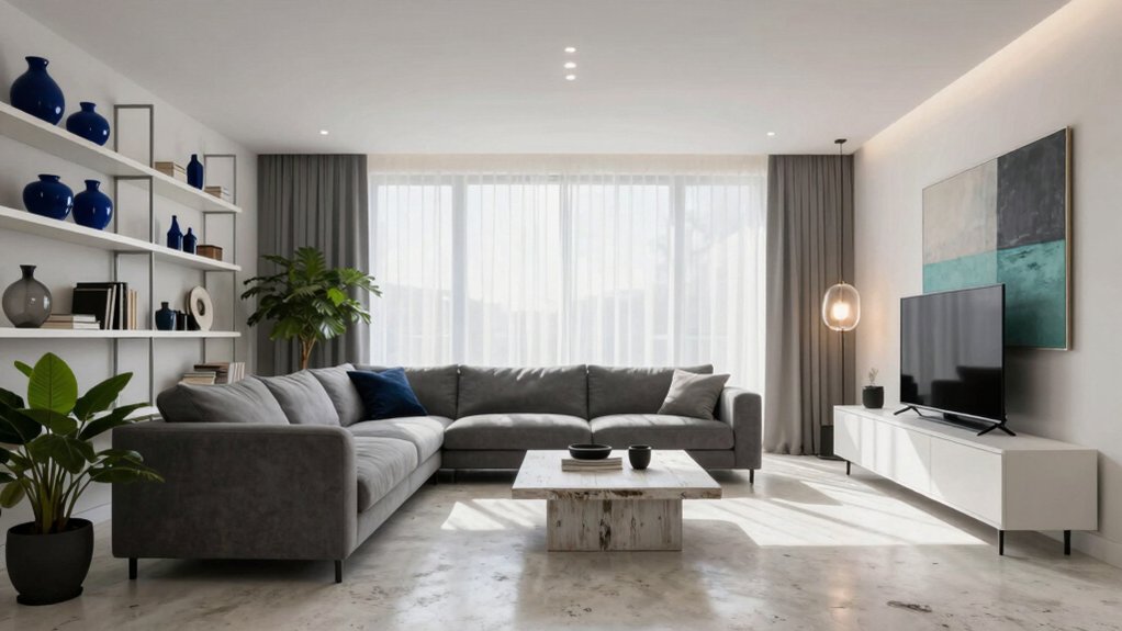

A vivid hue can transform a grey-and-white interior, breaking the flatness and introducing depth.
Consider a deep navy accent wall or a terracotta-toned rug to create contrast, while sage green plaster or a muted green throw can temper brightness and add warmth.
Match your accent color to the room’s lighting—warm terracotta glows under cool daylight, while cool emerald tones harmonize with warm incandescent lighting.
Opt for matte finishes to minimize glare, and layer in texture with accessories like navy glass vases or brushed copper lamps.
Maintain a balanced palette to elevate the space, with the next sections guiding you on how to apply these accents purposefully.
Why Pop Color Transforms Grey‑White Spaces
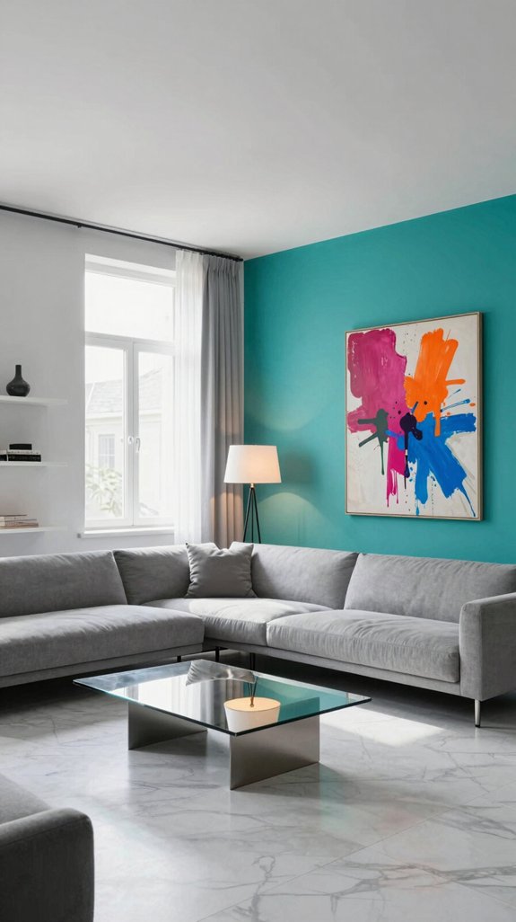
When you introduce a bold pop of color into a grey‑white room, the space instantly gains depth and energy. The vibrant hue punctuates the neutral backdrop, creating visual contrast that draws the eye and prevents the room from feeling flat. Notice how light reflects off the accent, casting subtle shadows that sculpt walls and furniture. The color becomes a focal point, guiding movement and framing key pieces without overwhelming the senses. By breaking up monotony, it delivers a psychological uplift, making the area feel more spacious and lively. Balance impact through thoughtful saturation, hue temperature, and strategic placement—ensuring each splash of color has intention. This intentional approach transforms understated interiors into dynamic, inspiring environments. Soft, calming tones like cornflower blue can also be used as subtle accents to enhance the overall serenity of the space.

Use for a variety of indoor and outdoor project surfaces including wood, metal, plaster, masonry or unglazed ceramic

Ideal for use on interior/exterior surfaces including wood, plastic, plaster, metal, masonry and unglazed ceramic

Ready to use, pre-mixed door and trim paint offers a fresh new look on interior or exterior metal, wood and fiberglass
How to Choose the Ideal Pop‑Color Hue for Your Grey‑White Room
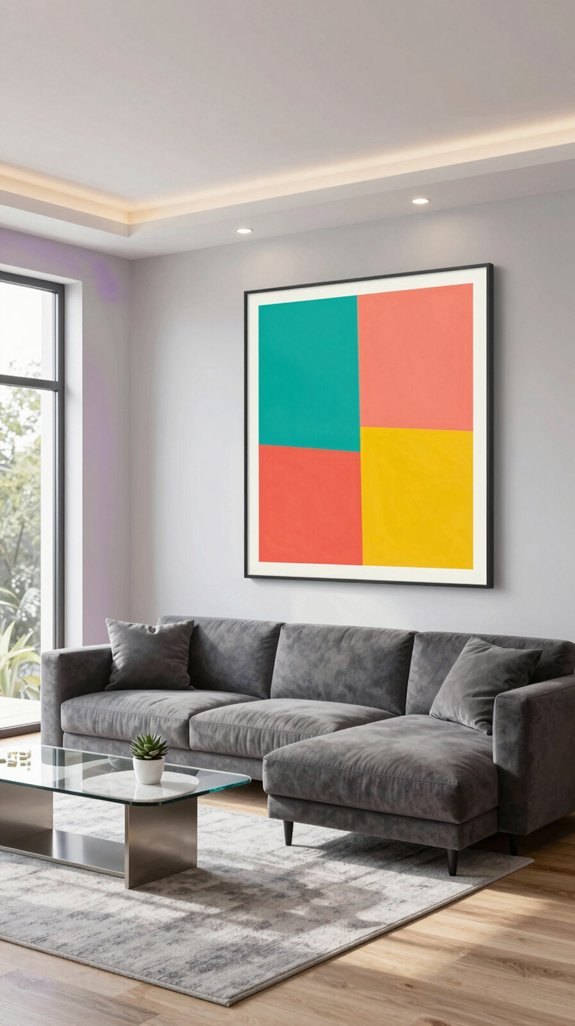
Which hue will make your grey-white space feel alive without overwhelming it? Begin by assessing the room’s natural and artificial light: cool daylight balances best with warm pop colors like terracotta or golden yellow, while warm incandescent lighting pairs well with cooler accents such as emerald or icy blue. Identify the undertone of your primary gray—gray with blue undertones harmonizes with coral or mustard, while greige or taupe-gray complements rich teal or magenta. Test paint samples with a 10-inch swatch on the wall, observing how the color transforms from morning to evening light. Opt for shades with high chroma but moderate saturation to ensure vibrancy without visual fatigue. Consider finish: matte surfaces absorb light and soften impact, while glossy finishes on furniture or décor amplify the hue’s presence. Finally, tie the accent color to a meaningful element in the home, like a beloved artwork or a cherished memory, turning the pop of color into a thoughtful, intentional focal point. The Hardwick White palette offers a refined, soft gray‑white base that pairs seamlessly with a wide range of accent hues.

Tides Series – Effortless style that flows with your life.This modern machine-washable non-slip rug features reinforced edges and a low-pile design that resists dirt. Its water-repellent surface makes spills easy to clean - liquids bead up for quick wiping. Simply machine wash in cold water (no bleach) to refresh. The non-slip backing keeps it securely in place. A perfect blend of function and contemporary design for active homes.

[Foldable Soft Floral Rug]: Washable 8x10 rug folds without leaving creases for easy seasonal storage.Chic boho and retro large area rug featuring gorgeous patterns printed on soft & cozy short pile for a velvety touch. A gentle mix of silver and gray rug exudes tranquility and inspires quiet meditation.

FOR A BETTER: We fold and compress the product and send it out. If there are wrinkles when you receive it, please leave it patiently for 3-7days, and it will return to its original state later.
How to Use Deep Navy as a Pop Color in Grey‑White Interiors
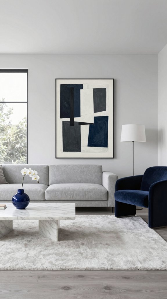
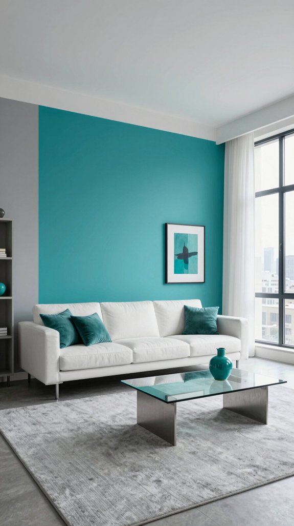
I’ve already shown how light and gray undertones steer you toward coral, teal, or mustard; now let’s explore how deep navy can serve as a bold pop in a grey-white interior. Begin by painting one accent wall in a rich midnight navy, allowing the adjacent whisper-gray walls and crisp white trim to heighten its intensity. Introduce subtle nods to the color through hardware—opt for drawer pulls with a dark indigo finish or cabinet hinges that carry a hint of blue in their matte coating—to mirror the accent wall with restraint. Anchor the space with a deep navy area rug laid over a light-gray floor, creating a grounded yet dynamic base. Layer in texture with throw pillows in slightly varied shades of navy and cobalt on a neutral sofa. Top a white console table with a navy-glass vase, its reflective surface adding dimension by capturing natural and ambient light. This thoughtful layering builds visual interest, infuses modern sophistication, and ties the palette together with intention and balance. Magnolia interior paints provide a classic creamy backdrop that complements the deep navy accents.

What is Venetian Plaster: Also known as “stucco Veneziano”, Venetian plaster is a wall and ceiling finish made from magnesium-grade dolomite limestone. It is heated to produce calcium oxide, then aged in water. Finally, the lime is blended with marble and other mineral aggregates. Applied in multiple layers, which are then burnished to create a smooth surface with the illusion of depth and texture. When applied correctly, this type of plaster will create a highly polished and marble-like finish.

Extremely durable interior paint ideal for use on properly prepared interior walls, ceilings or trim composed of new or previously painted drywall, plaster, masonry, wood and metal

Extremely durable interior paint ideal for use on properly prepared interior walls, ceilings or trim composed of new or previously painted drywall, plaster, masonry, wood and metal
How to Add Warmth With Terracotta Pop Color in Grey‑White Spaces
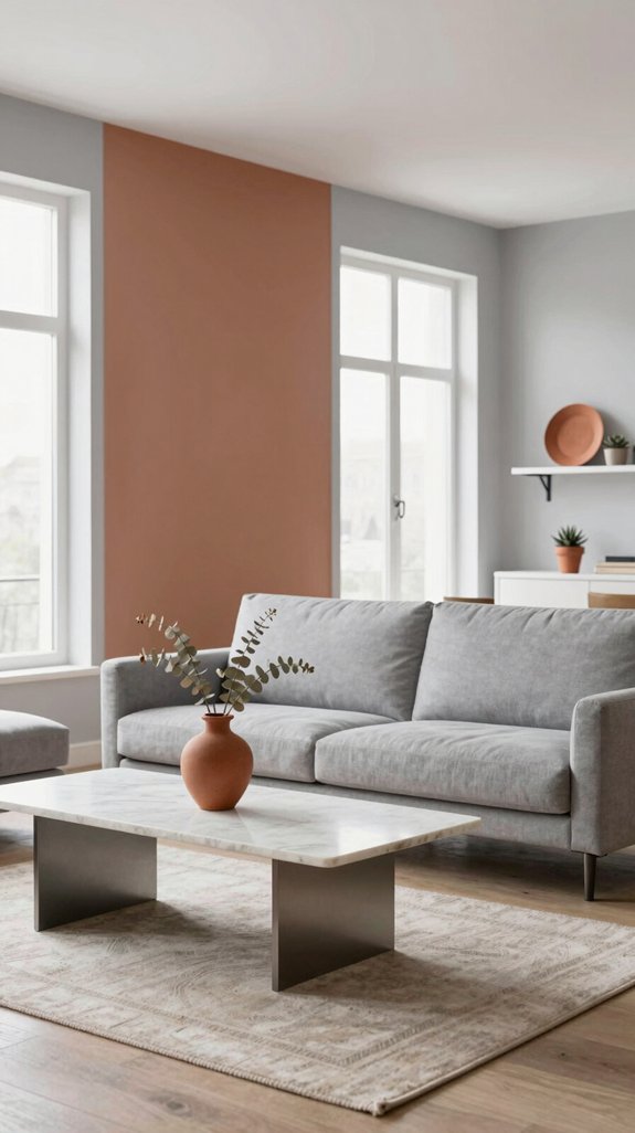
Introduce a terracotta accent wall into the grey‑white palette to bring warmth and character, softening the cool neutrals with its earthy richness and creating a welcoming focal point. Complement the wall with matte terracotta vases displayed on floating shelves, repeating the tone to build cohesion and depth. Anchor the seating area with a low‑pile terracotta rug that adds subtle texture against smooth floor tiles, enhancing both comfort and visual grounding. Incorporate brushed copper light fixtures to emit a soft, amber glow that enhances the warmth and plays beautifully against the terracotta surfaces. Complete the composition with a single piece of abstract artwork in terracotta tones, drawing the eye and harmonizing the monochrome base. This layered use of terracotta adds inviting depth and modern elegance without sacrificing the space’s clean, serene foundation. Consider pairing the terracotta accents with lavender wall paint to further enhance a calming atmosphere.
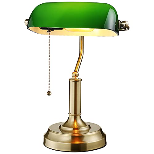
Classic Style: Add a touch of retro style and nostalgic feeling with the traditional banker's style of this green bankers lamp, bringing a classic mid-century look to your interior furnishings

【Size / Package Includes】10-inch in height (from the top shoulder to the bottom of the prong). 2 X lamp shade harps, 2 X saddle, 2 X lamp finial, 1 X instruction manual. Note: please make sure this is the proper length to fit your lamp.

📏 Size & Compatibility: 1.5" tall solid brass lamp finial, threaded 1/4-27 to fit lamp harp tops.
How to Soften the Palette With Sage Pop Color in Grey‑White Rooms
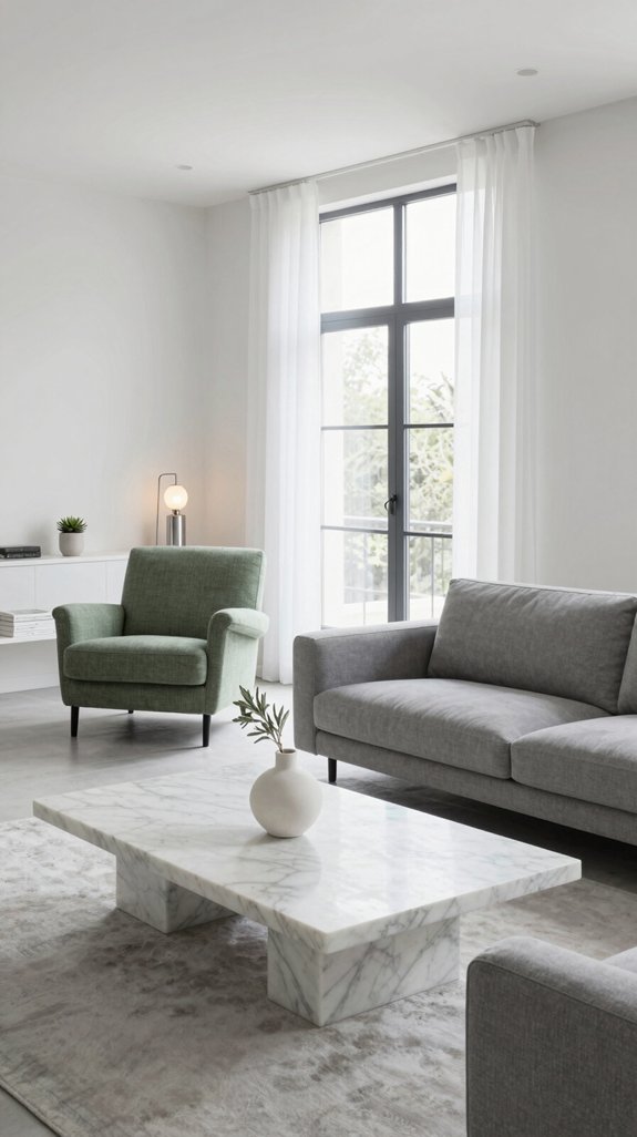
After the bold warmth of terracotta, I embrace sage to gently soften a grey-white interior. Sage acts like a natural toner, tempering high contrast while adding quiet depth. I apply it in subtle layers—through textured plaster walls, soft matte paint, or a single-coat accent wall—so the color blends rather than dominates. This muted green tames harsh light, reducing glare and fostering a serene, grounded atmosphere perfect for minimalist decor. To elevate the look, I incorporate sleek metallic finishes; faucets, lighting, or hardware in brushed nickel or matte black catch the soft green tones, creating delicate interplay and modern cohesion. By carefully controlling saturation, I avoid overly soft, washed-out effects, keeping the space fresh, balanced, and thoughtfully inviting. Consider exploring creative poster rail options to enhance visual interest without disrupting the palette.

Material: The blue cornflower throw pillow covers made of linen, soft to the touch, comfortable and skin-friendly, breathable, not easy to fade, not easy to wear.

QUALITY MATERIAL: The pillow cover is composed of a soft and comfy corduroy which is a kind of polyester fabric, features a cute and elegant boho stripe design. Our pillow covers are of good workmanship, they are tightly sewn without loose threads.

【Green Digital Printing】Our digital printing technology and organic cotton fabric make sure that the pillow covers are not only beautiful but also practical. With excellent color fixation, they resist fading to maintain a like-new quality for a long time. Additionally, they are gentle on the skin, ensuring comfort without causing any irritation.
Where to Place Pop Color: Walls, Furniture, and Accessories
Because sage thrives on restraint, it’s best placed where it can be seen without overwhelming a grey-white backdrop—on a single accent wall, a tailored sofa cushion, or a carefully chosen set of metal-toned accessories. Begin with a wall that receives ample natural light, applying the color to just one surface to add depth without dominating the space. Next, introduce the hue through furniture: a chair backrest, a linen-upholstered ottoman, or a runner across a minimalist coffee table brings tactile warmth and subtle contrast. Finish with judicious accessories—matte-finish vases, brushed-copper lamps, or textured throw pillows—each carrying a hint of sage to ground the palette while maintaining open, calming sightlines. This layered strategy blends quiet elegance with intentional contrast, allowing serenity and modernity to coexist.

Use for a variety of indoor and outdoor project surfaces including wood, metal, plaster, masonry or unglazed ceramic

1.This listing features a single-panel abstract wall art piece, showcasing soft organic geometric shapes in deep navy blue against a warm cream background, designed in a modern minimalist style with subtle textured brushstrokes for a sophisticated, calming aesthetic.
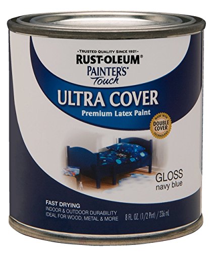
Use for a variety of indoor and outdoor project surfaces including wood, metal, plaster, masonry or unglazed ceramic
Common Pop‑Color Mistakes to Avoid
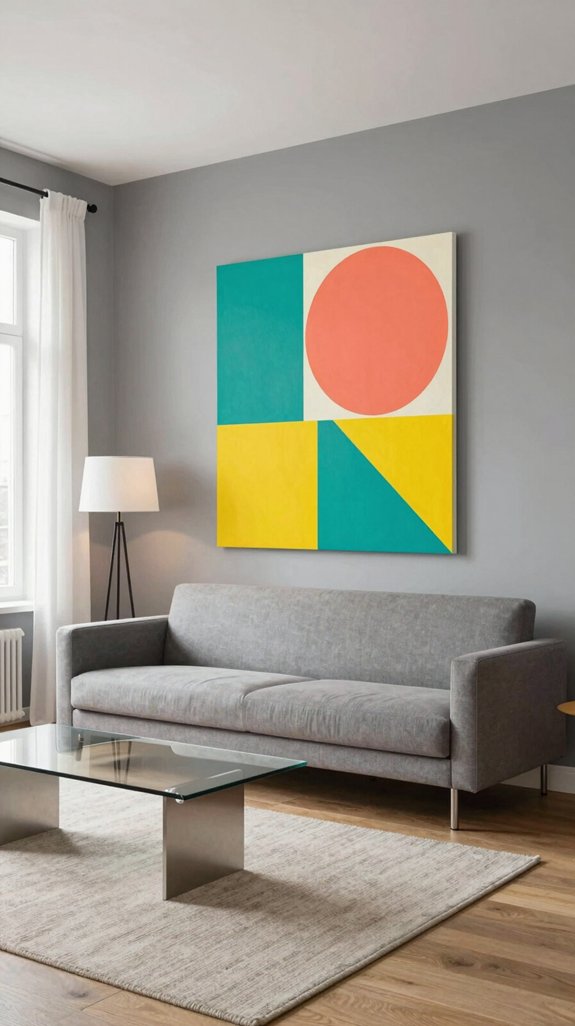
Even a single pop of color can clash if proportion, lighting, and balance aren’t respected—here are the three most common pitfalls and how to avoid them. First, overloading a space with too many bright accents—a vivid chair, a neon pillow, an electric rug—creates visual chaos. Stick to one focal point and let a neutral grey-white backdrop enhance its impact. Second, ignoring lighting: saturated hues can appear flat under harsh fluorescents but come alive under warm LEDs. Test paint swatches or fabric samples at different times of day to see how they respond to natural and artificial light. Third, mismatching color intensity with scale—painting an entire wall bold red in a small room overwhelms the space, while a soft teal accent lamp may go unnoticed. Choose stronger hues for smaller objects and subtler tones for larger surfaces to maintain harmony and depth. Adding texture through 3D wall art can further enrich the visual experience.

MACHINE WASHABLE: Our rug can be washed directly in washing machine in cold water and dried without heat. Daily maintenance is simple and convenient

Distressed Design:Jacquard woven of colored yarn on greyish white fabric to create a color block two tone contrast,these drapes surely add depth and sophistication to your room.Especially well compliment your similar distressed area rugs and pillow covers.

Luxuriously Soft & Plush: Crafted with premium 100% polyester fibers, this rug features an ultra-dense pile with over 20,000 stitches per square inch. The lofty, cloud-like texture delivers exceptional softness and warmth underfoot, creating sumptuous comfort that perfectly complements hardwood flooring in any living space.
Frequently Asked Questions

Extremely durable interior paint ideal for use on properly prepared interior walls, ceilings or trim composed of new or previously painted drywall, plaster, masonry, wood and metal

Ultra Premium Paint and Primer In One - Formulated for Superior Hide and Coverage
WHAT IS VENETIAN PLASTER: Also known as “stucco Veneziano”, Venetian plaster is a wall and ceiling finish made from magnesium-grade dolomite limestone. It is heated to produce calcium oxide, then aged in water. Finally, the lime is blended with marble and other mineral aggregates. Applied in multiple layers, which are then burnished to create a smooth surface with the illusion of depth and texture. When applied correctly, this type of plaster will create a highly polished and marble-like finish.
Can I Use Multiple Pop Colors Together in One Grey‑White Room?
Yes—using multiple pop colors in a grey-white room can work beautifully, as long as balance is maintained. Choose two vibrant hues and assign each to a distinct element, like an accent chair or decorative pillow, to avoid visual clutter. Let the neutral grey-white backdrop set a calm foundation, allowing the pops of color to stand out with intention and style.
How Do I Maintain Color Balance When Adding Bright Accessories?
Maintain color balance by introducing bright accessories as a single focal point, then echo that hue through subtle elements like throw pillows, artwork, or area rugs. Anchor the look with neutral furniture and wall tones to create visual harmony, allowing the accent color to stand out without overwhelming the space.
Are There Eco‑Friendly Paint Options for Pop Colors?
Low-VOC, water-based paints with natural pigments offer a sustainable way to bring bold pop colors into your home. Shades like algae-derived teal or beet-root magenta provide vibrant, eye-catching hues while releasing minimal fumes. These eco-friendly options support healthier indoor air quality and meet green building standards, making them ideal for stylish, conscientious spaces.
What Lighting Styles Best Highlight Pop Colors in Grey‑White Spaces?
Layered lighting works best to highlight pop colors in grey-white spaces. Use recessed LED lights to create a smooth, even glow across the room, then add directional spotlights to draw attention to accent walls or colorful artwork. Warm-toned pendant lights above islands or tables introduce coziness and depth. Include dimmable LED strips under shelves or along coves to subtly shift the ambiance, enhancing the vibrancy of bold hues without overpowering the neutral backdrop.
Can I Change Pop Colors Seasonally Without Repainting?
I refresh pop colors seasonally by swapping out textiles like cushions, throws, and rugs, along with decorative accessories and artwork. This approach keeps the neutral grey and white palette feeling current, minimizes expense, and allows for ongoing creative experimentation.



