
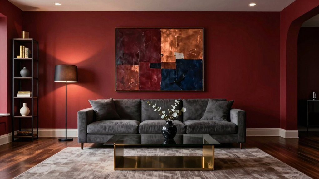
Opt for a deep ruby or oxblood wall color that subtly shifts under ambient light, then contrast it with charcoal-painted accent walls or black window trim for a sleek, grounded effect.
Introduce navy in upholstery or area rugs to bring in a cool, refined depth that balances the warmth of the red.
Enhance the luxurious feel with copper pendant lights or brushed-gold drawer pulls and faucets in the kitchen or bathroom.
Offset the intensity with creamy ivory throw pillows, area rugs, or window treatments, and anchor the look with matte-black light fixtures or door hardware.
Layering these textures and finishes adds visual interest and dimension, creating a space that feels both opulent and inviting.
How to Use Dark Red Interiors for a Luxurious Look?
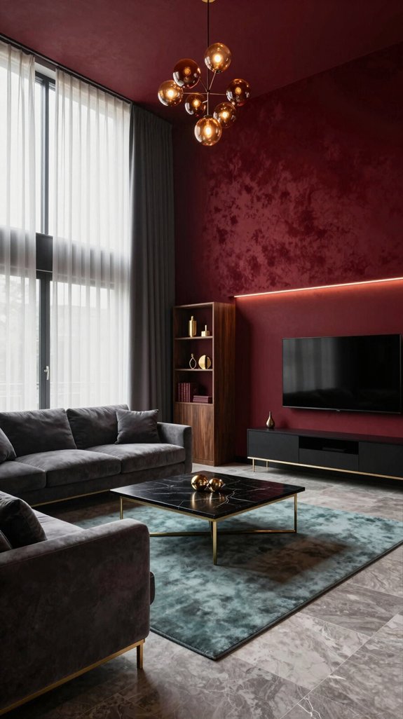
A dark red interior instantly exudes opulence when paired with thoughtful accents and strategic design choices. The deep hue acts as a grounding element, creating a sense of intimacy and sophistication. To enhance its richness, incorporate brushed brass lighting fixtures that reflect and refract light, adding a subtle shimmer across walls and surfaces. Contrast the bold color with sleek, low-profile furniture in matte black or polished walnut, which provides structural balance without diluting the drama of the space. Introduce visual rhythm through textured wall art and geometric-patterned rugs, ensuring each piece complements the intensity of the red without competing with it. For a modern twist, consider smart glass partitions that adjust in opacity, blending contemporary functionality with timeless elegance. By carefully balancing materiality, lighting, and innovative design elements, dark red becomes the foundation for a luxurious, immersive interior. Choose low‑VOC paints to maintain air quality while enjoying vibrant color.

Premium Canvas Wall Art featuring the iconic painting captures the historic moment of Ruby Bridges This artwork brings a touch of classic civil rights history and profound emotion to your space with high quality canvas material that ensures long lasting beauty and durability

Tutorial on Tools and Materials Needed for painting anything you can imagine in your home
Choosing the Right Dark Red Shade for Your Space
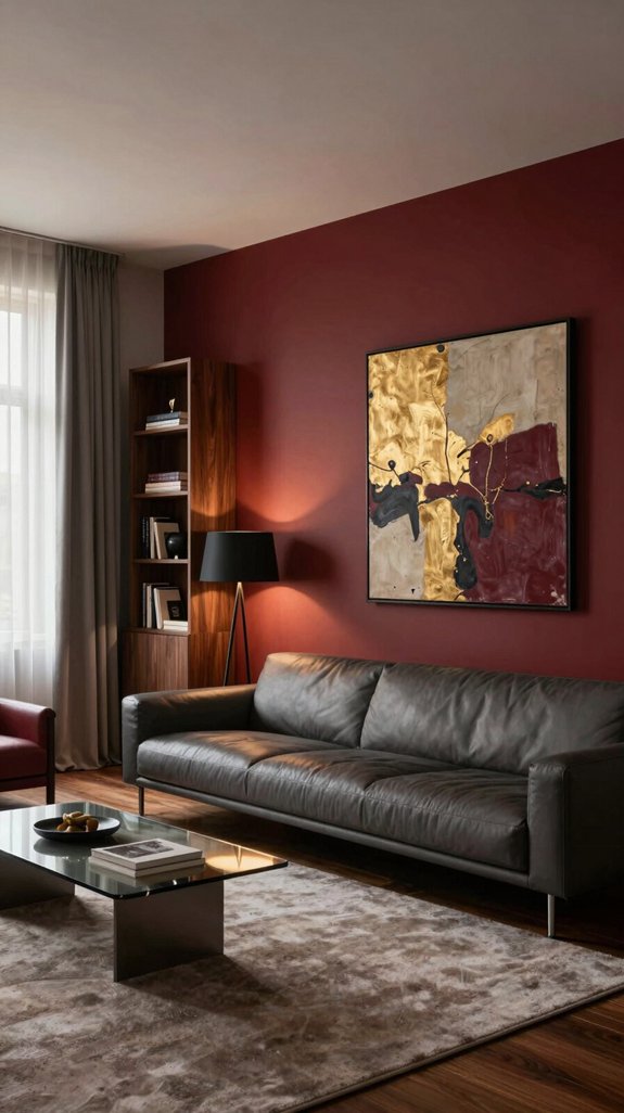
After exploring how dark red can anchor a luxurious interior, the next step is choosing the right shade for your space. Begin by assessing ambient light: natural daylight enhances the brightness of red, revealing ruby-like tones, while low-light areas suit deeper shades like burgundy. Test three swatches—crimson, oxblood, and maroon—on different walls to see how each responds to changing light throughout the day. Observe how the colors interact with existing materials such as marble countertops, brass fixtures, or reclaimed wood flooring. Pay attention to undertones: cooler, blue-based reds pair beautifully with polished metals and minimalist surfaces, while warm, orange-infused reds bring out the richness in velvet upholstery or woven textiles. Consider room size—larger spaces can handle bold, saturated hues, whereas smaller rooms often feel more balanced with softer, smokier versions of dark red. By aligning the color’s intensity, temperature, and undertone with your room’s architectural details and finishes, you ensure the dark red becomes a harmonious, transformative element in your home’s design. The wine‑red wall trend showcases how dramatic hues can elevate luxury interiors.

ALL-IN-1 PAINT & PRIMER: A hardy multi-purpose and multi-surface one-coat paint and primer in one for almost any indoor or outdoor surface. A wall, ceiling, floor, skirting board, cabinet, furniture and door paint for your bathroom, kitchen, home and garden.

🏠Details: 15.8x78.8 Inch, total 8.65 sq.ft (40cmX2m). Self adhesive(no extra glue needed). Made of durable vinyl. Charcoal marble contact paper peel and stick waterproof. Oil proof. Fully removable.
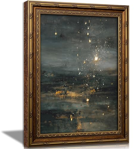
【Gothic Celestial Art Print】This canvas print of a starry night depicts a evocative impressionistic night sky: golden stars bloom against a deep blue-green and charcoal gray background, their soft light reflected gently on the water below. The richly textured brushstrokes and shimmering gold accents skillfully blend dark preppy style, retro aesthetics, and abstract beauty to create an ethereal and enchanting artwork. Quiet and captivating, it adds warmth and mystery to any wall.
Pairing Dark Red With Charcoal, Black, and Navy
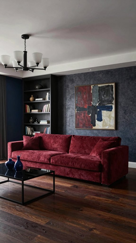
Pairing dark red with charcoal, black, or navy transforms a space with rich, layered depth while maintaining a grounded, intentional palette. Charcoal tempers the boldness of dark red, offering a soft, refined contrast that adds warmth without overwhelm—ideal for accent walls or upholstered furniture in living rooms or studies. Black creates sharp, striking contrast, allowing dark red to emerge as a commanding focal point in cabinetry, doors, or built-ins, enhancing architectural definition and lending a modern, elegant edge. Navy brings a nuanced balance, merging cool undertones with red’s richness to foster a serene yet dynamic atmosphere, perfect for bedrooms or dining areas where texture and depth are key. The finish plays a crucial role: matte surfaces absorb light, promoting intimacy, while gloss or semi-gloss sheens reflect it, accentuating contours and adding sophistication. By varying proportions—through wall color, furnishings, or trim details—this combination achieves a balanced, contemporary elegance that feels both luxurious and timeless. A complementary hue often used in sophisticated interiors is deep teal for added visual interest.
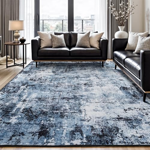
Modern Abstract Rug: Evokes the essence of ocean and sea foam, blending neutral tones of navy blue and black with abstract artistry. Offers a lived-in charm while effectively hiding messes, great for living room, bedroom, dining room, nursery room, playroom, classroom or dorm
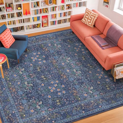
Vintage Botanical Elegance: Echoing the refined artistry of 19th-century textile traditions, this elegant area rug features a deep navy background with dusky blue accents, adorned with intricate floral and oriental motifs. Muted gold, sage green, and faded blush details weave through the design, creating a balanced contrast that feels both rich and refined. Its symmetrical botanical layout brings timeless charm and layered sophistication to any traditional, cottagecore, or eclectic interiors

Modern Abstract Rug: Evokes the essence of ocean and sea foam, blending neutral tones of navy blue and black with abstract artistry. Offers a lived-in charm while effectively hiding messes, great for living room, bedroom, dining room, nursery room, playroom, classroom or dorm
Adding Warm Copper and Brushed Gold Accents
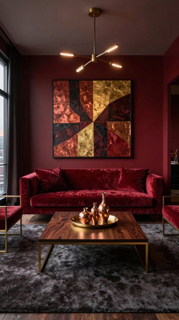
Although dark red already commands attention, introducing warm copper and brushed gold accents softens its intensity while adding a touch of refined elegance. Copper’s reddish-brown glow naturally complements the deep red tones, creating a harmonious blend that feels both rich and inviting. Brushed gold, with its understated shimmer, provides just enough reflective contrast to enliven the space without disrupting its balance—gentle enough to catch the light, yet subtle enough to maintain sophistication. Thoughtfully incorporating these metals through fixtures, lighting finishes, and decorative details like mirror frames or trim work introduces layered texture and visual depth. Whether it’s a copper pendant light above a vanity or brushed gold cabinet pulls in the kitchen, these accents elevate the overall design, resulting in a space that’s dynamic, cohesive, and luxuriously grounded in timeless appeal. Selecting a bulb with higher lumens can enhance the glow of these metallic accents, ensuring the brightest smart bulbs truly illuminate the room.

【Coppper Pendant Light】 - This matte black metal and wood pendant light exudes an artistic vibe, elevating the ambiance of your kitchen. It serves not only as a pendant lamp but also as a captivating decoration for dining room and kitchens. Its timeless appeal effortlessly complements any style
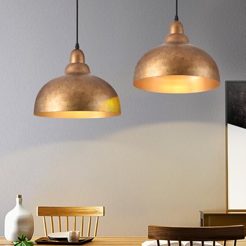
【Coppper Pendant Light】 - This matte black metal and wood pendant light exudes an artistic vibe, elevating the ambiance of your kitchen. It serves not only as a pendant lamp but also as a captivating decoration for dining room and kitchens. Its timeless appeal effortlessly complements any style

Authentic Vintage Industrial Ambiance: Crafted with distressed metal and an exposed Edison bulb, this hanging lamp embodies raw, authentic industrial charm. Perfect for creating a nostalgic loft, rustic farmhouse, or urban warehouse vibe in your space
Selecting Materials That Complement Dark Red
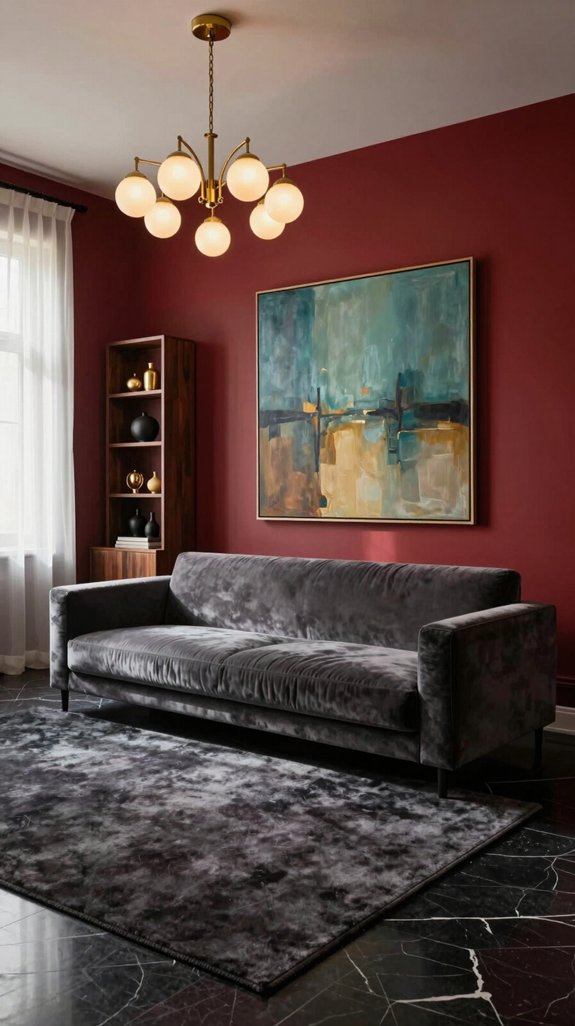
The copper and brushed‑gold accents set the foundation for materials that allow dark red to take center stage. I focus on texture hierarchy, introducing matte black steel that absorbs light and intensifies the richness of the red. Reclaimed walnut veneer adds warmth through its natural grain, balancing the cool depth of the hue while aligning with sustainable design principles. High‑gloss acrylic panels bring in reflective surfaces that interact dynamically with ambient light, enhancing drama without overpowering the space. For tactile contrast, woven sisal rugs contribute organic texture and earthy grounding, softening the overall palette. Brushed titanium hardware introduces a subtle industrial shimmer, lending a modern, forward‑looking elegance that complements the deep, luxurious tone of dark red. Soft pastel yellow can be used as a subtle highlight to brighten the space without overwhelming the dark red, especially when paired with golden accent tones that echo the warmth of the copper and brushed‑gold accents.

Privacy Made Simple, Noiseless: Need private space? One quick twist locks the door instantly. In an emergency, you can unlock it easily from outside. This practical black door handle runs nearly silently with no squeaks. Perfect door locks for bedrooms, bathrooms and guest rooms, no troublesome keys required

Seamless Privacy Access: Say goodbye to the hassle of keys with our innovative keyless privacy door handle. With just a touch of the internal button, you can access your private retreat instantly. In case of a lockout, simply use a standard screwdriver to unlock from the outside, ensuring your peace of mind.

Matching inteiror privacy doors: The interior door knobs are ideal for rooms where privacy is needed, such as bedrooom and bathroom. Clean and smooth lines of privacy door knob complements your home’s interior door and look modern and classic
Paint Finishes That Enhance Dark Red Walls
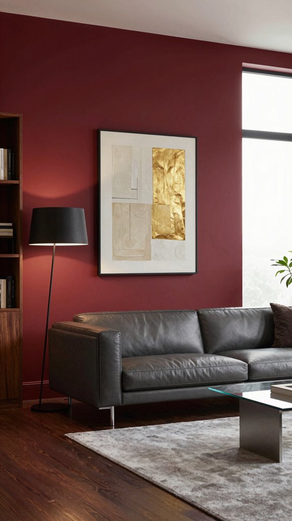
To make dark red walls stand out without feeling heavy, choose a paint finish that balances richness and light reflection. Semi-gloss works well, adding a soft shine that deepens the color while maintaining a smooth, easy-to-clean surface. Eggshell provides a gentle luster that minimizes glare, softening the intensity of the red while offering lasting durability—ideal for living rooms and dining areas. For a more contemporary look, matte-satin hybrid finishes combine the light-absorbing quality of matte with a faint glow, giving the walls a layered, dimensional feel. Consider using a metallic-infused primer beneath the paint to introduce subtle shifts in tone as light moves across the surface, enhancing the wall’s visual depth. Always test samples in different lighting throughout the day to ensure the finish enhances the red’s drama without dominating the space. Complement the rich red with cashmere‑hued accents to create a balanced, luxurious palette.
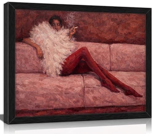
【Artistic & Stylish Print】This canvas print features a striking abstract portrait of a fashion woman lounging on a pink sofa, wrapped in a fluffy white feather stole with bold red tights, set against a rich ruby-toned background. The textured oil-painting style adds depth and vintage charm, creating a bold yet elegant statement piece that captures modern sophistication and timeless allure.This decorative painting is available in three sizes: 9x11 inches, 12x16 inches, and 16x24 inches.Please select according to your needs.


PRODUCT INCLUDES: Makeup Kit
Lighting Strategies to Keep Dark Red From Overpowering
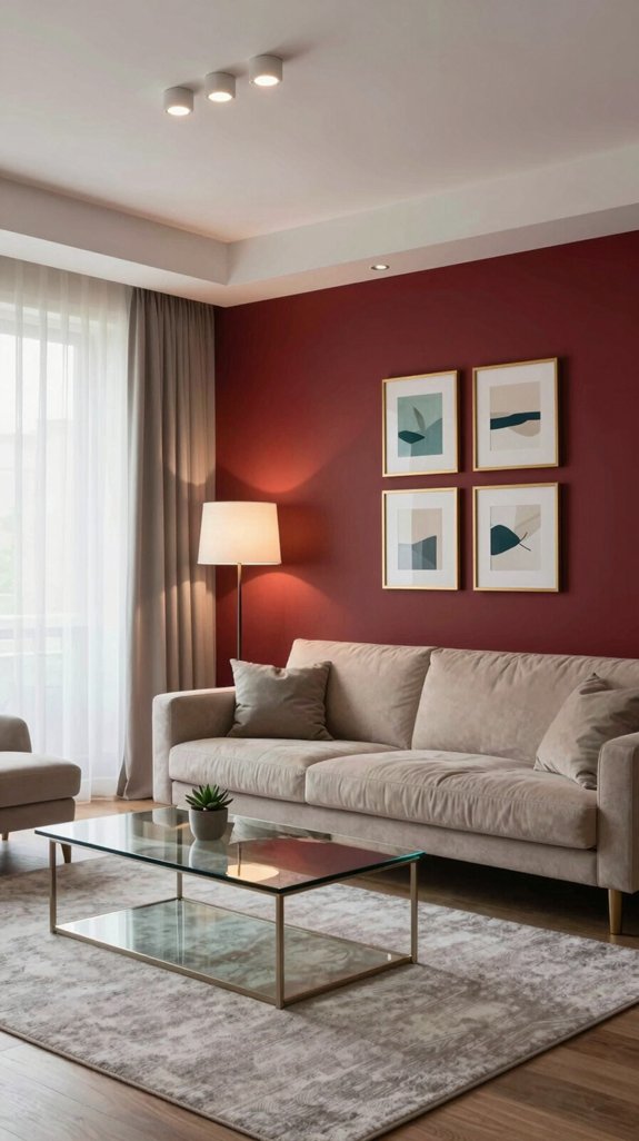
Choosing the right lighting helps balance dark-red walls so they add depth without overwhelming the space. Start with layered lighting: recessed LED fixtures at 300 K a a warm, inviting base, while directional spotlights draw attention to architectural details without intensifying the red’s saturation. Dimmers allow precise control over brightness, reducing harsh glare that can make the walls feel closing in. Incorporate reflective surfaces like high-gloss ceiling finishes and mirrored accents to bounce light around the room, enhancing brightness and creating a sense of openness. Balancing color temperatures plays a key role—a cool-toned accent light, such as a 4000 K pendant, introduces subtle contrast that maintains the room’s drama while keeping it visually grounded. Smart lighting controls enable curated scenes, letting you shift the ambiance effortlessly while preserving the room’s sophisticated, modern character. Complete your setup with a smart lighting kit for seamless integration and energy efficiency.
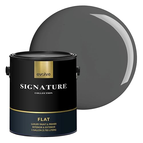
PAINT + PRIMER IN ONE: Signature formula delivers flawless coverage from the first stroke, sealing surfaces and minimizing coats for a refined finish.

Ideal for use on interior/exterior surfaces including wood, plastic, plaster, metal, masonry and unglazed ceramic

EASY TO USE, EVEN FOR BEGINNERS: Whether you’re new to DIY or a pro, Rust-Oleum Chalked makes painting easy and enjoyable. Minimal prep required means you can jump right into your project confidently and focus on creativity—not complicated steps.
Balancing Dark Red Walls With Subtle Furniture
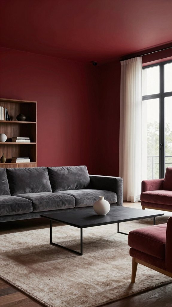
When pairing dark-red walls with subtle furniture, focus on contrast and texture to prevent the space from feeling heavy. Begin by assessing the hue’s intensity, then choose furnishings in muted neutrals, soft greys, or warm beiges that complement the depth of the walls without overwhelming them. Opt for textured upholstery—like linen, brushed suede, or matte velvet—to introduce tactile warmth, while clean, streamlined silhouettes keep the look light and uncluttered. Integrate reflective elements such as brushed metal legs, glass tabletops, or mirrored accents to amplify natural light and enhance the sense of spaciousness. Anchor the room with thin, linear rugs and complete the composition with understated wall art in neutral tones. This layered approach preserves a harmonious palette, resulting in a space that feels rich, dramatic, and effortlessly breathable. Consider using cable management solutions like vertical cable organizers to keep cords hidden and maintain a tidy aesthetic.

High-Quality Construction: Our washable rugs are made of premium high quality polyester fibers. Functional low pile allows the area rug for convenient placement in entryways, underneath door and furniture, and will not obstruct doorways. Whether you step on with bare feet or laying on with your children or pets, you can feel the warmth and warmth underneath.

Unique Abstract Art Rugs: Our modern abstract area rugs pour infinite creative inspiration into your living space. This 5x7 blue abstract rug with navy grey striped features free-flowing abstract line elements for a perfect collision of modern and contemporary. We offer a wide range of styles, including abstract, minimalist, modern, art deco, accent and more, ensuring that each rug will be the finishing touch to elevate the style of your home.

Super Soft Fluffy Rug: The surface of Lairep's 4x6 shaggy rug is made of high-density, premium velvet material, making the fuzzy rug ultra soft and skin-friendly, warm and luxurious. Meanwhile, the plush area rug is lasting and will not shed, fade or odor. The center layer is a thickened shock-absorbing sponge that provides cushioning support and increases the thickness of the navy blue carpet, creating a comfortable area for your family
Room‑by‑Room Guide: Living Room Applications
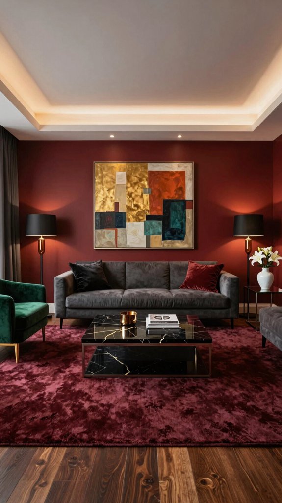
Dark-red walls set a bold tone, grounded by a low-profile sofa in warm ivory that softens the intensity and creates an inviting atmosphere. A sculptural coffee table in brushed brass adds texture and reflects ambient light, enhancing the room’s dimension without competing with the rich wall color. At the focal point, a modular media console in matte black offers sleek storage and clean lines, balancing the depth of the red while maintaining a contemporary edge. Layering begins with a geometric rug in muted teal and gold, its pattern adding visual rhythm and connecting key elements across the floor. Recessed LED lighting with adjustable color temperatures highlights the walls’ depth in the evening and gently brightens the space at dawn, shifting the mood with the day. Together, these choices shape a living room that’s both dramatic and livable—luxurious, intentional, and full of quiet energy. Wall‑mounted cabinets provide additional storage without sacrificing floor space, complementing the sleek aesthetic.

⭐️Red Copper Pendant: this home indoor pendant is in red copper finish, eye-catching finish adds aesthetics and perfect match for home with vintage elements

MATERIAL & DIMENSIONS - The pendant light is made of metal. The fixture width is 7in/18cm, fixture height is 7in/18cm, chain length is 39.37in/100cm. It is a small light. Please check the size clearly.

[Rustic Farmhouse Design] Our farmhouse copper pendant light fixtures with rustic style industrial metal shade.The dome shade uses hand-painted finish copper. Vintage hanging light fixture complementing to your home decor.
Room‑by‑Room Guide: Bedroom Applications
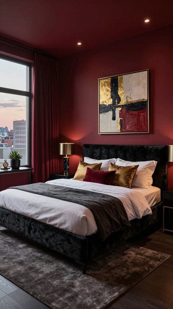
Deep-red walls set a dramatic tone in the bedroom, balanced by a soft, muted gray duvet that tempers the intensity while maintaining atmospheric depth. Brushed brass nightstands enhance the moody elegance, reflecting ambient light without disrupting the rich color scheme. A matte black, geometric low-profile headboard introduces clean lines and structural contrast, backed by a discreet LED strip that provides a soft, customizable glow for evening reading. To elevate the palette, a plush deep-emerald throw adds a touch of complementary color, blending avant-garde flair with cohesive design. Warm honey-toned hardwood flooring grounds the space, preventing visual heaviness and adding natural warmth. Through layered textures, subtle metallic accents, and strategic lighting, the bedroom transforms into a refined retreat—innovative, intentional, and deeply inviting. The sleek silhouette of a tuxedo-style sofa complements the room’s geometric accents while preserving its sophisticated aesthetic.

VERSION UPGRADING: The surface of our door handles adopts electroplating process instead of the powder coated or painted surface of other products, which is been designed with strength and durability for a long time use; No noise when twisting the handle; We respect all the reviews and are dedicated to providing better products and experience. If you have any questions, please feel free to contact us at any time

PRIVACY FUNCTION – KEYLESS INTERIOR DOOR KNOB. This privacy door knob is designed for bedrooms, bathrooms, and interior rooms where privacy is needed. The interior door knob features a thumb turn lock inside and an emergency release outside that can be opened with a coin or flat screwdriver. No key required. Ideal privacy door handle for bathroom and bedroom doors

PREMIUM MATERIAL & ELECTROPLATED FINISH — Upgrade your bedroom door locks with high-quality zinc alloy construction, featuring a thickened solid handle and a built-in anti-saw security bolt. The electroplated matte black finish (unlike ordinary powder-coated or painted surfaces) provides stronger adhesion that won't peel or rust in high humidity environments. Modern square design with smooth touch enhances your home decor
Room‑by‑Room Guide: Kitchen and Dining Areas
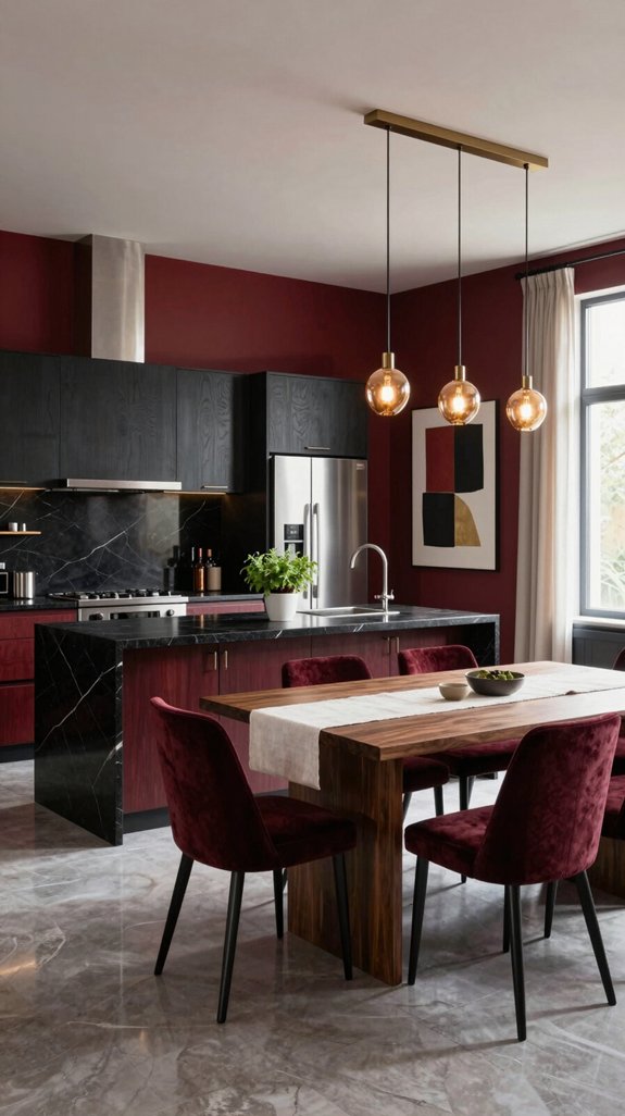
The deep-red walls that define the bedroom’s ambiance can extend their dramatic flair into the kitchen and dining areas when balanced with lighter, functional accents. I choose high-gloss white cabinets to reflect light and offset the intensity of the red, maintaining a clean, contemporary look. Brushed-metal hardware in matte black or antique brass adds subtle contrast and refined detail. Light quartz countertops with delicate veining provide durability and texture while keeping the palette harmonious. A cluster of pendant lights in brushed steel hovers above the dining space, offering ambient glow and a sculptural touch. To ground the dining area, I place a rug in muted gray or soft sage beneath the table, introducing warmth and tonal variation that softens the boldness of the walls. Selecting a subwoofer with a high bass output can further enhance the auditory atmosphere of the space.
Using Creamy Ivory to Soften Dark Red Tones
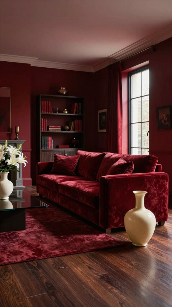
When creamy ivory is introduced into a room dominated by dark red, the contrast gently softens the boldness of the red, tempering its intensity while maintaining the space’s inherent drama. The warmth and neutrality of ivory act as a visual relief, diffusing the richness of the red and making the environment feel more welcoming. Ivory’s subtle undertones interact with natural and ambient light, enhancing the room’s brightness without compromising the depth of the darker hue. Applying ivory to walls, trim, cabinetry, or upholstered furniture creates layered tonal variations that add dimension, guiding the eye through the space and offering moments of visual rest. The finish of the ivory—whether matte, satin, or lightly textured—brings tactile richness, contributing to a refined and modern interior. This combination encourages thoughtful design planning, where color and material work in harmony to blend luxury with comfort, resulting in a balanced, cohesive living space. Soft ivory paint can also be used on accent walls to introduce a subtle glow that complements the deep red.
Maintenance Tips for Dark Red Surfaces
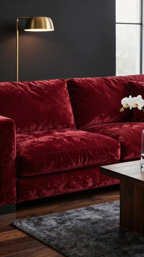
Keeping dark red surfaces looking vibrant and elegant begins with consistent, gentle care. Start by dusting with a soft microfiber cloth to prevent surface scratches. For cleaning, use a pH-balanced solution diluted to a one-percent concentration, applying it with a silicone-based sponge to lift grime without damaging the finish. Always wipe in the direction of the grain, especially on lacquered or wooden finishes, to avoid streaks. Immediately blot spills with a lint-free towel, then follow with a light rinse using distilled water to stop mineral residue from forming. Every six months, apply a micro-breathable sealant to protect against UV fading, especially in sun-exposed areas. Never use abrasive pads or harsh chemicals, which can dull or etch the surface. Before introducing any new product, test it in a discreet spot and record the results in a maintenance log to fine-tune your routine for long-term beauty. Use only non‑toxic cleaners to keep the environment safe for kids, pets, and sensitive individuals.
Common Mistakes When Decorating With Dark Red
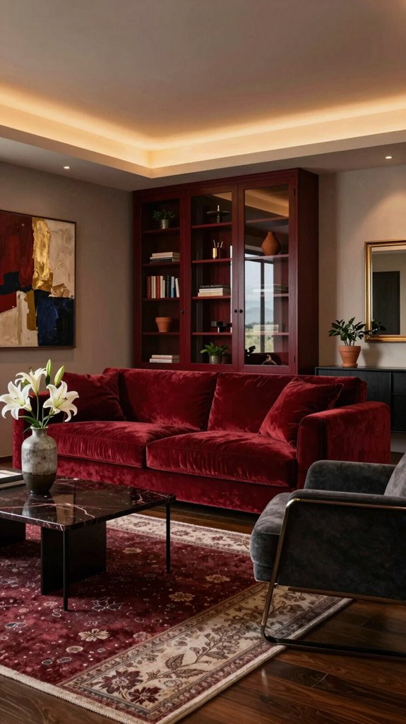
Dark red can transform a space with richness and depth, but getting it wrong can make a room feel oppressive instead of inviting. One common mistake is applying dark red to all walls, which overwhelms the senses and shrinks the perceived size of a room. Opting for a single accent wall or a painted ceiling maintains drama without sacrificing openness. Another pitfall is pairing the hue with low-contrast neutrals like beige or cool gray that recede into the red, flattening the design. Instead, balance it with crisp whites or warm taupes to create definition. Lighting plays a crucial role—harsh overheads intensify the color’s heaviness, while layered lighting, including sconces, table lamps, and dimmable fixtures, brings out its warmth and dimension. Furnishings also matter; placing too many dark, bulky pieces against dark walls dissolves visual hierarchy. Introduce lighter-toned or mid-century furniture to anchor the space with contrast. Finally, texture is essential—combine matte paints, lacquered surfaces, and metallic accents in lighting or décor to create subtle movement and elevate the room’s sophistication. Consider the practical benefits of a freestanding coat rack to add functional style without compromising wall space.
Final Checklist: Achieving a High‑End Dark Red Retreat
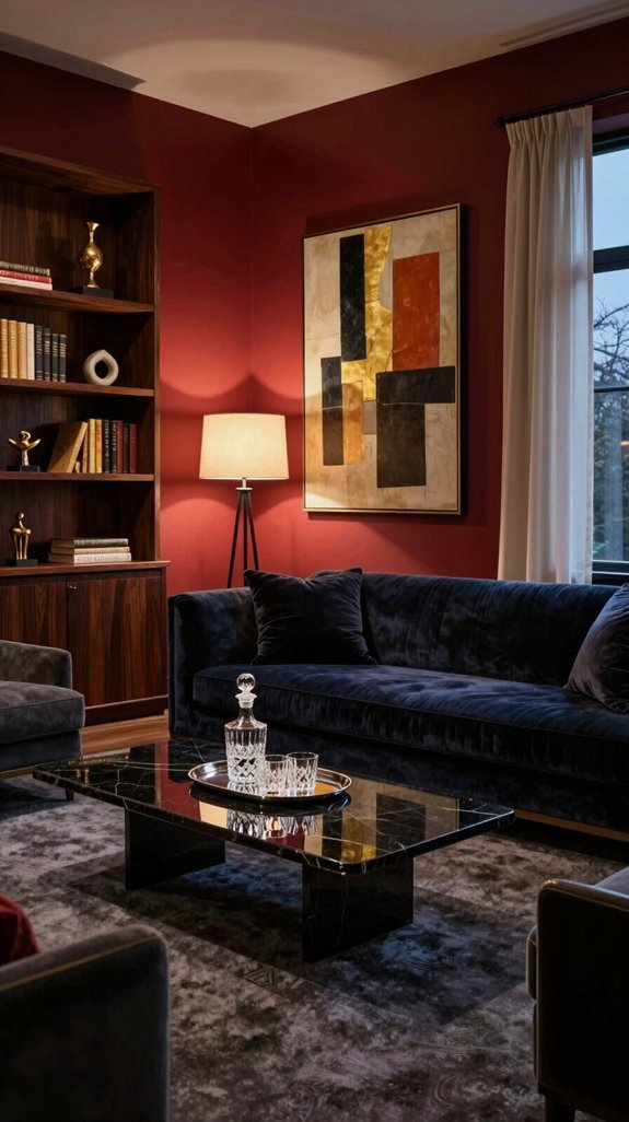
For a high-end dark red retreat that radiates luxury and warmth, begin by grounding the space with a single accent wall in deep crimson, balanced by warm neutral tones on other walls and large surfaces. Finalize the look with this checklist: 1) Confirm paint finish—opt for matte to enhance depth or satin for a hint of refined luster. 2) Layer lighting effectively using recessed LED downlights, dimmable wall sconces, and a sculptural chandelier emitting soft amber light. 3) Introduce rich material contrast through velvet-upholstered furniture, brushed brass fixtures, and polished marble details on tables or countertops. 4) Ensure acoustic comfort with thick area rugs, textured wall panels, or fabric-covered room dividers to absorb sound. 5) Mind the scale of décor—choose one or two bold art pieces or sculptural elements that command attention without overwhelming the room. 6) Integrate smart-home controls for lighting, temperature, and ambient audio to effortlessly shift the mood. 7) Consider adding a gold metallic accent to echo the opulence of luxe interior design. Execute each step with precision to achieve a space of elegant intensity and residential sophistication.
Frequently Asked Questions
Can Dark Red Paint Cause Allergic Reactions?
Dark red paint may cause allergic reactions in sensitive individuals, especially if it contains volatile organic compounds (VOCs) or potent pigments. To ensure a safe and comfortable space, review the paint’s safety data sheet, choose low-VOC or zero-VOC options, and always test a small, inconspicuous area before applying it to larger surfaces.
Is Dark Red Suitable for Small Apartments?
Dark red can be an effective choice for small apartments when paired with light neutral tones and reflective elements like mirrors or glossy finishes. The rich color introduces depth and sophistication, while the contrast with lighter accents helps maintain an airy, open feel.
How Does Humidity Affect Dark Red Wall Durability?
High humidity can compromise the durability of dark red walls by softening the paint, leading to peeling and discoloration over time—particularly when the finish isn’t formulated with moisture-resistant properties. To preserve the richness and integrity of the color, opt for breathable, vapor-permeable paint finishes and maintain indoor humidity levels with a dehumidifier.
Can Pets Scratch Dark Red Upholstery?
Pets can scratch dark red upholstery, particularly if the fabric has a loose weave or low pile. Their claws may snag the fibers, creating noticeable marks that stand out against the deep color. For durability and ease of maintenance, opt for tight-weave or performance-grade fabrics treated for stain and abrasion resistance.
Do Dark Red Interiors Increase Home Resale Value?
Dark red interiors can enhance resale value when styled with care, offering a bold and sophisticated ambiance that appeals to buyers seeking character and warmth. This rich hue adds depth and drama to living spaces, particularly when balanced with neutral furnishings and natural lighting to prevent the room from feeling too enclosed. When executed thoughtfully, dark red walls or accent features create a striking backdrop that elevates the overall design appeal of a home.



