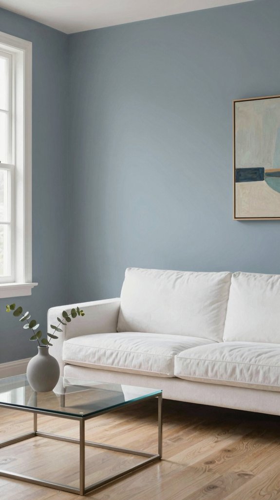
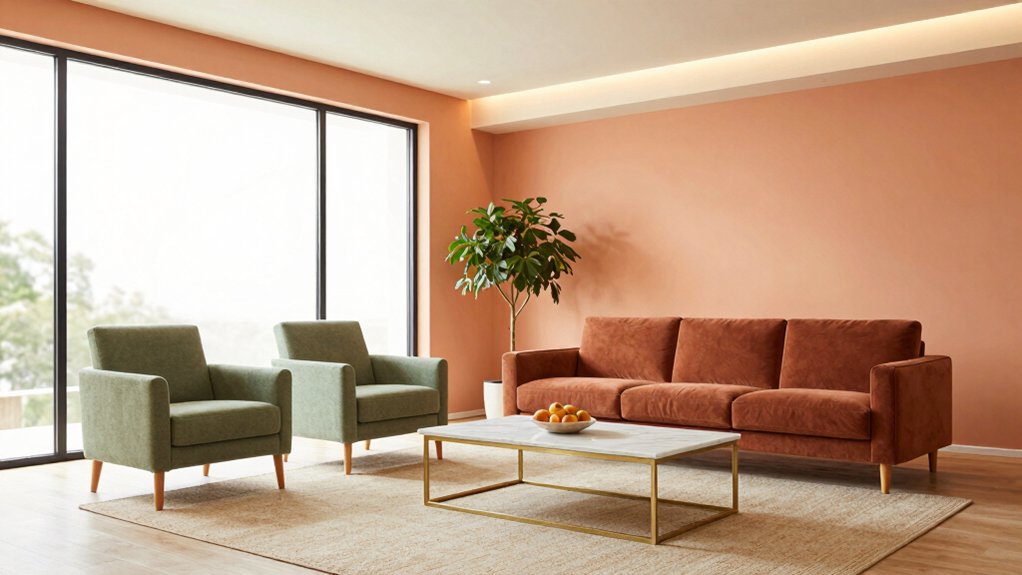
I love how apricot instantly adds a buttery warmth that feels both modern and inviting. Pair it with creamy ivory to create a calm, refined backdrop, or contrast it with deep teal for a dramatic, cinematic effect in living rooms or bedrooms.
Muted sage cools the hue, bringing earthy balance to airy spaces like sunrooms or kitchens, while warm gold finishes echo apricot’s golden undertones for understated luxury in lighting, hardware, or decorative accents.
Crisp white trim or charcoal-gray upholstery can sharpen the look, adding definition and contrast.
Embrace seasonal updates—switch in fresh sage accents in spring or deepen the palette with navy textiles in winter—to keep interiors feeling dynamic and current.
Discover how to apply this palette room by room, and learn how layering textures like linen, rattan, and ceramic can elevate the warmth and depth of apricot in any space.
What Makes Apricot a Cozy Base Color?
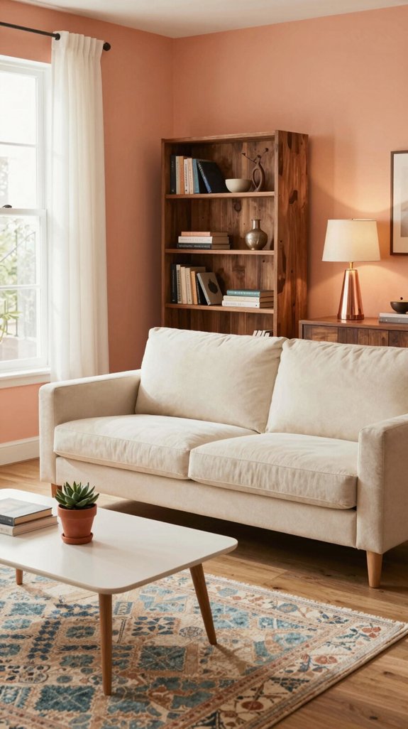
When I step into a room painted in apricot, the warm, buttery hue instantly softens the walls, making the space feel welcoming and effortlessly comforting. This delicate blend of orange and peach echoes the gentle light of sunrise, evoking a deep sense of calm and familiarity. Unlike bolder tones, apricot’s moderate saturation adds warmth without overwhelming the senses, making it ideal for creating serene living rooms, cozy bedrooms, or inviting dining areas. Paired with matte paints, linen drapes, and textured throws, the color enhances depth and coziness without demanding attention. It serves as a harmonious foundation in both clean, minimalist spaces and richly layered interiors, beautifully complementing natural wood, ceramic accents, and woven baskets. With the help of warm-toned lighting or shifting daylight, apricot subtly transforms from honeyed glow to soft terracotta, keeping the ambiance dynamic yet consistently inviting. Its adaptability and quiet warmth make apricot a timeless choice for homes designed to feel truly lived-in and deeply comforting. The subtle undertones of soft taupe can also be introduced through accent walls or trim to enrich the overall palette.

SPRAY PAINT AND PRIMER – Krylon COLORmaxx Spray Paint and Primer delivers premium coverage and superior color with adhesion and durability. This primer and spray paint can be used on wood, metal, wicker, most plastics, glass, plaster/ceramic and more.
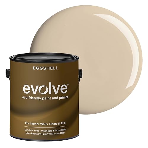
PAINT + PRIMER IN ONE: Evolve’s paint-and-primer formula helps you get great coverage from the start, sealing your surface and reducing the extra work of multiple coats.

PAINT + PRIMER IN ONE: Evolve’s paint-and-primer formula helps you get great coverage from the start, sealing your surface and reducing the extra work of multiple coats.
Apricot + Creamy Ivory Pairing for Calm Cohesion

I love how apricot’s warm glow feels instantly elevated when paired with creamy ivory, creating a seamless backdrop that’s both soothing and refined. This combination brings a quiet sophistication to living spaces—soft, buttery ivory cushions the subtle vibrancy of apricot, allowing the hue’s gentle luminosity to open up the room. I layer apricot-toned textiles over ivory walls, letting natural light reflect off the neutral base to enhance the warmth without overpowering the senses. For flooring, matte ceramic tiles in ivory ground the palette, while apricot-hued accents—like woven baskets or brass-trimmed lighting—add quiet points of interest. The result is a harmonious, understated environment that feels current yet enduring, ideal for those seeking a sanctuary of modern calm. Hardwick White offers a comparable soft gray‑white tone that can be used alongside apricot for a balanced, neutral backdrop.

PLAYFUL GLAM: drawing inspiration from the traditional glam trend, this 2-light flush mount ceiling light has clean simple lines and a stunning soft gold finish that adds a streamlined elegant appeal to any décor

【Brushed Brass Finish】 This vintage 3-light chandeliers feature a sleek brushed brass finish lamp body accompanied by clear glass shades. The upgraded finish not only adds an elegant touch but also includes a scratch and tarnish-resistant coating, ensuring that the bathroom light maintains its pristine appearance over time.

Unique Crystal Design: A vintage ceiling light adorned with crystal pendants embodies a luxurious blend of old-world charm and shimmering elegance. Our retro-inspired semi flush mount ceiling light serves as a stunning focal point, elevating the ambiance of any interior space with its timeless beauty and intricate craftsmanship.
Apricot + Deep Teal Pairing for Modern Drama
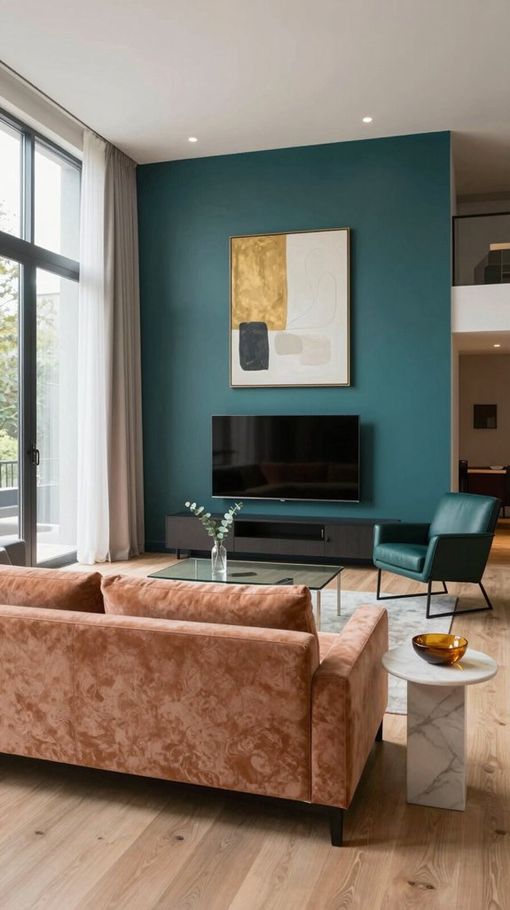
I’m drawn to the way apricot bursts against deep teal, instantly sparking a dramatic, contemporary vibe. I place apricot cushions on a deep teal sofa, letting the warm orange hue pull the eye while the rich blue grounds the space. The contrast feels cinematic, echoing design palettes seen in high-end lofts and modern boutiques. I pair brushed-copper lighting with matte deep teal walls, allowing apricot accents to catch and reflect a soft glow that intensifies the atmosphere after dark. Textured linen throws in apricot soften the sleekness of glossy teal tiles, adding warmth and tactile balance. Geometric brass shelving brackets and glass floating shelves reinforce the modern aesthetic, ensuring every detail contributes to a cohesive, avant-garde interior.
Unique Painterly Floral Design: With an elegant floral design, this bed in a bag offers an eye-catching refresh on your sleeping space. The perfect gifts for her, it wraps your loved ones in cozy elegance for every special moment.A thoughtful gift for birthdays, housewarmings, Christmas, Thanksgiving, or any occasion.

Chic Ruffle Aesthetic: Adorned with exquisite artisan-style ruffled edges, the JOLLYVOGUE seersucker comforter set infuses your space with a perfect blend of vintage farmhouse charm, transforming your bed into a stunning, inviting focal point

Elegant Floral Design:This BEDELITE queen comforter set is like a blossoming sea of flowers, transforming your bedroom into a dreamy garden. Lying beneath it feels like being immersed in a floral paradise, ensuring you have a sweet dream every night. Whether it's Father's Day, Mother's Day, or Valentine's Day, this bedding set is an excellent choice for a holiday gift.
Apricot + Muted Sage Pairing for Earthy Balance
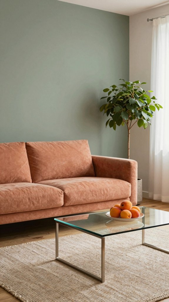
The bold warmth of apricot finds serene balance when paired with muted sage, creating an earthy, harmonious palette that feels both grounded and refreshing. Instead of high contrast, this combination offers a nuanced interplay—apricot’s soft peachy undertones blend gracefully with the cool, ashen green of sage, resulting in a tranquil yet layered atmosphere. In a living room, envision an apricot-hued statement armchair nestled against walls finished in sage-tinted plaster, their subtle textures catching the daylight to enhance depth. Layer in apricot linen throw pillows for cozy tactility, while ceramic planters in muted sage green hold lush foliage, tying the scheme to the natural world. This duo embodies the essence of “biophilic minimalism,” crafting serene, intentional spaces that feel connected to nature and curated with quiet sophistication. Consider using material contrast to further enrich the visual depth of the space.
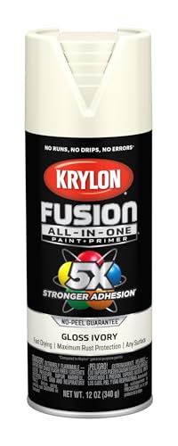
ALL-IN-ONE SPRAY PAINT – Krylon All-In-One Spray Paint delivers best in class adhesion, durability, and rust protection. The aerosol spray paint offers a broad color palette with multiple finishes and sheens for indoors and out.

DURABLE FINISH: Ensures a long-lasting finish that stands the test of time. Ideal for interior walls, ceilings, bedrooms, dining rooms, family rooms, bathrooms, kitchens, hallways and offices.

VERSATILE SIZE - This acrylic paint comes in a convenient 2 oz bottle and is sure to be a staple in your craft supplies
Apricot + Warm Gold Pairing for Luxe Touches
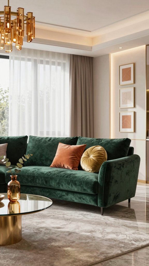
When apricot meets warm gold, the space transforms into a haven of understated luxury—inviting, luminous, and rich with dimension. An apricot-upholstered sectional anchors the room, its velvety texture absorbing and softening the natural light. Paired with a brushed gold coffee table, the warmth of the metal echoes the hue’s golden undertones, creating a seamless flow. Behind the sofa, a warm gold leaf accent wall adds opulence and depth, catching the light with a gentle shimmer. To balance the gleam, apricot-toned linen curtains and plush throw pillows introduce warmth and tactility. A matte gold chandelier hangs low, casting a flattering, diffused glow that enhances the apricot walls without overpowering them. Even the hardware on nearby cabinetry—drawer pulls and picture frame edges—echoes the gold theme in a satin finish, tying the details together. The interplay of color and metal creates a sophisticated harmony—elegant and modern, yet endlessly welcoming. This pairing doesn’t shout; it whispers luxury, making it ideal for spaces that value serene refinement. The subtle shimmer of jade green accents can further enrich the palette, echoing natural gemstone hues.

MODERN MINIMALIST STYLE — This dining room light fixture features a brushed gold metal frame paired with cylindrical clear glass, adding a modern, elegant, and luxurious touch to your home. It is not just a pendant light, but also an art decoration.

Semi-Flush Mount Design & Classic Style--- This brushed gold ceiling light is the perfect choice to complement your industrial/modern look. Its brushed gold base and impurity-free hand-blown clear glass with excellent light transmittance offer a modern interpretation of the classic urban industrial style.

Champagne Gold Finish with Amber Hammered Glass Shades——This champagne gold vanity light features elegant amber hammered glass shades that instantly add warmth,depth, and visual interest to your space. The brushed gold finish pairs beautifully with mirrors, marble countertops, and warm modern interiors for a polished, upscale look.
Apricot + Crisp White Pairing for Fresh Cleanlines
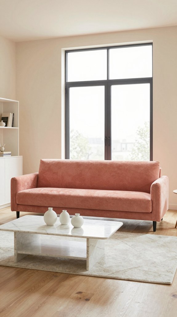
Apricot’s soft glow feels instantly brighter against crisp white, transforming a space into a breezy, sun-kissed retreat. Layer apricot cushions on a white sectional to let the pastel hue accentuate clean architectural lines without overpowering the room. The contrast enhances natural light, making ceilings seem higher and walls more open. Pair matte apricot tiles with high-gloss white cabinetry for a refined tension that feels both contemporary and enduring. Introduce a brushed-copper light fixture to bring subtle warmth, balanced by sheer white drapes that diffuse light gently. Opt for low-profile furniture with streamlined silhouettes and minimalist hardware, ensuring the apricot accents remain the quiet focal point. This pairing champions minimalism while infusing the space with a light, uplifting energy—fresh, serene, and thoughtfully composed.

Kids' Twin-size bed sheet set with Navy Stripe print includes a flat sheet, fitted sheet, and pillowcase

Soft & Durable Material: Crafted from high-quality 100% polyester fabric, this patterned quilt is soft, lightweight, and breathable for year-round comfort. This cute quilt ensures you enjoy both style and comfort. It provides a soothing sleep experience and the perfect gift for hot sleepers.

TRENDY & COMFORTABLE: Cotton Comforter Set made of 100% cotton and beautifully features chenille tufting, The boho comforter King size also comes with matching shams. Ample down alternative filling in this King bed comforter will give all season comfort
Apricot + Charcoal Pairing for Dark Anchors
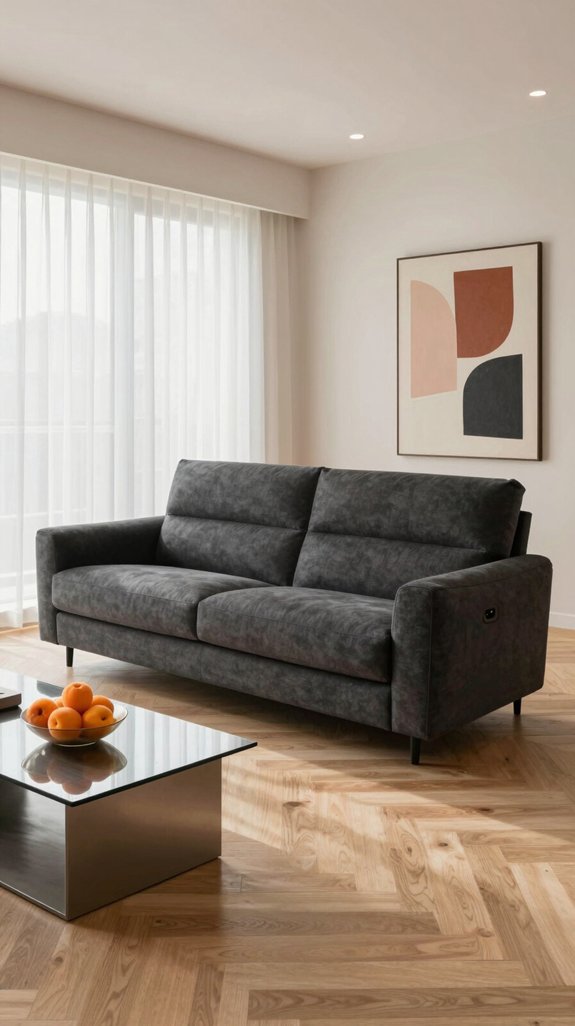
When anchoring a space with deep charcoal walls or a statement charcoal sofa, a touch of apricot introduces warmth and luminosity without diluting the room’s atmospheric depth. Try a high-sheen apricot velvet throw pillow atop a matte charcoal sectional, where the interplay of textures enhances the contrast between light and shadow. Introduce a floor or table lamp with a brushed-metal apricot finish under a charcoal-toned ceiling to infuse a hint of modern elegance with a grounded, reflective glow. For flooring, consider apricot-tinted stained hardwood planks installed over a charcoal underlayment, creating a dimensional foundation that draws the eye and adds organic warmth. The balance lies in letting charcoal command the space—use apricot selectively in accent walls, soft furnishings, lighting fixtures, and decorative objects to ensure the mood remains rich, layered, and welcoming. Rails for hanging posters can be discreetly mounted on the charcoal walls to display artwork without disrupting the color harmony.

Superior Light Blocking: Our blackout curtains, designed with 100% black out linen fabric, are perfect for those seeking complete darkness in their living space. Whether you're a light sleeper, work night shifts, or simply want to create a cozy movie-watching environment, these curtains effectively block out all external light sources.

Extremely durable interior paint ideal for use on properly prepared interior walls, ceilings or trim composed of new or previously painted drywall, plaster, masonry, wood and metal

Ideal for use on interior/exterior surfaces including wood, plastic, plaster, metal, masonry and unglazed ceramic
Seasonal Apricot Pairings
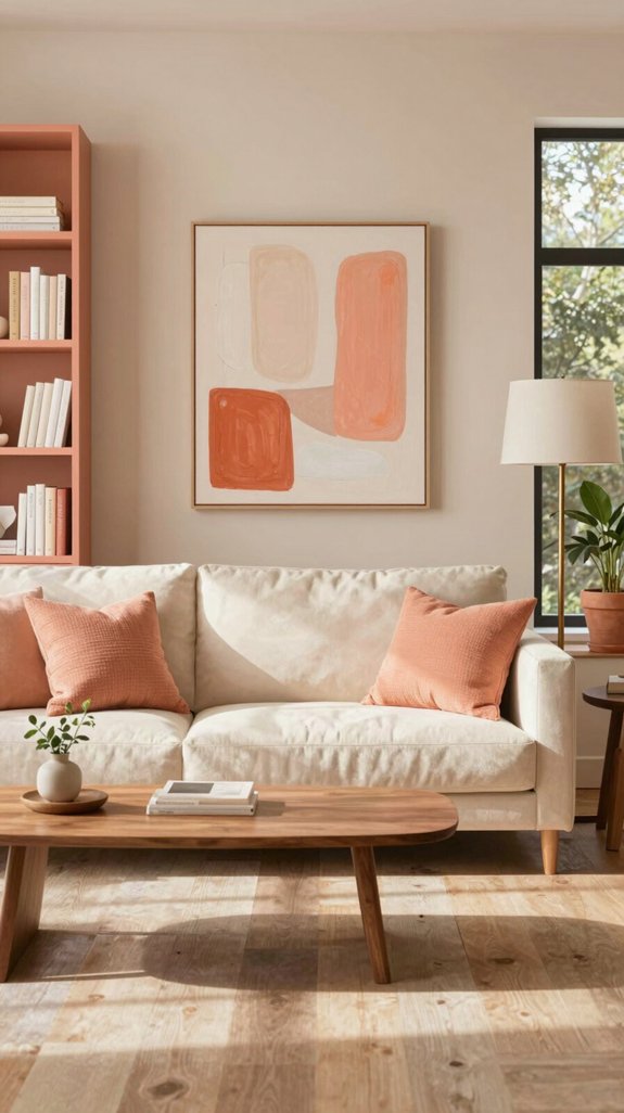
I love how each season gives apricot a fresh personality, so I’ll guide you through pairing it with colors and textures that feel timely and effortless. In spring, I match apricot with soft sage and matte ceramic finishes, letting the pastel green echo new growth while the ceramic adds subtle, earthy depth. Summer calls for crisp aqua and woven rattan accents; the turquoise highlights apricot’s sun‑kissed glow, and natural fiber baskets or furniture keep the space light and inviting. Autumn leans into muted terracotta and brushed wool upholstery, creating a warm, tactile harmony that mirrors falling leaves and enhances cozy interiors. Winter embraces deep navy and sleek marble surfaces, where the cool, grounding hue accentuates apricot’s subtle warmth, and polished stone countertops or décor offer a refined, contemporary contrast. Each seasonal palette respects current design trends while inviting innovative, layered living spaces. Consider using lime green accent walls to add a vibrant pop that complements apricot’s warmth.
Applying Apricot Schemes by Room

When I step into a living room, I let apricot become the anchor, pairing it with plush velvet cushions in muted teal and brushed-gold lighting fixtures that catch the eye without overwhelming the space. The warmth of apricot flows into the kitchen, where apricot-toned tiles frame a matte-black island, and copper cabinet handles echo the hue’s richness, creating a harmonious balance between vibrancy and sophistication. In bedrooms, apricot linens are layered over charcoal-gray bedding, with an amber-hued bedside lamp casting a soft, tranquil glow that enhances relaxation. Bathrooms are transformed into serene retreats, featuring apricot-tinted glass shower panels paired with crisp white fixtures and brushed-nickel taps that subtly tie into the overall palette. In home offices, an apricot accent wall adds energy and focus, contrasted by warm walnut desks and sleek teal shelving, resulting in a dynamic yet grounded workspace that inspires creativity while maintaining comfort. The trend of using cheerful hues is reflected in many modern interior designs, offering both visual appeal and emotional uplift.
Frequently Asked Questions
Can Apricot Paint Be Used on High‑Traffic Walls Without Fading?
Apricot paint, when formulated with premium, UV-resistant pigments and applied in a durable matte finish, performs exceptionally well on high-traffic walls. It maintains its warm, inviting hue over time, resisting discoloration from both sunlight and frequent contact, making it a stylish and practical choice for hallways, entryways, and family rooms.
Is Apricot Safe for Children’s Rooms Regarding VOC Emissions?
Apricot paint emits virtually no VOCs, making it an excellent, safe choice for children’s rooms. Tested against strict safety standards, this fresh and vibrant hue adds a lively, modern touch while ensuring healthy indoor air quality in any playful, creatively designed space.
How Does Apricot Affect Lighting Energy Consumption?
Apricot-colored walls reflect more natural daylight, helping to brighten rooms and reduce the need for artificial lighting. In well-lit spaces, this effect can cut lighting energy consumption by approximately 5–10%, particularly when combined with high-efficiency LED fixtures.
Can Apricot Be Combined With Metallic Wallpaper for a Cohesive Look?
Apricot’s soft warmth pairs beautifully with metallic wallpaper, creating a harmonious fusion of color and texture. By using balanced paneling, coordinated decorative elements, and reflective trim details, the two elements merge seamlessly. The result is a space that feels modern yet welcoming, with a cohesive aesthetic that enhances the room’s depth and atmosphere.
What Are the Best Cleaning Products for Apricot‑Finished Surfaces?
Use pH-neutral, non-abrasive cleaners such as a diluted vinegar-water solution or a plant-based citrus cleaner, applied with a soft microfiber cloth. These options effectively clean apricot-finished surfaces while maintaining their natural warmth and luster without leaving streaks or residue.